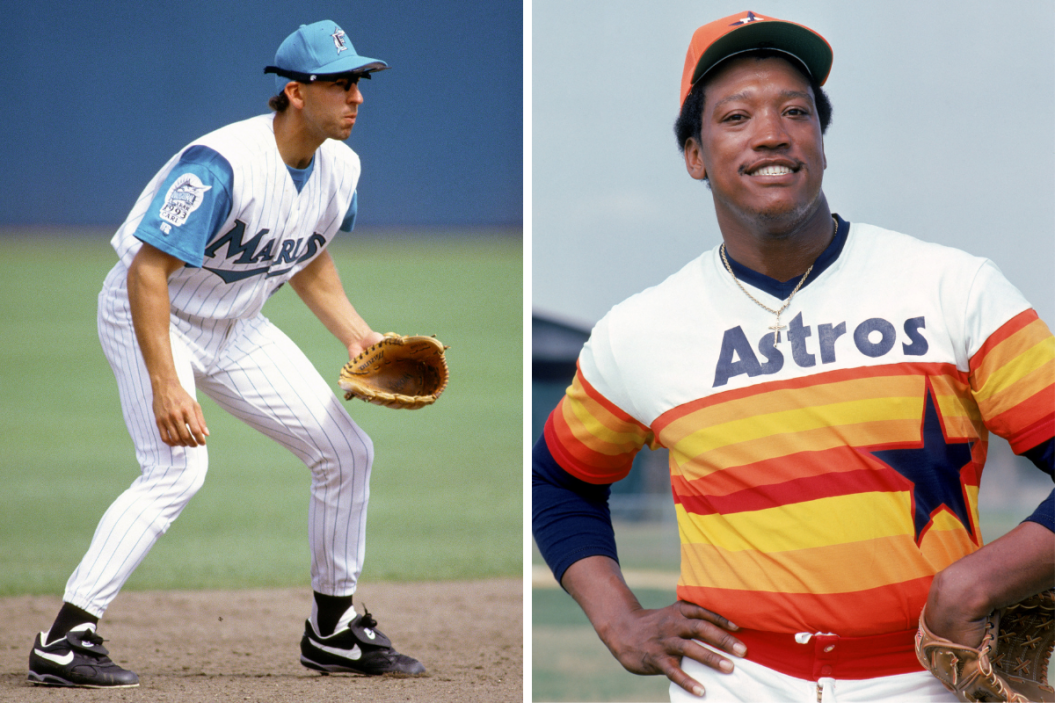
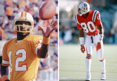
Major League Baseball has a 150-year history, so it's not surprising there's been a lot of uniform variance throughout that time — and some teams have changed their jerseys a lot more than others.
Teams like the Boston Red Sox, Cincinnati Reds, Chicago Cubs, San Francisco Giants, Oakland Athletics and Los Angeles Dodgers can lean on a well-established color scheme that never needs to change. No need for throwbacks when your whole look is one.
Pinstripes might last forever for teams like the Chicago White Sox or New York Yankees, but a lot of other teams really have to mix up their jerseys to keep things fresh. Many teams do much more than just change uniforms — the Cleveland Indians rebranded into the Cleveland Guardians and the Miami Marlins have used more colors than the painting color palette wall at Home Depot.
Throughout the years, many team uniforms have been thrown in the dumpster and forgotten about. You know those historically-considered-ugly-but-they're-actually-glorious Houston Astros sunset jerseys? Or how about the Seattle Mariners' "Turn Ahead the Clock Night" sleeveless jerseys that Ken Griffey Jr. first made cool? Yeah, those are the types of uniforms we're talking about.
MLB has had hundreds and hundreds of uniform variations since its inception in 1869 (current players are probably glad wool isn't the material of choice anymore). While plenty uniforms have been downright terrible, there have also been plenty of spectacular ones that could make even the cheapest dad crack open his wallet at the team store.
We thought we'd take a look at some of the best MLB uniforms that no are no longer in circulation. So which are the best uniforms that should never have gone away? Here's a whole selection.
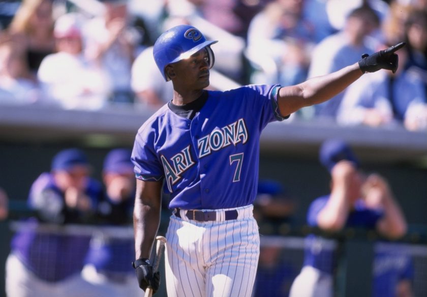
18. Arizona Diamondbacks Purple Uniforms
Jeff Carlick/Stringer/Getty Images
What happened in the desert? The D-Backs used to have a series of really cool purple-and-teal uniforms. Purple and teal is always a fun combo (just check out the Charlotte Hornets in the NBA), especially with pinstripes, and they won their only World Series in these unis. So why did they change it to a deeply boring red-and-white scheme that absolutely no one likes? I don't get it. Perhaps a stronger shift back to their original color scheme can help turn around their current misfortunes.
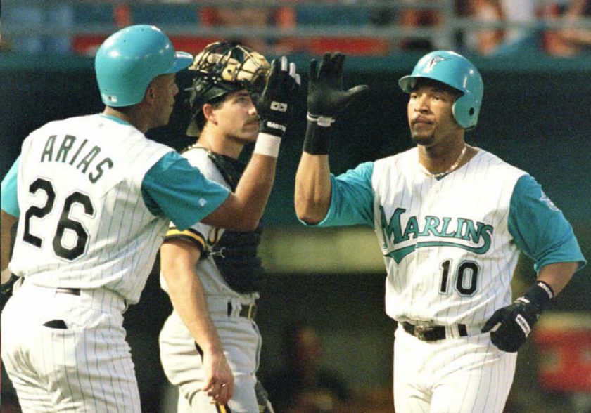
17. Florida Marlins Teal Jerseys
RHONA WISE/AFP via Getty Images
Before they changed their uniforms to be black with orange trim, like some weird terrible version of the Orioles, and then to black with red and blue trim, the Marlins actually had really cool unis. They actually got it right from the very get-go: their original 1993-95 pinstripe home jerseys with long-sleeve teal underneath are both killer and unique. Never should've changed them. Perhaps in the future, we'll see these return. The team has already brought back the teal pinstripes for the 2023 season, albeit on Friday home games. With the way things are going now, the Marlins may have a brand new color scheme by the time you read this.
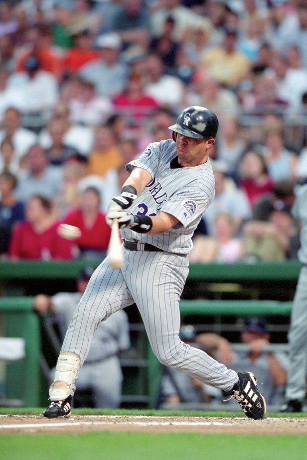
16. Colorado Rockies Gray Pinstripes
George Gojkovich/Getty Images
Colorado's uniforms haven't actually changed all that much over their history. There's always black and purple (the best color combo in sports), and there's always some form of pinstripes. And no one has perfected the sleeveless look like Colorado. But these 2000-01 uniforms marked the only time the Rockies used gray pinstripes with purple lettering. It was such a winning combo it's not clear why it only lasted such a short time. Bring it back, Colorado! Give the people what they want!
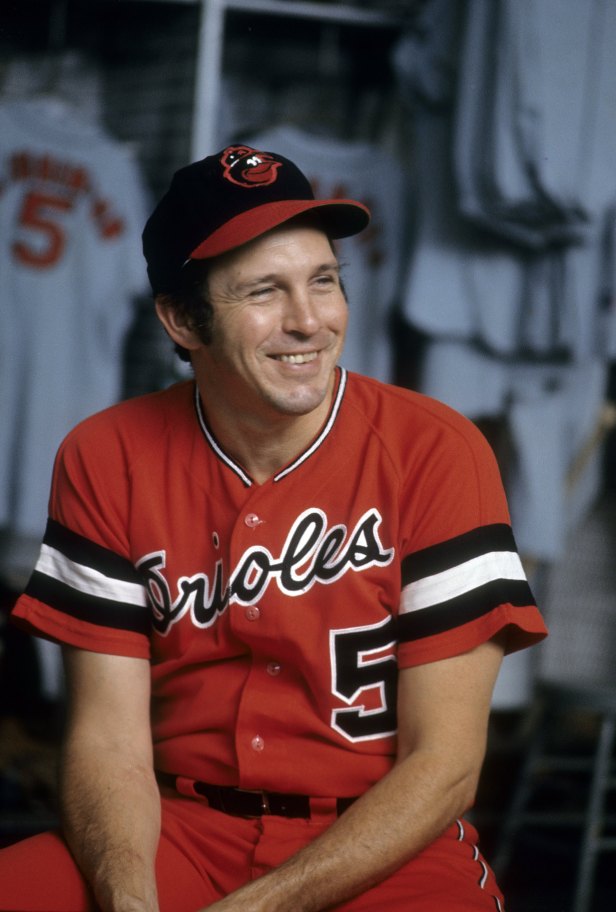
15. Baltimore Orioles All-Orange Uniforms
Focus on Sport/Getty Images
The Orioles have worn bright orange jerseys several times throughout their history, but this outfit designed by Hall of Fame third baseman Brooks Robinson was the first and best time they went orange-on-orange. It was also the only time they had those cool sleeve stripes. I say bring these back ASAP. No MLB team has ever really featured anything like them. The Rays and the Guardians dabbled in some 1970s retro looks, but neither one succeeded in making an aesthetic impact. As the Orioles continue their long rebuild, perhaps they can work these uniforms back into the rotation.
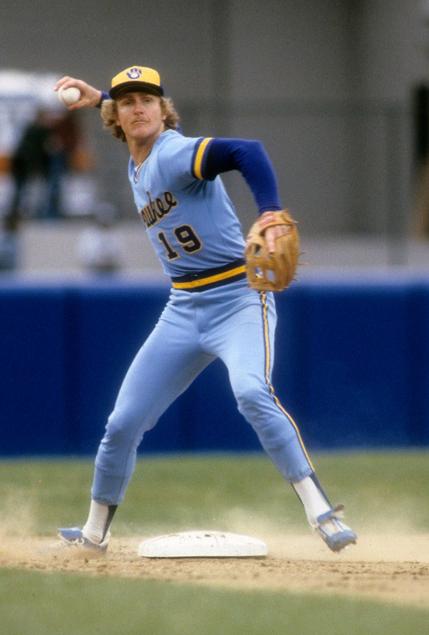
14. Milwaukee Brewers Powder Blues
Focus on Sport/Getty Images
The Milwaukee Brewers' uniforms now might be the worst in the league, a depressing miasma of navy blue and muted gold, but it wasn't always the case. In the 1970s and 80s, the Brewers wore these absolutely rad blue-and-yellow unis. In recent years we've seen the Brewers return to their navy blue and gold color scheme, but the powder blue look has yet to reappear. Bring these back immediately. We here at FanBuzz will forever be #TeamPowderBlue.
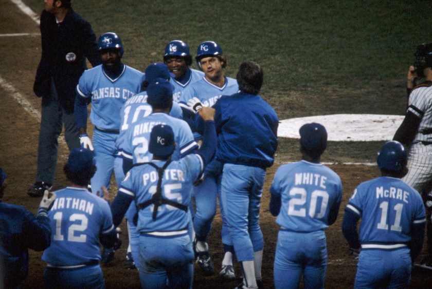
13. Kansas City Royals Powder Blues
Bettmann/Getty Images
A good general rule is that powder blue is never, ever a bad idea for a uniform. Every MLB team that's tried it has found success, and even NFL teams like the Chargers have a long, proud history of powder blue unis. The Royals use a variant of these as an alternate jersey now, but it's not quite the same. If the Royals really want to up their jersey sales, bringing back the powder blue pullover is the way to go.
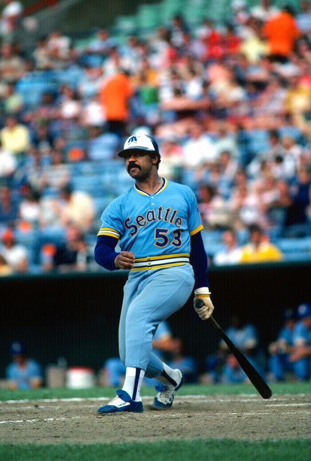
12. Seattle Mariners Blue-Yellow Jerseys
Focus on Sport/Getty Images
Look, I don't know what to tell you; vertical sleeve stripes are always cool, and blue-and-yellow is a winning color combo. The Mariners' early history may have largely been devoid of All-Stars, but they at least had some rad unis. Their home whites were pretty cool, but these, their road uniforms, were even better.
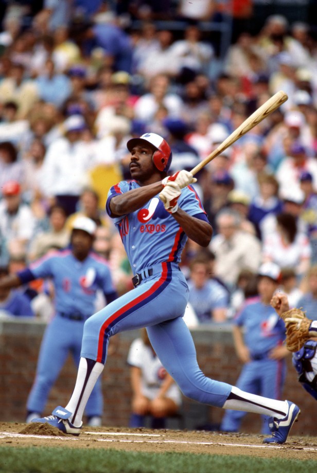
11. Montreal Expos Red, White & Blue
Rich Pilling/MLB Photos via Getty Images
Not only do these uniforms not exist anymore, but the team is also defunct. Major League Baseball moved the Montreal Expos to D.C. in 2005, rebranding the team as the Washington Nationals. Patterned vaguely on the red-blue-white color scheme of the Montreal Canadiens, these Expos unis will be the first thing that returns if Montreal ever gets another team. The Nationals have tried to distance themselves from the Expos across the board, and their retro jerseys are no different. Washington did experiment with some Expos looks, but the whole vibe was off. Perhaps this is a look that only works North of the Border.
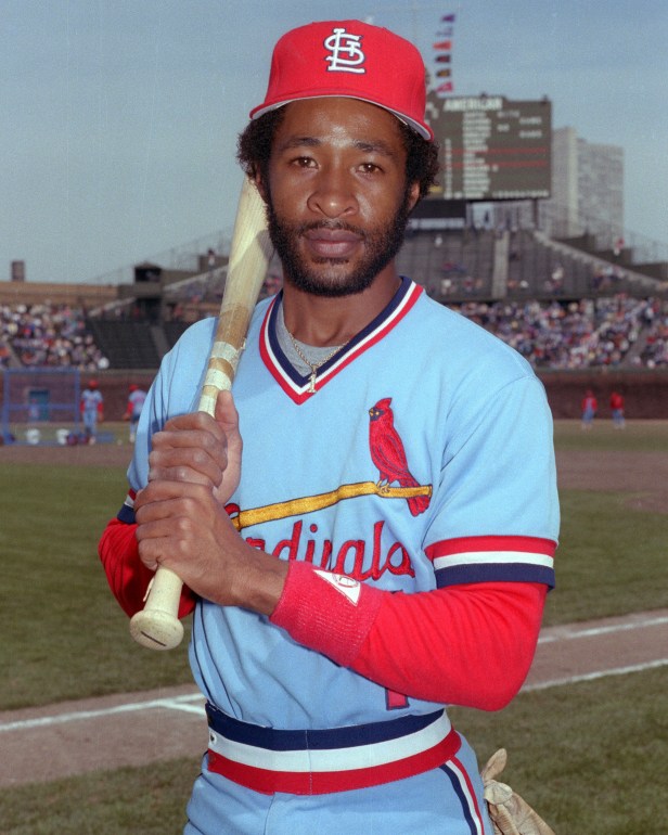
10. St. Louis Cardinals Experimental Blues
Ron Vesely/MLB Photos via Getty Images
RELATED: The 10 Best Uniforms in College Football Put Everyone Else to Shame
The Cardinals have always featured red and white on their jerseys, but for a brief time in the late '70s and early '80s, they experimented with a much more interesting look. Does this color scheme make any sense? Of course it doesn't; cardinals aren't blue. But it's cool as heck, and that's all that matters. This is slightly cheating. The Cardinals have very recently brought these back as throwback unis (maybe to lure free agents?). After all, these are Keith Hernadez's favorite uniforms and we're still #TeamPowderBlue.
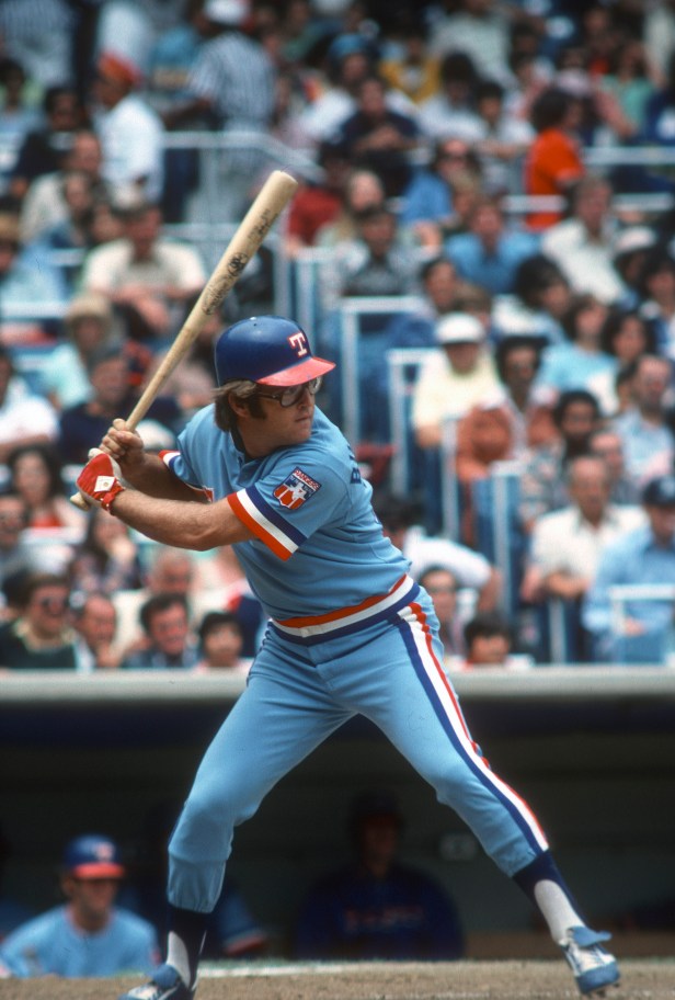
9. Texas Rangers Flag-Based Uniform
Focus on Sport/Getty Images
Before they decided to transition to the most boring uniforms in the entire league (oooh, gray and navy blue, how original), the Rangers had a really fantastic look in the late '70s and early '80s based on the Texas flag. Look, can we just flash all MLB unis back to the late '70s/early '80s? The league clearly had a winning fashion thing going back then. And Nike knew that when they brought back the powder blue drip to Arlington.
8. Tampa Bay Rays Hunter Greens
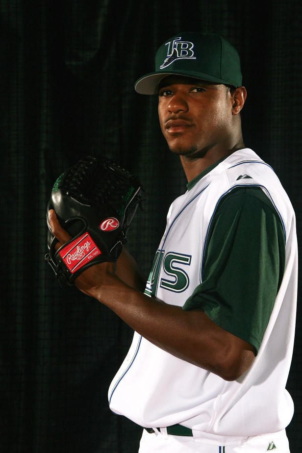
Nick Laham/Getty Images
Hunter green (not to be confused with Cincinnati Reds flamethrower Hunter Greene) is not usually that much of a winning color, but the Rays made it work, at least for a time. These mid-2000s uniforms are way better than any boring old navy blue, black or gray color they've attempted before or since.
7. New York Mets Pinstriped Sleeves
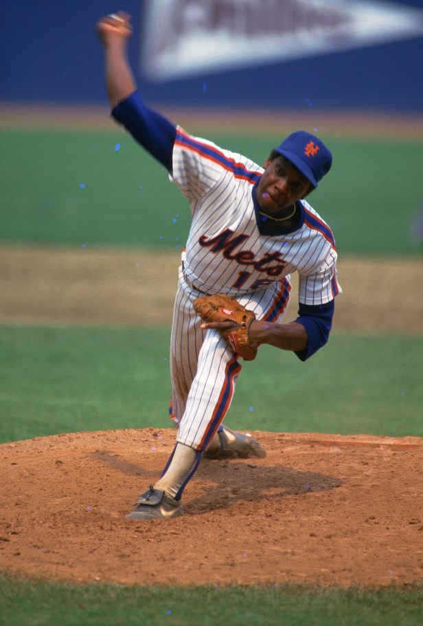
Focus on Sport/Getty Images
The Mets' uniforms haven't really changed much in their 65-year history, for a good reason: you really can't go wrong with pinstripes and a blue-orange color scheme. But in the mid-to-late 1980s, they experimented with a really cool variation involving these stripes on the sleeves. This might be one of the only times a team's home uniform was even cooler than the road one. The team tried to bring these back in 2016 to celebrate the 30th anniversary of their 1986 World Series title, but the throwbacks fell flat. Perhaps the decision to make the jerseys looser, to accommodate player preference, didn't help the Mets capture the magic of 1986. Regardless, this look is still a big hit amongst the Flushing Faithful.
6. Minnesota Twins Light Blues
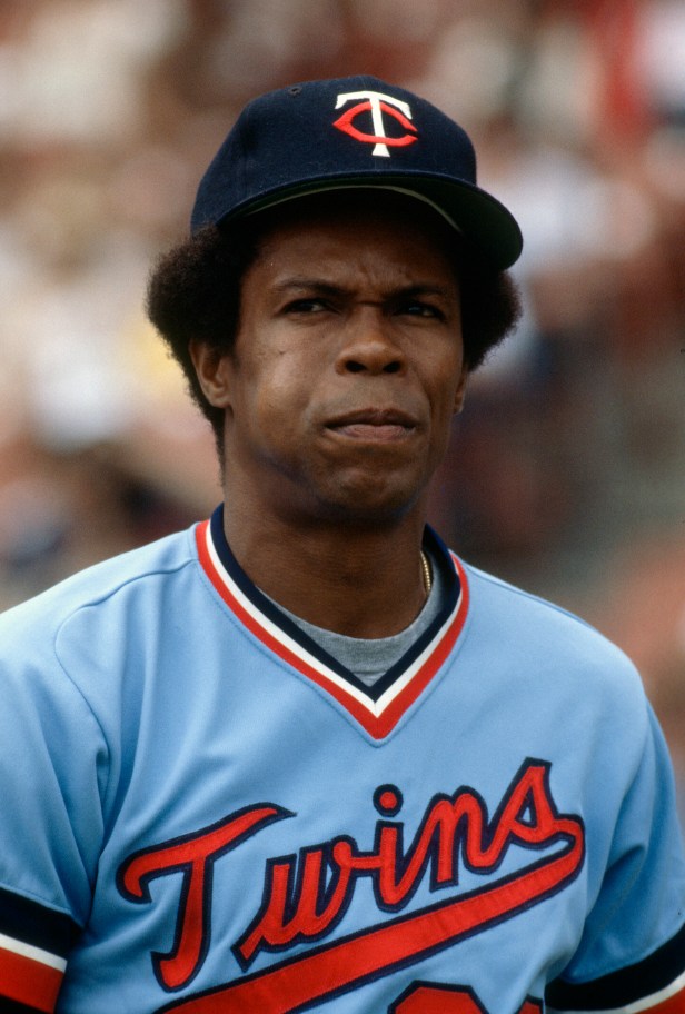
Focus on Sport/Getty Images
Few things in MLB history have been as cool as Rod Carew wearing the old-school Minnesota Twins blue-grey uniforms with red trim. There's not a lot to say here other than to hammer the point home again: light blue is a killer uniform color.
5. Philadelphia Phillies Powder Blues
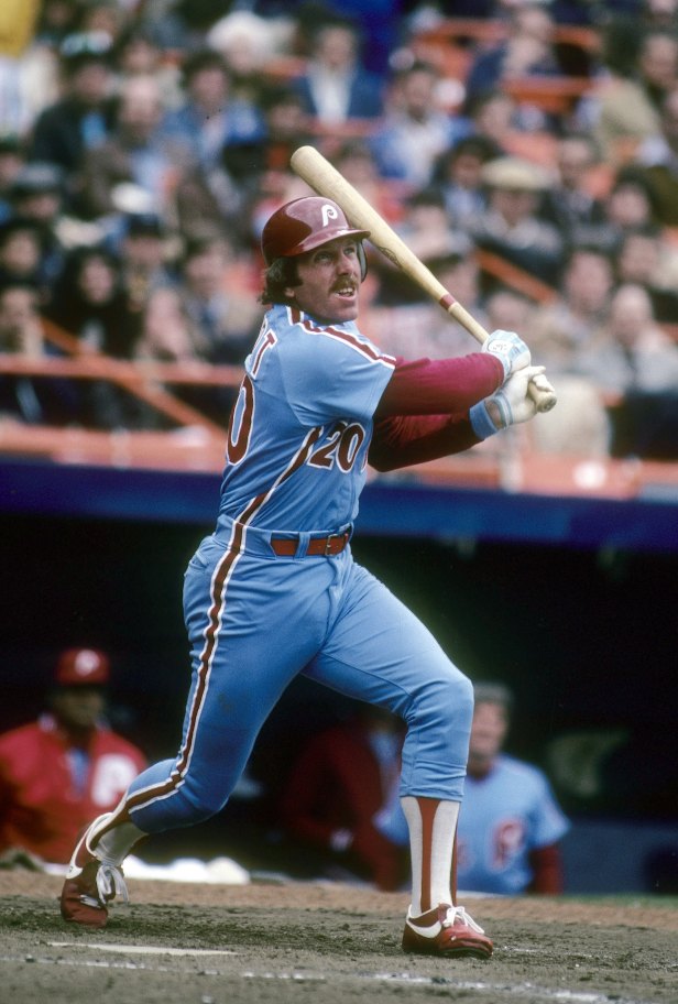
Focus on Sport/Getty Images
The Philadelphia Phillies are one of the few 19th century baseball teams that has changed their uniforms a significant number of times throughout their history. They've been red-and-white, burgundy-and-gray, navy blue-and-white (gross) and then this color scheme of powder blue and burgundy during the 1970s, maybe the only pro sports team to ever attempt it. Considering how cool it was, I don't know why it ever went away.
4. Toronto Blue Jays Powder Blues

Focus on Sport/Getty Images
The 1980s were a glorious time for MLB uniforms, an age when powder blue ruled the roost. Other than maybe the Royals, no team leaned into this harder than the Toronto Blue Jays, who sported blue on blue on blue with just a little bit of white to offset it. What an amazing time to be alive.
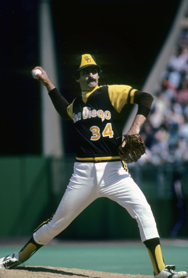
3. San Diego Padres Brown/Yellow Uniforms
Focus on Sport/Getty Images
The San Diego Padres' old school brown-and-yellow unis, those worn by Dave Winfield, Rollie Fingers and Gaylord Perry, shouldn't work. Nothing about that color combo should be good...and yet here we are. I'm as baffled as you are, but these things rule. The Padres pivoted several times with their looks since first retiring this look. From the navy and orange looks from the Tony Gwynn Era and then a quick trip to navy and gold during their rebuild, the Padres have finally arrived back at their origins. And if their current roster is any indication, we're going to be seeing much more of this colorway for the foreseeable future.
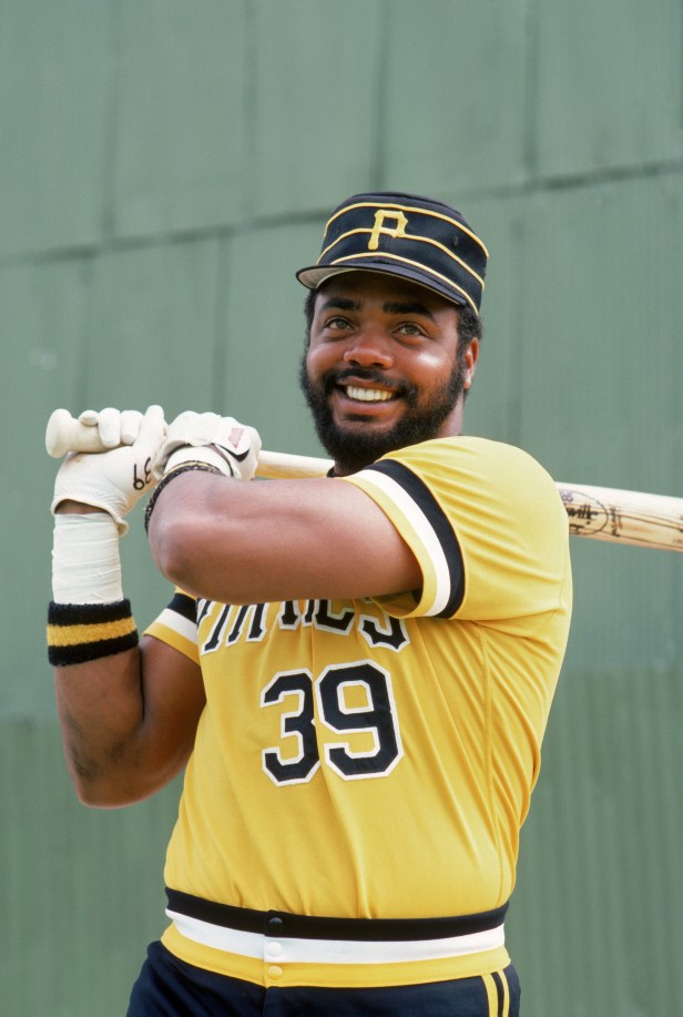
2. Pittsburgh Pirates Yellow-Striped Hats
Rich Pilling/MLB Photos via Getty Images
The Pirates may have had decades of futility to contend with now, but they can always lean on that killer yellow-and-black color scheme (and the best ballpark in the league). Their uniforms have always been at least decent, but they were never better than their late '70s/early '80s caps. There's never been anything like these oddly-shaped, horizontal striped lids in MLB history, and we need to bring them back immediately.
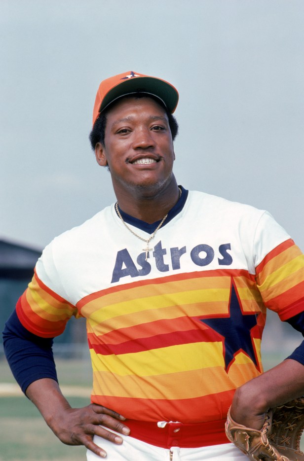
1. Houston Astros Sunset Jerseys
Rich Pilling/MLB Photos via Getty Images
This list was only ever going to end one way. The Astros' uniforms now are pretty solid (orange is always a winning color), but nothing is ever going to touch these late '70s unis. These orange-yellow horizontal striped uniforms may be divisive, but that's just because the people who hate them are wrong. They rule.
