The New York Mets are celebrating their 60th season in 2022, and the team the Amazins are fielding now is a far cry from the one that took the field in 1962. The inaugural season of New York Mets baseball still holds the record as the absolute worst, with Casey Stengel's Metsies posting a 42-120 record as they limped to the finish line.
Videos by FanBuzz
Seven years later, the Mets would win the 1969 World Series, their first in team history, behind future Hall of Famers like Nolan Ryan and Tom Seaver and the rest is history. But while some things like their roster, stadium and manager have changed multiple times over their 60 years of existence, their logo has not.
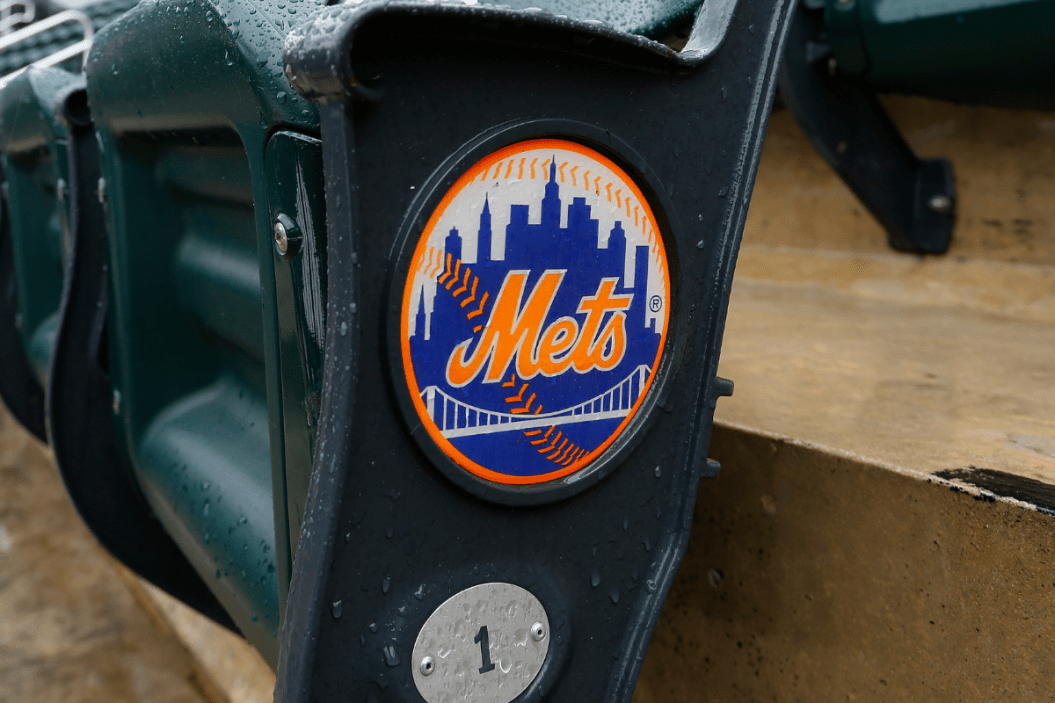
The New York Mets logo, designed by Artist Ray Gotto, is one of the most recognizable in sports, with the orange outline of a baseball seam and the iconic New York skyline providing the perfect backdrop for the cursive Mets wordmark to rest up against. But while we all recognize that these buildings are New York-specific there's a little bit more to their origin.
The New York Mets Origin Story

Photo by Bettman/Getty Images
The New York Mets became a major league baseball franchise in 1962, the same year as the Houston Colt .45s, who would later rebrand to the Houston Astros.
Recent MLB expansion has involved moving less successful teams to new cities like the Montreal Expos becoming the Washington Nationals or a handful of new franchises from whole cloth like the Florida/Miami Marlins, Arizona Diamondbacks and the Tampa Bay Rays. But that wasn't always the case. In fact, there was a time when a World Series winner could be on the move a handful of seasons after their ring ceremony.
MLB's expansion push had begun in the 1950s with the Boston Braves moving to Milwaukee, the Philadelphia Athletics moving to Kansas City, the Washington Senators becoming the Minnesota Twins and the St. Louis Browns moving to Baltimore and becoming the Orioles. But perhaps the biggest moves came from the Empire State, as the Brooklyn Dodgers and New York Giants moved to California on the same day.
In the blink of an eye, New Yorkers who had spent their entire lives hating the Yankees were left without another baseball team to support. What were the other options were there? Root for the Red Sox? Fat chance. Stay up until the wee hours of the morning listening to the California broadcast? Sure, New York is the city that never sleeps, but there are limits.
With the Los Angeles Dodgers and San Francisco Giants now setting up shop on the West Coast, MLB pushed for newer franchises out West. This included the California Angels and the Colt .45s in the early 1960s. But New York demanded a new MLB team to replace the two they felt were stolen from them. MLB Commissioner Ford Frick acquiesced and the New York Mets were born.
The New York Mets Find Their True Colors

Photo by Gavin Baker/Icon Sportswire via Getty Images
The Metropolitans were designed to represent every borough of New York, especially the ones that just lost their teams. Embracing the official colors of New York City as their own, the orange, blue and white color scheme of the Mets uniforms immediately set them apart from the Yankees.
But there was a secondary meaning to the Mets' choice. The specific royal blue was the predominant color of the Brooklyn Dodgers and the orange they adopted was that of the New York Giants.
Even the Mets caps were a nod to the ones worn by the Giants in their final seasons at their ballpark, the Polo Grounds, where the Mets would play until the construction of Shea Stadium was completed in 1964. The orange "NY" logo the Mets wear on their caps wasn't the first time it was seen by residents of the Big Apple, as it was lifted from the Giants, with the blue body of the cap as an homage to Brooklyn's Boys of Summer. Mr. Met was a completely new invention for the Mets, and he still remains the only professional baseball mascot in New York, alongside his wife Mrs. Met.
But the baseball club's primary logo itself goes even deeper. In an early Mets media guide, the Mets front office explains their reasoning for the specific buildings and infrastructure selected. The Bridge in the foreground, which resembles the Queensboro Bridge, is "symbolizes that the Mets, in bringing the National League back to New York, represent all five boroughs," according to the media guide excerpt.
The New York Mets Skyline is Not Your Average NYC Sight
Pretty much everything you ever wanted to know about the @Mets logo, from an early club media guide. pic.twitter.com/d41eM0mAJI
— Todd Radom (@ToddRadom) March 26, 2022
Remember when I said that the Mets emblem utilizes the iconic New York City skyline? That's not necessarily true. In fact, the New York Mets logo, creates its own reimagined skyline that takes more than just Manhattan into consideration.
"It's not just a skyline in the background," the media guide excerpt states. "It's a skyline with meaning to it. At the left is a church spire, reminding us that Brooklyn, the city of churches, is represented by the Mets as well as the other boroughs. The second building from the left is the Williamsburgh Savings Bank, 42 stories, the tallest building in Brooklyn. Next is the Woolworth Building, once the tallest building in Manhattan. After a general skyline view of midtown comes the Empire State Building, the tallest building in America. At the extreme right is the United Nations Building."
The Williamsburgh Savings Bank hasn't been the tallest building in Brooklyn since 2009, and the Empire State Building is the seventh tallest building in Manhattan, but does that really matter? Fans who visit Citi Field for a Mets home game will also notice that the Mets have updated the skyline emblem over the years. In center field above the Shake Shack, the Mets have added the North and South Towers of the World Trade Center, with both buildings wrapped in a red, white and blue ribbon.
The Mets are colloquially known as New York's team, thanks to the Yankees' large fanbase reach, similar to that of the Dallas Cowboys. There's a grit to the franchise you won't find in the new Yankee Stadium, a toughness. Shea Stadium, the Mets' home in Queens for 45 years, was iconic in its own right, and now Citi Field bridges the history of the Mets, the Giants and the Dodgers seamlessly with its design.
Major League Baseball has had its fair share of logo history in recent years with the Cleveland renaming their franchise to the Guardians. But even that decision was derived from the one made by the Mets so many years ago, with the Guardians namesake coming from the Guardians of Traffic that reside on the Hope Memorial Bridge. Infrastructure makes for the best team logos.
So the next time you see the Mets in their Friday night black alternate jerseys and black caps, their blue road alternates, their 1986 pullover throwbacks or even their pinstriped home whites, remember that no matter the look, the Mets carry an entire city on their sleeve.