The Super Bowl logo used to be fun. Different. Creative. It used to be something fans could proudly display on a hat or a jacket. There was genuine excitement when the design was revealed each year.
Videos by FanBuzz
Ever since Super Bowl XLV in 2011, there's been a problem with the logo: It's incredibly boring. The design that was painted at the middle of Cowboys Stadium for the big game that year may have looked nice at first. It was polished, and it was silver. But year after year since then, the logo has gone mostly unchanged.
So what gives? What the hell happened to it?
Leave it to Commissioner Roger Goodell and the "No Fun League" to ruin what used to be one of the best parts of the Super Bowl.
The Awesome History of the Super Bowl Logo
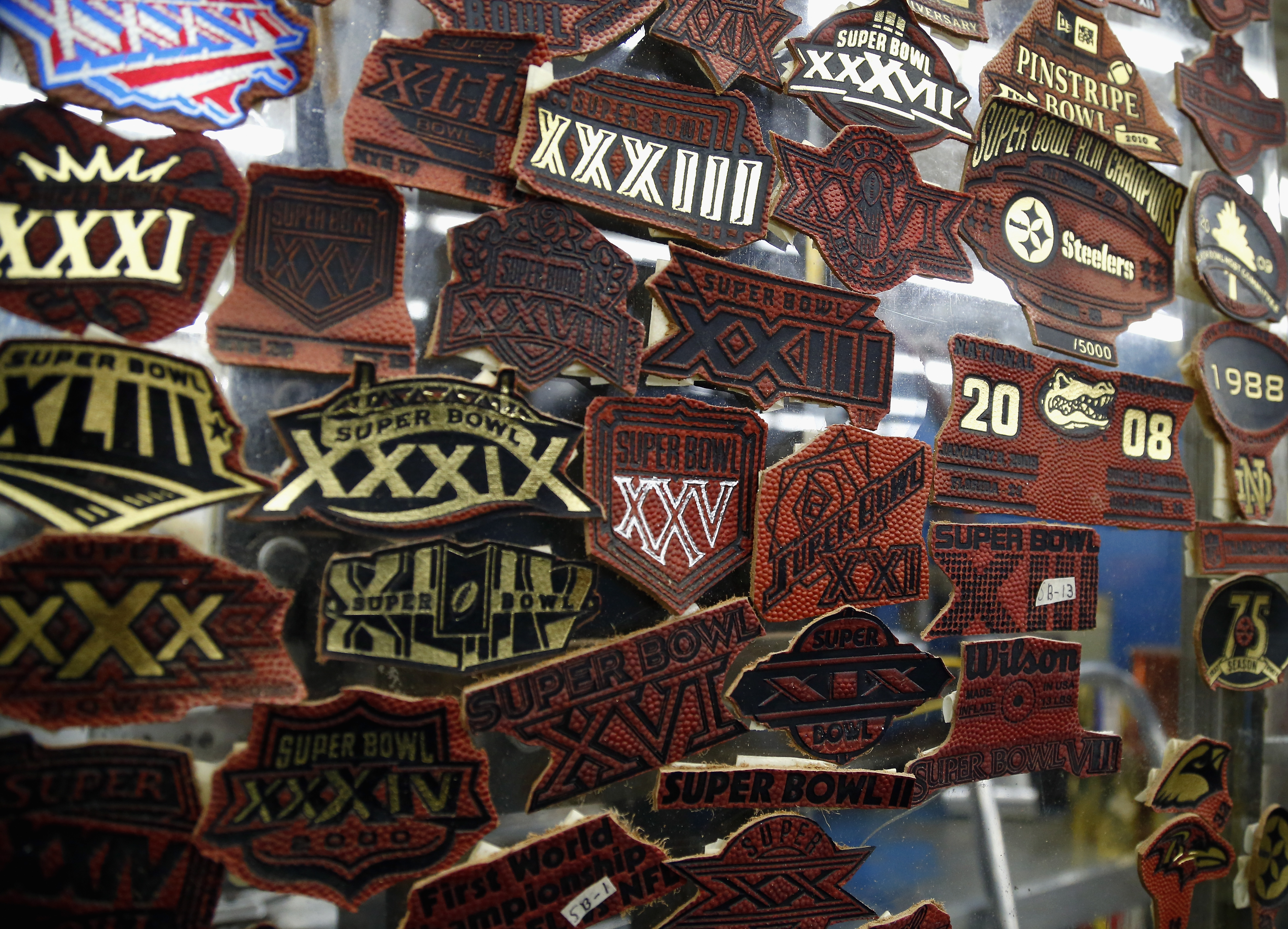
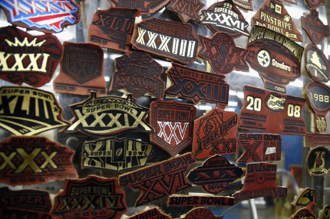
Logos from past Super Bowls at the Wilson Sporting Goods football factory on Jan. 19, 2014, in Ada, Ohio. Wilson Sporting Goods has been making all of the Super Bowl footballs since Super Bowl I in 1967. (Photo by Matt Sullivan/Getty Images)
Admittedly, the first 10 or so logos were pretty plain, with most just looking like an amateur design artist playing with different fonts. Super Bowl IX was the first to feature some sort of element paying homage to the host city, though, with what looks like a French horn in one leg of the "X." All of them can be found here.
The #SuperBowl logo has become less creative, and more corporate throughout the years. pic.twitter.com/VOIG4bLswO
— The Sporting News (@sportingnews) February 6, 2021
Through the years, colors and nods to locations were added. Super Bowl XII's logo very obviously portrayed the Mardi Gras hues. While blue and red took over in the 1980s and early 1990s (save for XV and XVI), at least the designs were unique and, often, sexy. Super Bowl XIV is a classic, from the font to using the "I" and "B" to form a Lombardi Trophy.
January 20, 1980: The Steelers defeated the LA Rams (19–31) in Super Bowl XIV — #NFL's powerful #logo and artwork. pic.twitter.com/gtR7vJnQQD
— Pull Up Shoot (@seamercx) January 20, 2015
The designers did things right in the '90s, too. There were the Pasadena roses in XXVII and a Georgia peach in XXVIII. The naval ship in XXXII's logo was a nice touch. And don't even get me started about that Miami art deco design the following year.
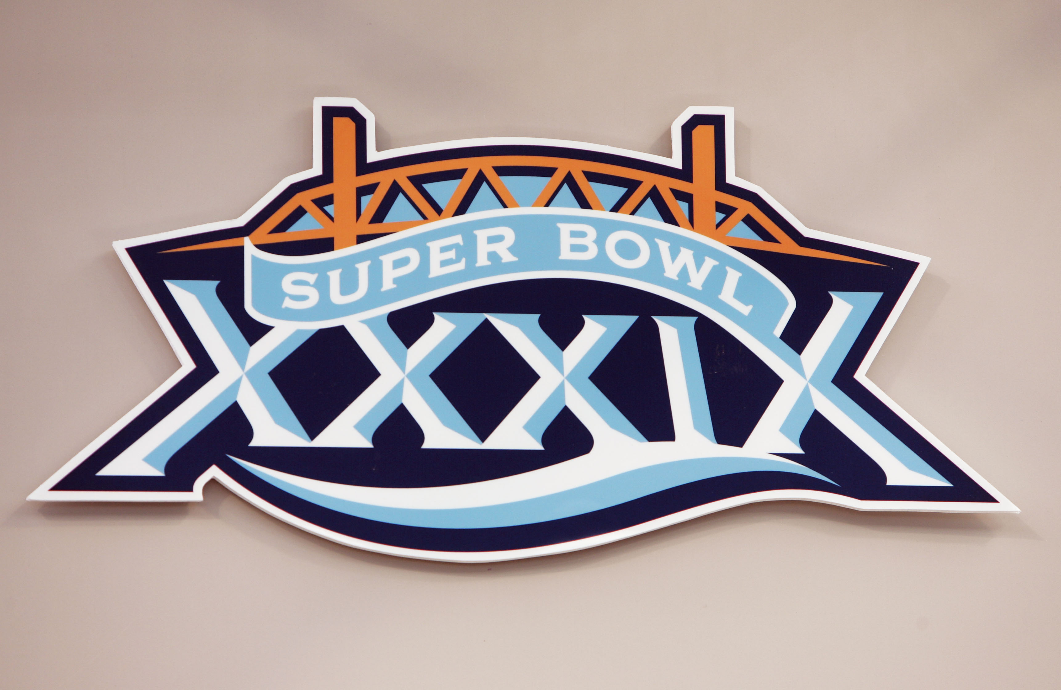
The original XXXVI was going to be Mardi Gras-themed, but it was changed following the Sept. 11 attacks to feature a logo of the U.S. in red, white and blue. The unused logo can be found here. The rest of the 2000s were memorable, too, including the Old Point Loma Lighthouse (XXXVII) in San Diego, the Space theme (XXXVIII) for Houston, Jacksonville's Main Street Bridge (XXXIX) and an odometer for when the Motor City hosted XL.
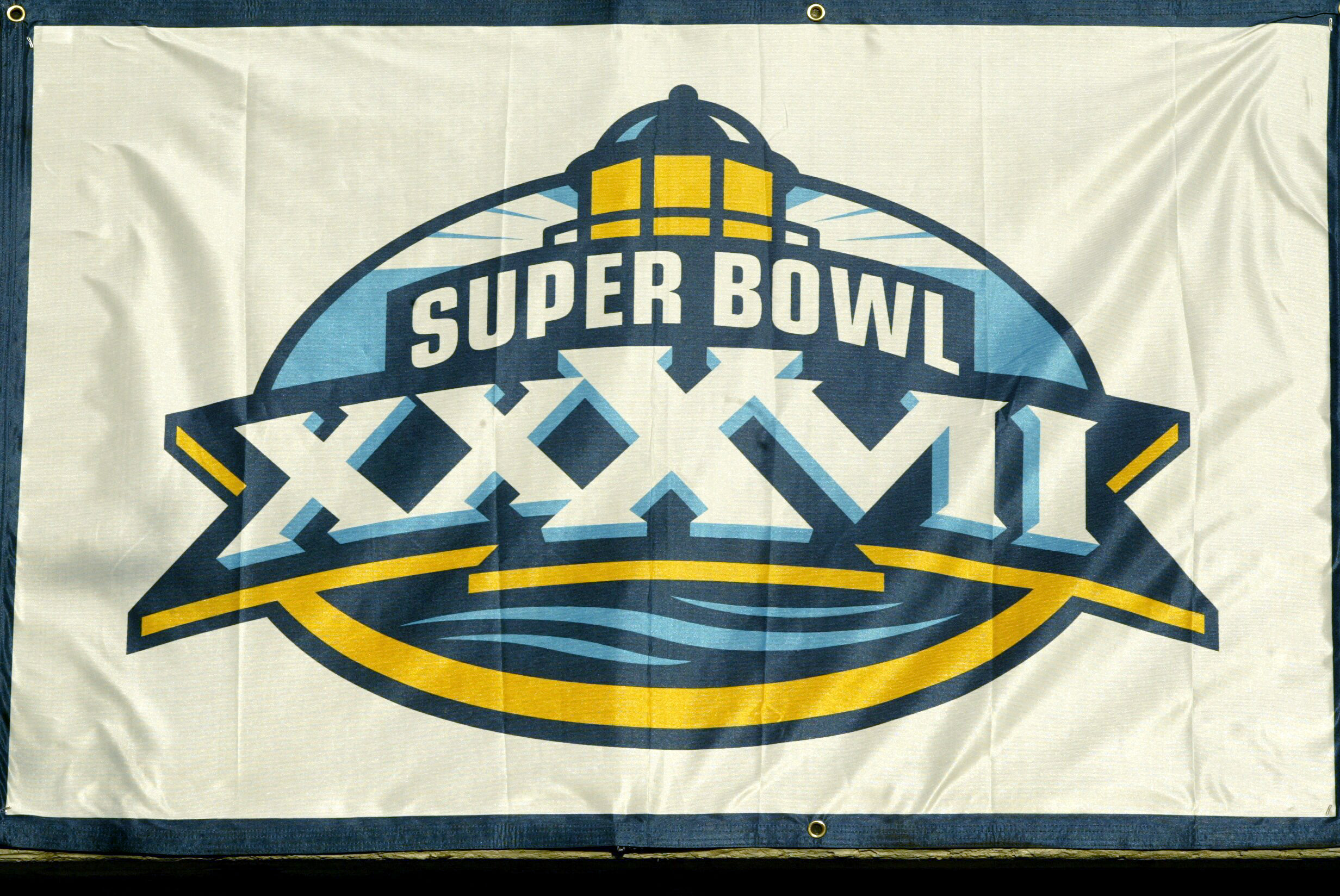
A banner with the Super Bowl XXXVII logo hoisted into place on Jan. 21, 2003, at Qualcomm Stadium in San Diego, California. (Photo by Stephen Dunn/Getty Images)
The official logo of Super Bowl XXXIX on media day at Alltel Stadium on Feb. 1, 2005, in Jacksonville, Florida. (Photo by Jeff Gross/Getty Images)
Super Bowl logo on the field during Steelers media day for Super Bowl XL at Ford Field in Detroit, Michigan, on Jan. 31, 2006. (Photo by Al Messerschmidt/Getty Images)
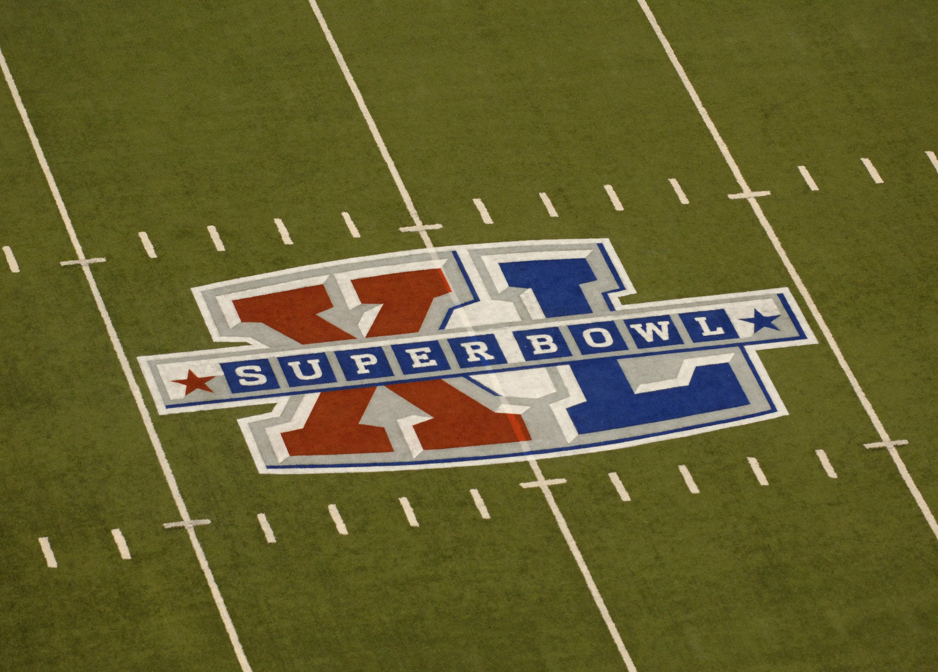
It wasn't until Super Bowl XLV that the logo became, well, boring.
So, Why is the Logo So Boring Now?
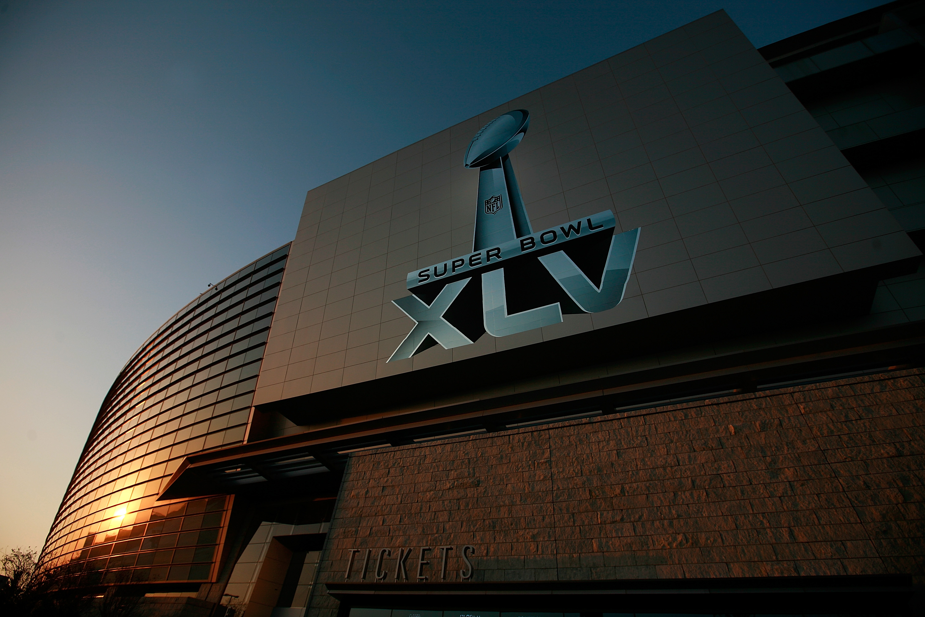
The logo for Super Bowl XLV outside of Cowboys Stadium on Jan. 30, 2011, in Arlington, Texas. (Photo by Tom Pennington/Getty Images)
The blame can be placed on Goodell and the "No Fun League." Goodell assumed office as commissioner in 2006, and the logo has been boring since 2011.
Prior to Super Bowl XLV, the NFL announced that design firm Landor would be designing the Super Bowl logo. The company, which also rebranded the "9/11" logo at the World Trade Center site, has designed every one since 2011.
Back when Landor was announced as a partner, the company released a statement that called past logos "dramatically different" each year, as if that were a bad thing.
"The NFL has historically introduced a dramatically different Super Bowl logo every year based primarily on the location of the game, and using roman numerals for greatest impact. Landor's strategy for the new visual identity system places at the heart of it the Vince Lombardi trophy, given to the Super Bowl's winning team each year. Depending on the NFL event, the new system allows for complementary elements to be introduced. The released version, for the Arlington 2011 Super Bowl XLV, is the first example of a region-specific identity which will include each year's stadium venue and the roman numerals to designate the event. This system affords the NFL consistency from year to year, regardless of the playoff event," the statement read, via Sporting News.
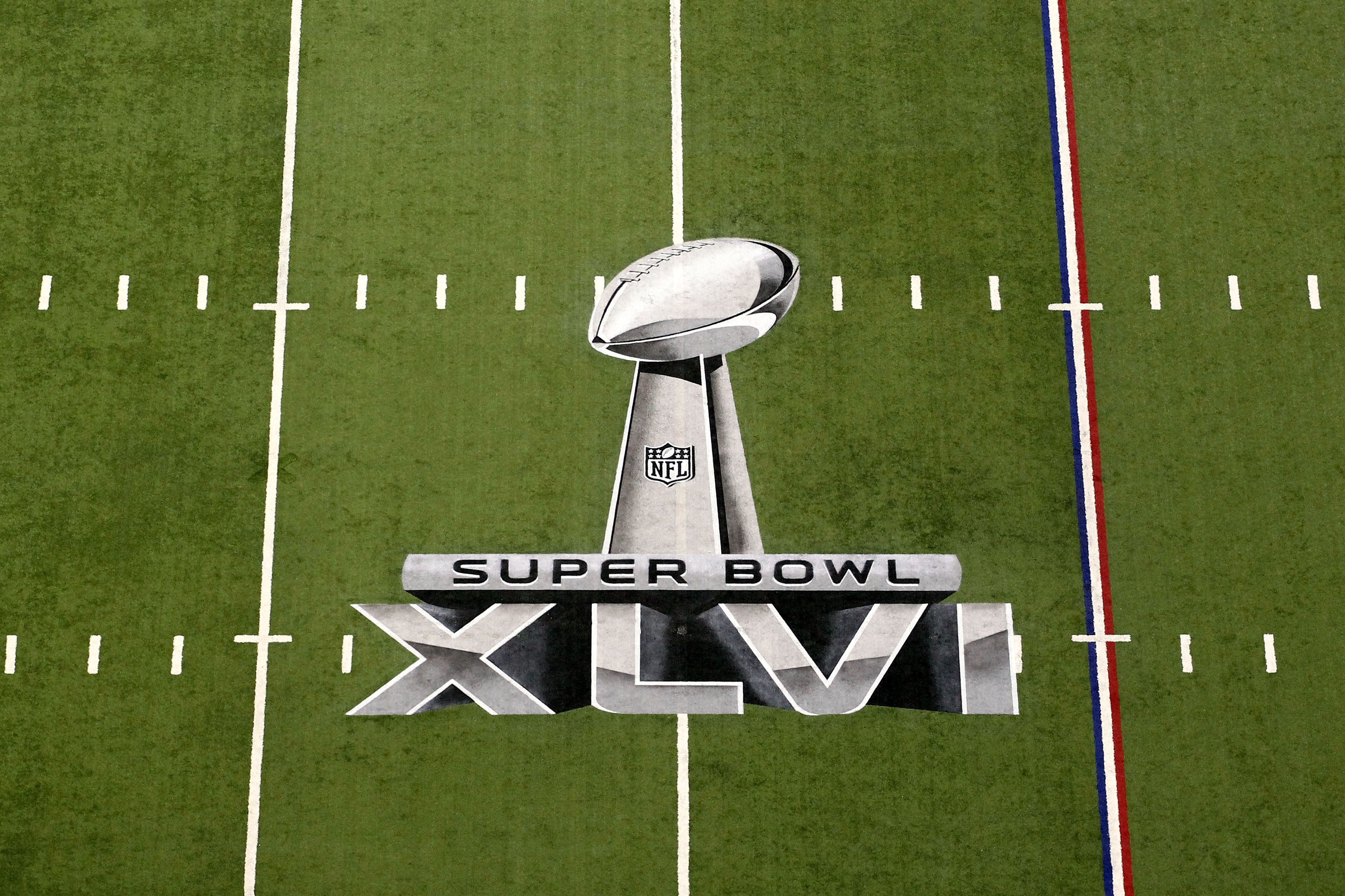
A detail of the official Super Bowl XLVI logo painted on the field during Super Bowl XLVI between the New York Giants and the New England Patriots at Lucas Oil Stadium on Feb. 5, 2012, in Indianapolis, Indiana. (Photo by Andy Lyons/Getty Images)
That "consistency" is what makes the last 13 logos incredibly boring. Landor's first five logos all looked identical, save for the host stadium below the Roman numerals. The Lombardi Trophy in each of them has remained static, too. And the groundbreaking idea for Super Bowl 50? A massive, gold "50" behind the stadium. Whoopee!
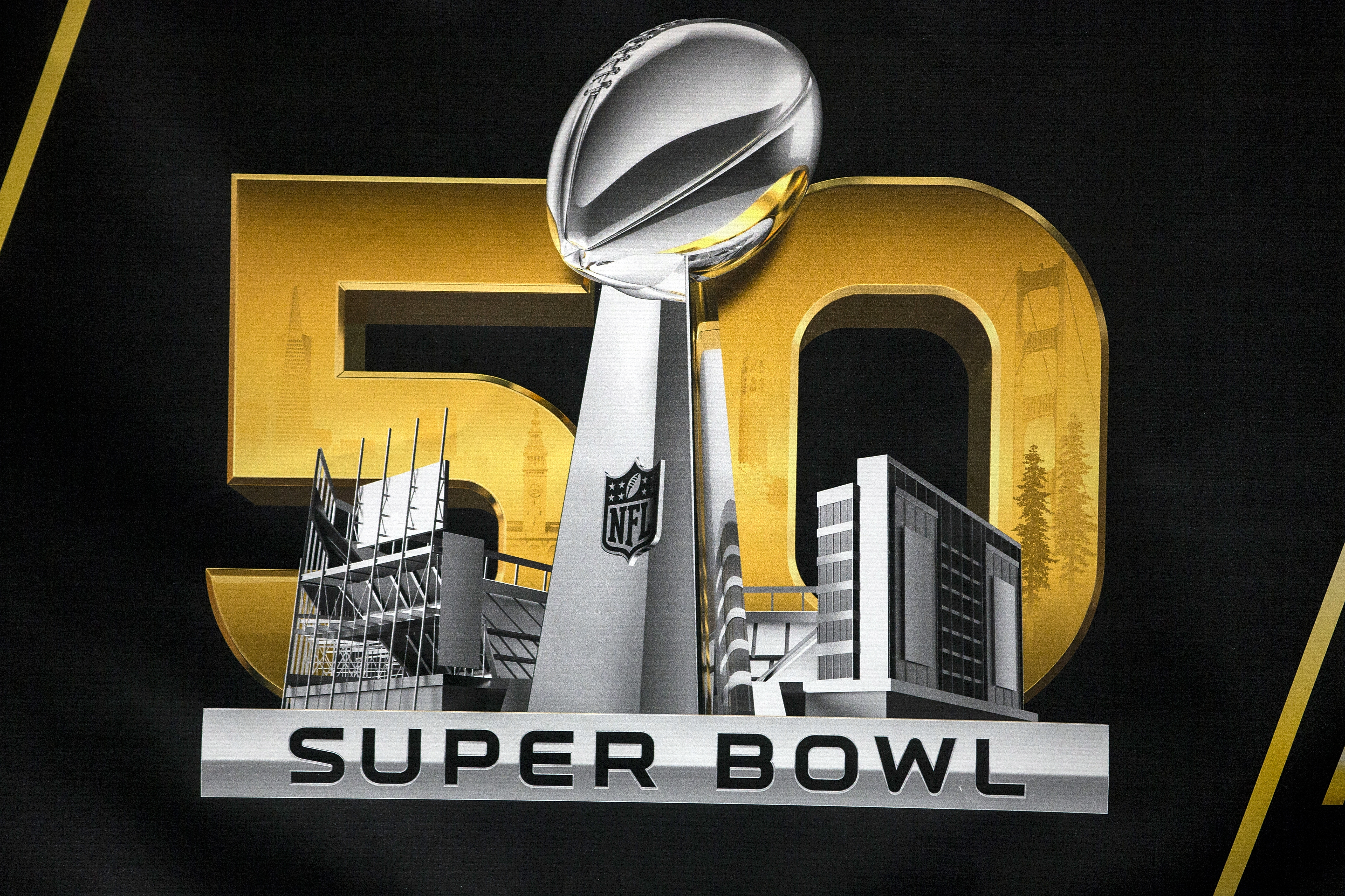
A detailed view of the Super Bowl 50 logo during the NFL Experience exhibition before Super Bowl 50 at the Moscone Center on Feb. 3, 2016, in San Francisco, California. (Photo by Jason O. Watson/Getty Images)
At least the last two designs have elements from the host cities. The difference is that past logos weren't so damned obvious in the way they paid tribute to the location. Last year's logo just screamed "here's Sunset Boulevard!" L-a-z-y.
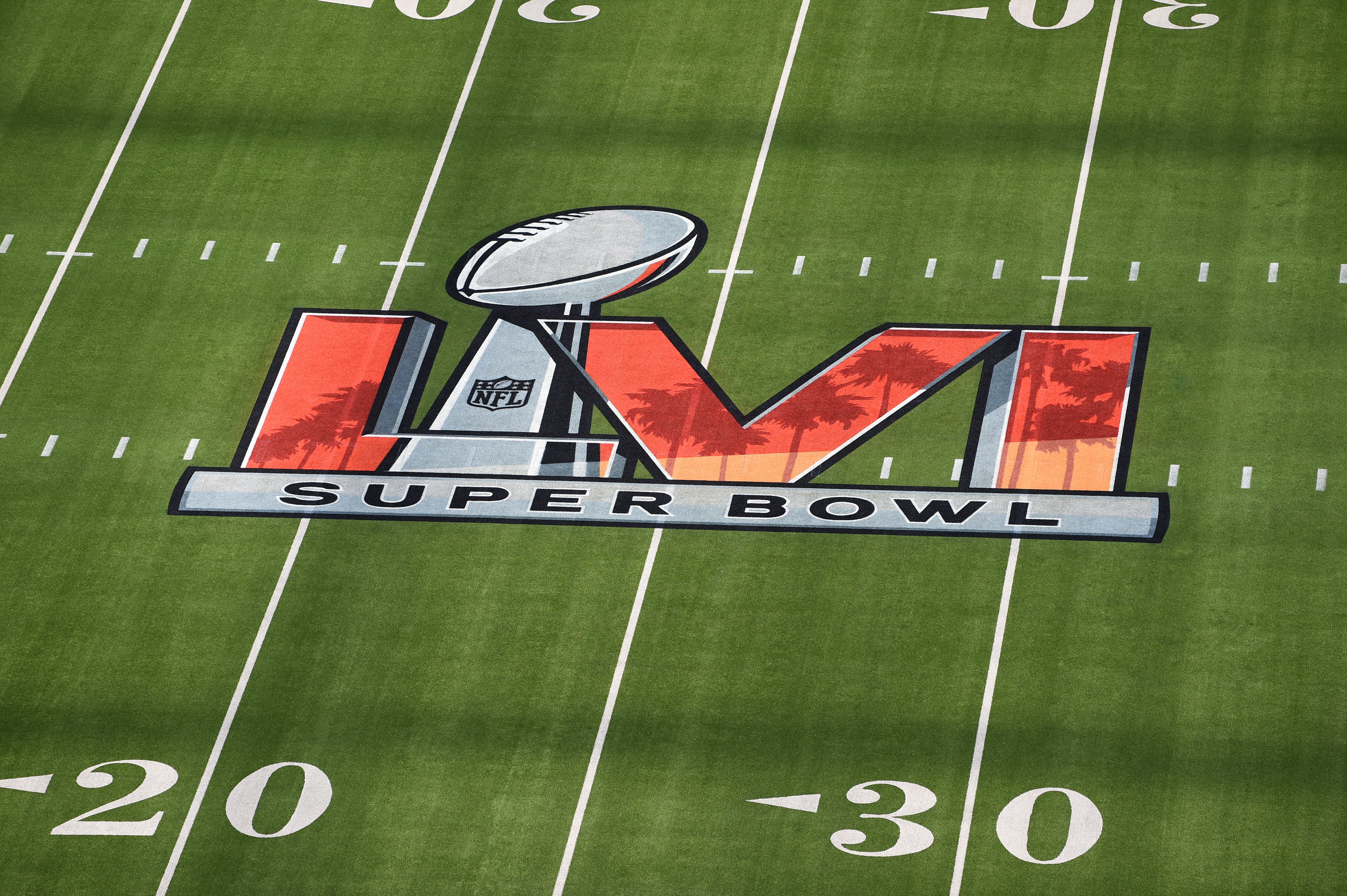
The Super Bowl LVI logo painted on the field prior to Super Bowl LVI between the Cincinnati Bengals and the Los Angeles Rams on Feb. 13, 2022, at SoFi Stadium in Inglewood, California. (Photo by Brian Rothmuller/Icon Sportswire via Getty Images)
Back in 2010, Landor executive creative director Nicolas Aparicio told FastCompany that "the NFL realized that there's a gathering excitement, approaching the Super Bowl. The audience grows from 4.6 million in the pre-season to 16 million by the playoffs. A logo system needs to express that, and help build on it."
The problem is this logo system does anything but build on excitement. It does the opposite. Nobody wants to buy Super Bowl merchandise if you can't tell the difference between this year's logo and the one 10 years ago. It's time the NFL does something about it.