College football is full of historical, classic uniforms. We often talk about the best uniforms and jerseys in college football. Think of Michigan's iconic maize-and-blue look with the winged helmet. People will espouse the unis at schools like USC, Notre Dame, Alabama, LSU, Georgia and, well, basically every SEC school. Fans of teams down South tend to be quite enthusiastic, as you may have noticed.
Videos by FanBuzz
However, we're not here to do a yet-another-ranking of the best college football uniforms. This is about the worst college football uniforms that ever existed. College football gives us a lot of options on this front. While a team may have one alternate uniform in the NFL, often a throwback look, college football is full of alternative looks. Nike, Adidas and the other uniform providers like to show off the goods, and schools use their alternate looks as recruiting tools.
These are the 10 worst uniforms in college football history. Or, at least, the ones in recent memory. Maybe back in the 1920s, Navy wore some look we'd hate, but, you know, a grainy black-and-white photo doesn't get that point across. Also, this list consists of FBS teams only. You're off the hook, Division II teams wearing questionable combos.
Some fans might complain about the simplicity of Oklahoma, Penn State or Wisconsin uniforms. Still, we bet they'll stop after seeing these looks.
10 Worst College Football Uniforms Since 2000
10. Louisville Cardinals 2003 Road Uniform
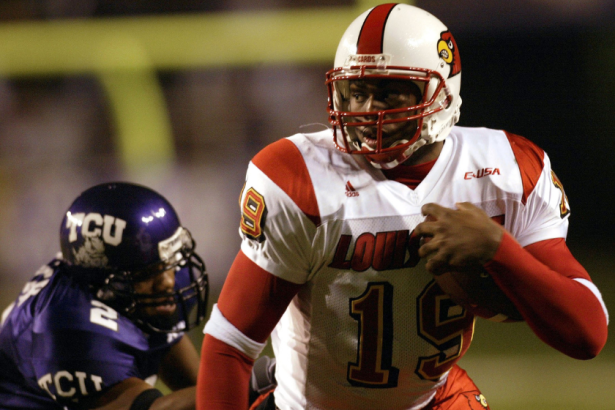
Photo by Ronald Martinez/Getty Images
Bobby Petrino took over at Louisville and brought new uniforms, and it wasn't an intense look. Have you ever wondered what it would look like if somebody tried to create an off-brand San Francisco 49ers look? The Cardinals delivered it. In particular, the yellow trim on the numbers looks entirely out of place.
9. Indiana Hoosiers 2001 Home Uniform
On This Date - Nov. 10, 2001 - @TheRealRandleEl rushed for 149 yards in @IndianaFootball's 37-28 win over No. 22 Michigan State. Randle El passed Air Force's Dee Dowis for the most rushing yards by a QB in NCAA D1-A history in the game and finished with 3,895 career rushing yards pic.twitter.com/kMeGNE9iFX
— John Decker (@JYDecker) November 10, 2021
The black helmets looked banal and generic, and frankly, that describes this whole look. Maybe the Hoosiers hoped to bore their Big Ten opponents to death? Like Michigan State or Minnesota would just doze off on the field? The black stripes on the unis are particularly bad.
8. Iowa State Cyclones 2002 Home Uniform
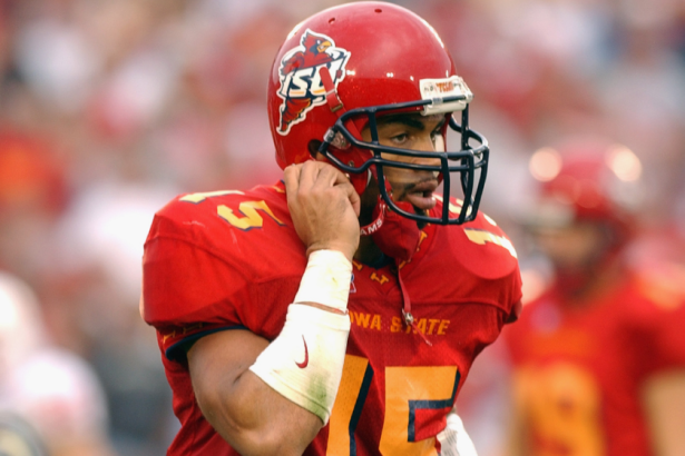
Photo by Matthew Stockman/Getty Images
Did McDonald's sponsor this team? Were these designed for a bowl game called the Golden Arches Bowl or something? This yellow and this red don't go well together at all. Also, the "I" emblems on the color are total trash.
7. Kansas Jayhawks 2014 Alternate Uniform
Kansas Jayhawks Unveil Ridiculous ‘Crimson Chrome’ Alternate Uniforms http://t.co/ftJ2RVQCsw pic.twitter.com/SQn3CCAdM3
— Next Impulse Sports (@NextImpulse) August 13, 2014
We hate to pile on a football program with basically nothing going for it. Last year was its worst year since the one prior and so on and so forth until you get back to the brief highs of the Mark Mangino era. The "Crimson Chrome" alternate uniforms weren't terrible, but the helmets were hideous. We'd take the most boring helmet in the world over these. Like, a plain white helmet with nothing else on it would be 100 times better than this monstrosity.
6. Texas Tech Red Raiders 2013 Alternate Uniform
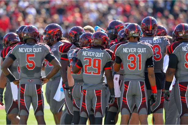
Photo by John Weast/Getty Images
RELATED: The 10 Best Uniforms in College Football Put Everyone Else to Shame
They are called the Red Raiders, and yet these uniforms are gray-on-gray. Sure, there is some red, but the red parts of these "Never Quit" alts are somehow the worst part. We also aren't fans of thematic nameplates, and these jerseys all said "Never Quit" on the back.
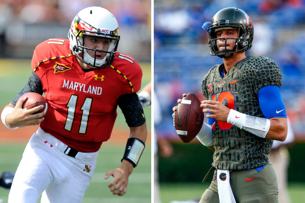
5. Maryland Terrapins 2012 Alternate Uniform
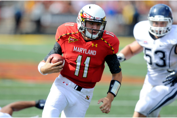
Photo by G Fiume/Maryland Terrapins/Getty Images
The state of Maryland has maybe the ugliest flag in the country. Unfortunately, the Terps have a penchant for paying homage to said flag. The helmet for their "Maryland Pride" getup is maybe the worst helmet we've ever seen. It's definitely making the College Football Playoff in the bad helmet championship.
4. Arizona State Sun Devils 2013 Alternate Uniform
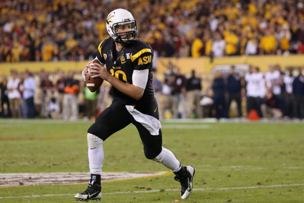
Photo by Christian Petersen/Getty Images
We don't necessarily get the logic of a black-on-black look when you play in Arizona. Hopefully, they never wore these in the sun. Mostly, though, these helmets are brutal. We indeed aren't the first to evoke Guy Fieri's name when we see these.
3. Oregon Ducks 2011 Alternate Uniform
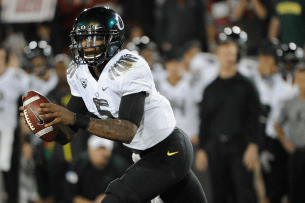
Photo by Thearon W. Henderson/Getty Images
The Oregon Ducks have that Nike money behind them, which means showing off seemingly a dozen designs every year. Some of them are killer, but some of them are trash. These ones are terrible. For starters, we've always despised the wings on the shoulders look. Second, these are black on gray. Where's the yellow and green? This Ducks look is not just wrong. It's boring, which is something Oregon rarely is.
2. Colorado Buffaloes 2009 Alternate Uniform
Photo by Thearon W. Henderson/Getty Images
These are uniforms that would have been nixed by an XFL team. If they were practice jerseys, some schools would still say, "Nah, we're good." This gold-on-gray look picked the worst shade of gold and gray possible. The helmets are also so bad. If we were being recruited by Colorado that year, we would have wanted to make sure those were going back in the closet before we signed on.
1. Florida Gators 2017 Alternate Uniform
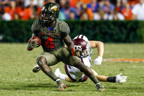
Photo by David Rosenblum/Icon Sportswire via Getty Images
Many people are polarized on orange in a uniform, which means complaints about the likes of the Miami Hurricanes, the Boise State Broncos, the Tennessee Volunteers and, of course, the Florida Gators. However, the look we've showcased here was entirely off the map — and off the mark — for the Gators. This green-on-green-on-green look was designed to call to mind actual Gators with swamp-like hues. Like, with scales and everything. We won't sugarcoat it. These just don't look good on the eyeballs.
Dishonorable Mentions
There's our top 10, but we aren't letting your squad off the hook. Here are a few dishonorable mentions. In 2015, the South Carolina Gamecocks wore an alternate look at home with brutal helmets. The 2000 BYU Cougars wore jerseys that could only be described as "swoopy." In 2019 the Cincinnati Bearcats donned alternates that were fine save for the fact it looked like they were cosplaying as Ohio State. The 2012 Virginia Tech Hokies had an all-time lousy helmet involving a flexing Hokie. If the rest of the look wasn't quality, it would have cracked the top 10. Then, there's the Wyoming Cowboys on the Group of Five level. They wear brown and yellow regularly, two colors that simply do not go together.
It just shows you that for every beautiful blue-and-gold UCLA uniform, there is a Northwestern uniform with too much purple. Ultimately, though, these are the 10 looks we liked the least.