Every year, sports teams all over the world unveil exciting, new uniform combinations meant to add some spice to the long season ahead. Whether you prefer iconic American brands like the Michigan Wolverines and New York Yankees, seeing a sharp jersey is a nice change of pace for any team.
Then again, some clubs go way too deep into their creative bag of tricks, and they have turned out some downright horrendous creations over time. While the list is truly endless, here are 21 of the ugliest uniforms of all time that definitely should have stayed behind in the locker room.
Some of these you might actually find refreshing. Others, well, you'll agree should have never been made.
The 21 Ugliest Sports Uniforms Ever, Ranked
21. Jorge Campos (1994, 1998)
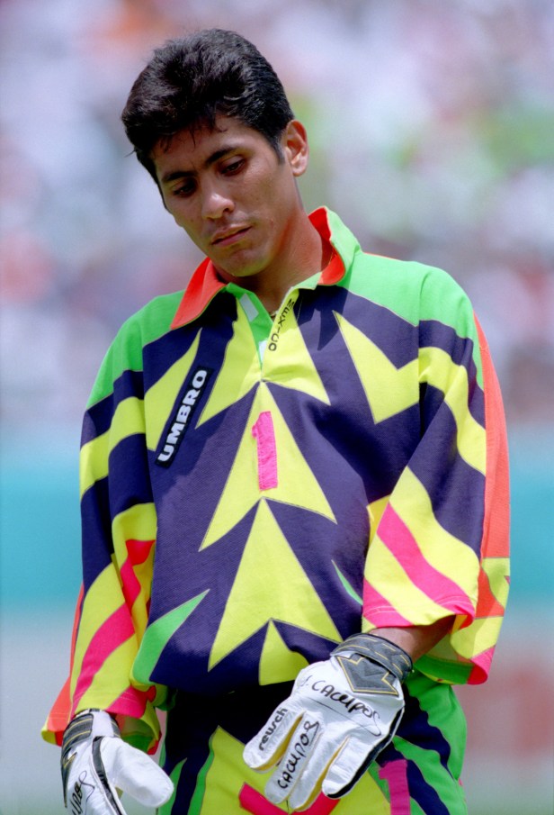
Photo by Neal Simpson/EMPICS via Getty Images
For the 1994 and 1998 World Cup, Mexico goalie Jorge Campos decided to get dressed with the lights off and emerged wearing whatever the heck this is. Thankfully for his teammates, they didn't get caught wearing this stupid thing.
20. Atlanta Thrashers (1999-2003)
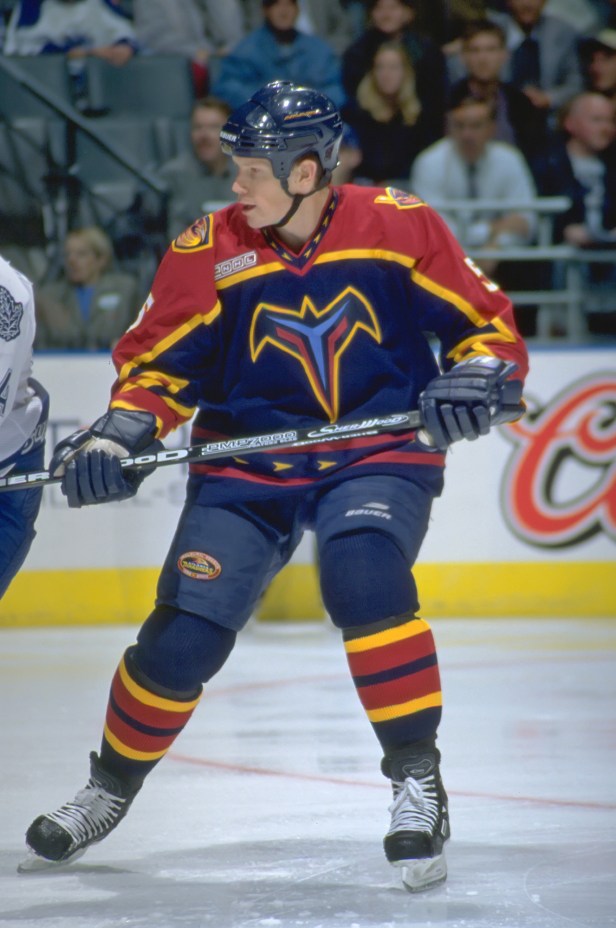
Photo by Graig Abel/Getty Images
The Trashers first took the ice in 1999 paying homage to the Georgia state bird, the brown thrasher, on their away uniforms. Apparently for this team, the designer forgot what a bird actually looks like because these were the unfortunate result.
19. Mighty Ducks of Anaheim (1995-96)
The Ducks strayed from their iconic look that started the franchise and unveiled a weird half man, half duck creature and still kept the old logo on the shoulder. They finished the 1995 season in ninth place, which saved everyone from seeing these things in the NHL playoffs.
18. Pittsburgh Pirates (1999)

AP Photo/Osamu Honda
I'm not sure who dubbed these things the "uniform of the future," but they clearly weren't from any future I ever want to be from. Thank goodness they were only worn for one game. As a Pirates fan, please, please, please never let these see the light of day.
17. Tampa Bay Devil Rays (1998-2000)
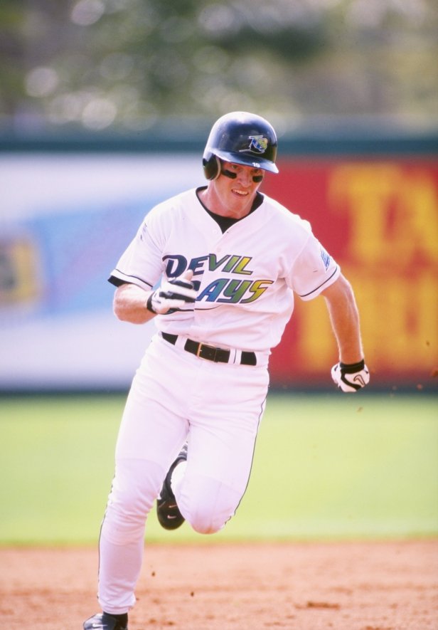
Craig Melvin/Allsport/Getty Images
From the rainbow gradient on either the gray or white uniforms to the fact that the Devil Rays never topped 70 wins in these, three MLB seasons is enough to never bring them back. But alas, they still made a return in 2018.
16. Maryland Terrapins (2011)
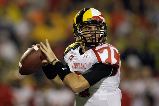
Photo by Rob Carr/Getty Images
The Terps knocked off Miami Hurricanes in their season opener in 2011, but then lost 10 of their next 11 games to finish 2-10. The old saying "if you look good, you play good" definitely can be used to reference Maryland's abysmal 2011 season...
15. New York Islanders (1995-97)
For some reason, the Islanders ditched their iconic blue and orange jerseys for this strange creation of a color scheme. From the weird Islander man on the front to the crooked name plates across the back, these things are still just awful to look at.
14. San Diego Padres (1970s)
When you talk about terrible color combinations, this one might take the cake. Brown and yellow on a baseball jersey? What is this, a burnt hot dog with mustard? The Padres did have Baseball Hall of Famer Dave Winfield, who went on a 12-year run of MLB All-Star selections starting in 1976, so at least something positive came out of seeing these eyesores.
13. Seattle Seahawks (2015-Present)
Seattle wins the award for the most squint-worthy uniforms on this list. I've heard of being flashy for a football team, but these Nike "Action Green" alternate jerseys are just ridiculous. I wonder if they glow in the dark? Leave the neon green uniforms to Oregon.
12. Toronto Raptors (1995-98)
When Toronto put an NBA team on the floor for the first time, they were wearing this Barney-purple dinosaur jerseys that look like they belonged in the kid's show. While some lament this choice in a show of support for Damon Stoudamire, these things are too weird to leave off the list.
11. Houston Astros (1975-86)
RELATED: Nolan Ryan's Net Worth: How Rich is Baseball's Strikeout King?
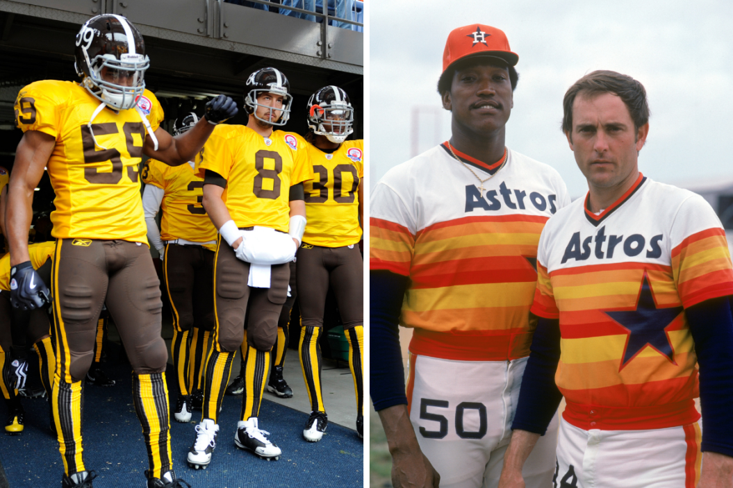
Three playoff appearances couldn't keep these Astros off the list. Houston's Tequila Sunrise creations did accompany Phil Niekro's best three-year run of his career from 1977-79, but then again, maybe these warm-colored atrocities shouldn't have. Sorry, Nolan Ryan.
10. Denver Broncos (2011)
The Broncos should have taken notes from the Padres on these and NEVER paired brown and yellow. From the dark brown helmets to those wild socks and everything in between, it's a good thing they let these things fade away.
9. Las Vegas Wranglers (2010)
The answer is yes: Those are Santa-themed hockey jerseys, completed with a fake beard.
8. Philadelphia Eagles (2007)

AP Photo/Rusty Kennedy
It's a shame that Eagles legend Donovan McNabb will forever be captured wearing these hideous football uniforms. Then again, the Eagles did score 56 points against the Detroit Lions while wearing them.
7. Tampa Bay Buccaneers (1976-96)
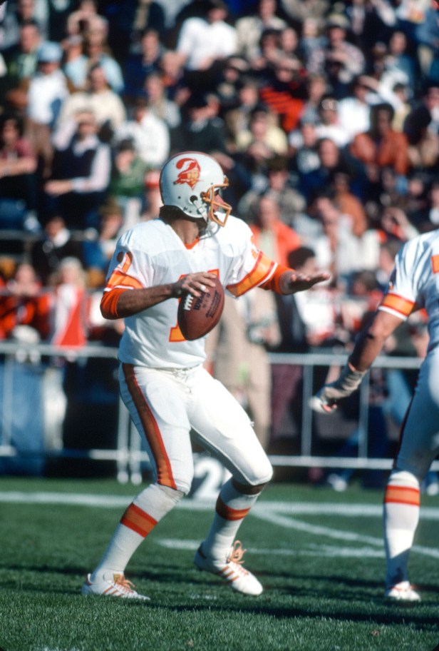
Photo by Focus on Sport/Getty Images
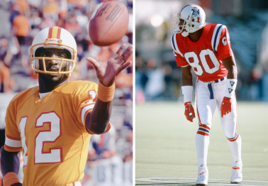
The creamsicle Buccaneers uniforms accented with "Bucco Bruce" will always be associated with the NFL's longest losing streak in the Super Bowl era (26 games), and a whole lot of painful memories for any fans in Florida who were forced to watch this team back in the day.
6. Norwegian Men's Curling Team (2014)
What was supposed to be an ode to Norway's flag turned into one of the loudest outfits you'll ever see. Norway finished in fourth during the 2014 Winter Olympics, but these suits might be worth more than any Olympic medal could measure.
5. Los Angeles Kings (1995)
These forgettable "Burger King" jerseys were the Kings alternate uniform during the '95 season, and something tells me 35-year-old Wayne Gretzky, and the rest of Los Angeles, did not approve of these at all.
4. Club Deportivo Palencia Balompié (2016)

Playing in Spain's third division doesn't offer the biggest boost in ratings. So when the club came out wearing these anatomical kit for the playoffs, they turned themselves into a walking example of "Things You Should Never Wear in Public."
3. Pittsburgh Steelers (2012-2017)
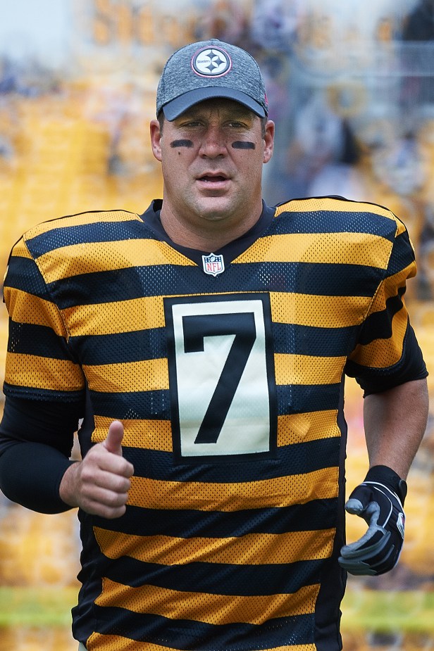
Photo by Shelley Lipton/Icon Sportswire via Getty Images
Oh, the Bumblebees...An ode to the 1933 Pittsburgh Pirates, the franchise debuted these monsters in 2012. From the tan pants to the hideous stripes, the Steelers should NEVER have brought the 1933 throwback uniforms to the football field.
2. Vancouver Canucks (1980s)
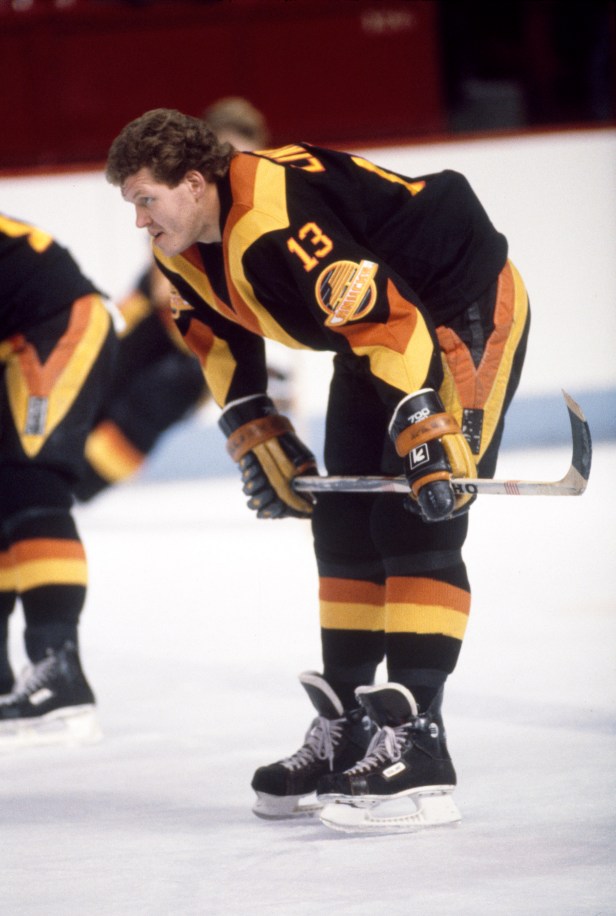
Photo by Denis Brodeur/NHLI via Getty Images
I don't know if the Canucks actually thought these were a good idea, or if they just wanted to keep the Disco 70s alive a little longer. No logo. No mascot. No words. Just a giant, ugly 'V' on a yellow, red and black palette.
1. Chicago White Sox (1976)
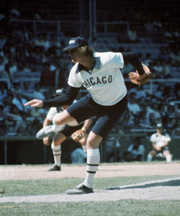
Photo by: Diamond Images/Getty Images
Uniforms serve two purposes: To distinguish between teams and itemize the players on them. If you can figure out a good reason why Chicago made their players trot out to play a BASEBALL GAME wearing shorts, then good luck. For no other reason than shorts in professional baseball makes absolutely no sense, these, hands down, are the worst uniforms in sports history.
