Uniforms from classic colors to crazy combinations are met with a mixture of reactions from fans. Unless you're the Michigan State Spartans with their awful new alternates. With those, it's just pure hate.
Videos by FanBuzz
Sparty's new alternate uniforms were introduced back in April prior to MSU's spring game, and they have not been welcomed by college football fans. They should make for an interesting time on social media when they wear them for the first time this season.
Michigan State's Alternate Uniforms
Spartans reveal new alternate uniforms for 2019 👀 pic.twitter.com/Xr9Y7GsVXy
— Michigan State Football (@MSU_Football) April 13, 2019
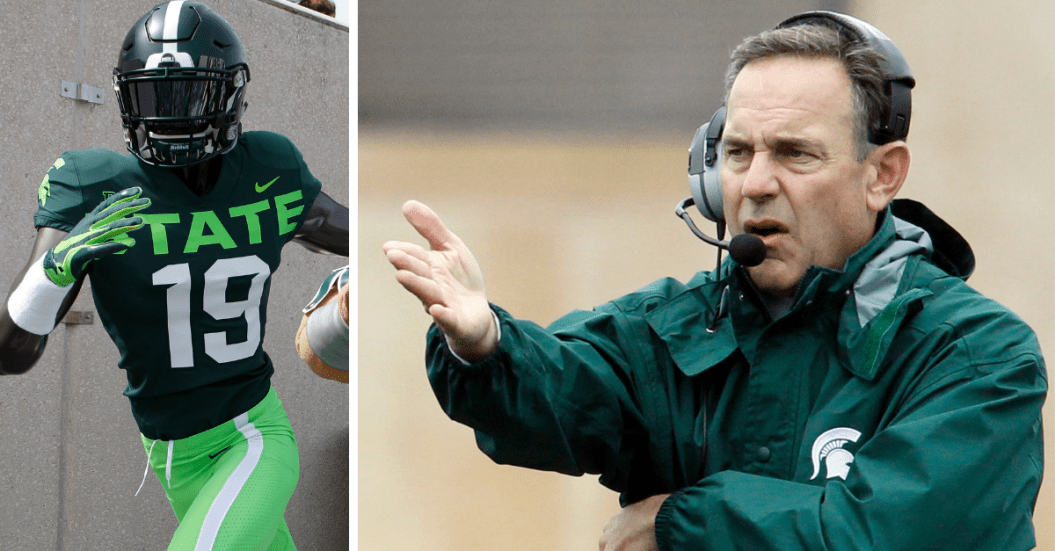
These atrocities have three main differences along with the fact they made the secondary color a neon lime green. Going from top to bottom, the first difference is the spartan helmet on the Michigan State helmet. Originally white on their usual game-day helmets, this one is neon green on the usual dark green helmet with a solid, white stripe.
The next, and possibly biggest change, is the text on the chest. Usually, this would read 'Michigan State' in small, white letters above the numbers and feature a small spartan helmet between that and the collar. On this jersey, there is no spartan logo and simply reads 'STATE' in large, neon green letters along with the Big Ten and Nike logos.
Possibly the worst part of the entire ensemble are those bright-green pants. Normally, these would be dark green as well, but choosing the neon green for the pants was bold and horrifying.
It’s here pic.twitter.com/Jc71CpRsys
— Colton Pouncy (@colton_pouncy) August 5, 2019
There is no reason for this uniform. The fact that multiple people must have looked at these and said they looked good enough to reveal is just plain crazy. There are things that could have been done to make this at least passable. If the pants are the normal dark green and there is just a little bit of the neon color, it may not be in contention for the worst looking uniform I have seen.
Nike definitely receives an 'F' grade on this one, and it seems like they were going for a look they usually give the Oregon Ducks, but they have yellow as a secondary color that pairs well with green. Basically, just choosing a color to go along with the green and white was about as big a fail as possible in this situation.
Michigan State's Basketball Uniforms
Michigan State managed to put out the WORST uniforms in basketball and football history 😷 pic.twitter.com/UQTT9b9llI
— Evan Fox (@evanfoxy) August 5, 2019
The basketball team has had the lime green color worked into their uniforms at times as well, but those worked out a little better. The black with bright green works well and is probably what they should have done for the football team if they really wanted to include that new color.
But just imagine if that electric green were white, grey, or black. These still don't make a good looking uniform. The text on this chest is way too big. It stands out way too much, and not just because of the color. They go from arm pit to arm pit. If the letters were just MSU, I think it might have worked, but it takes up too much space with the size and number of letters.
But when head coach Mark Dantonio enters Spartan Stadium leading the Michigan State football team, they could look even worse. You have to imagine the photos in a well lit studio gave it the best look possible. When it is out on the field on football players, it can only look worse.
So when they do wear these in East Lansing, which is hopefully never, be ready for some great social media content because the tweets will be memorable.