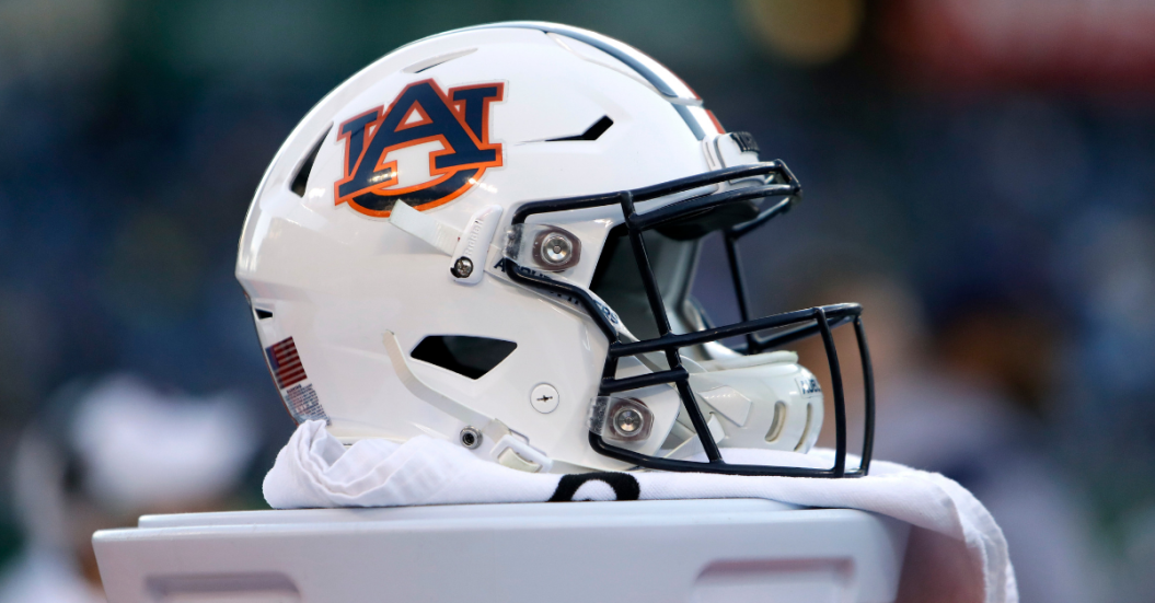
Auburn University is making a change. No, it's not time to replace college football head coach Gus Malzahn just yet. The Tigers are simply updating their "shield" logo for the university and its athletics programs, the same one its had on its football helmets since 1966.
Videos by FanBuzz
The new logo is going to shrink the white space to have more focus on the "A" for Auburn and the "U" is going to be shorter, according to Brandon Marcello of 247Sports.
"Auburn updated its visual identity system to make it compatible with the many ways, especially digital, in which it is now used to help us further elevate the Auburn brand," AU Assistant Vice President for Communications Mike Clary said. "It's in fact already in partial use."
Auburn changes their logo. @bmarcello first to report about the new look. pic.twitter.com/5kdGSN3ylw
— Pat Smith (@patsmithradio) August 9, 2019
RELATED: The 100-Year-Old Legend Behind Auburn's "War Eagle"
Basically, Auburn changed its font from "Copperplate" to "Sabon," according to The Auburn Uniform Database.
Although it's unclear whether or not the Auburn Tigers changes will be made for the upcoming NCAA football season at Jordan-Hare Stadium, here's what the AU logo would look like in a social media graphic:
Here's a handy graphic of the new logo on the Auburn helmet compared to the old/current pic.twitter.com/unkfIq6mAs
— Clint Richardson (@Clintau24) August 9, 2019
This is not a drill. This is a day Auburn has decided to change its primary logo for rebranding purposes.
With Jarrett Stidham in the NFL now, most fans are more concerned about whether Bo Nix or Joey Gatewood will be the starting quarterback this season, but this is weirdly big news.
It's a small change, certainly, but literally everything has to be changed to this new logo at some point, whether you like it or not. Not to mention, every single piece of Auburn Tigers sports apparel you've bought since the turn of the century will officially be considered old.
The Auburn, Alabama community won't have to change colors, but it must accept that a new AU logo is on the way.