NHL teams are perhaps not as experimental as teams in the NBA, NFL or MLB — you can do some things with pants. Still, it's primarily sweaters you're going to be working with. But it's also a sport with one of the longest histories of any league (only Major League Baseball has been around longer). So, there have been a lot of opportunities for uniform experimentation.
Videos by FanBuzz
This hasn't always worked. The mid-'90s were an unmitigated jersey disaster. Teams competed to develop the most tedious and eye-searing combinations possible (there's a reason virtually none of those uniforms have survived to the present day).
And unsurprisingly, the early NHL days weren't filled with wins. Many Original Six teams haven't changed uniforms since their early history. But they should have because they've never been outstanding (the Chicago Blackhawks and New York Rangers are particular offenders here).
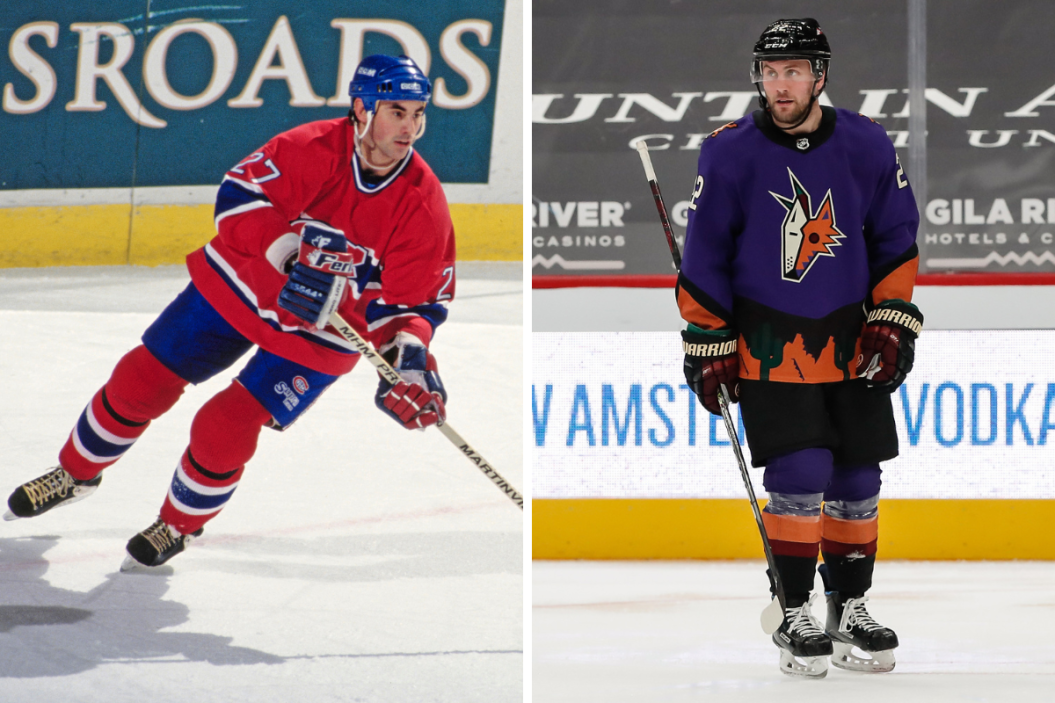
But there have also been huge successes. The entire 1980s was (in contrast to certain leagues) a massive win for almost the whole league. More recently, 2021's Reverse Retro campaign combined colors, logos and themes from throughout league history. Several of the best jerseys the NHL has ever seen were part of that promotion. Honestly, Arizona needs to get it done and adopt theirs full time. And a couple of teams have only trended towards better and better looks as time has gone on.
But which are the best jerseys in National Hockey League history? Which stand the test of time — or need to be brought back post-haste? Who tops the rankings, or would if these were ranked?
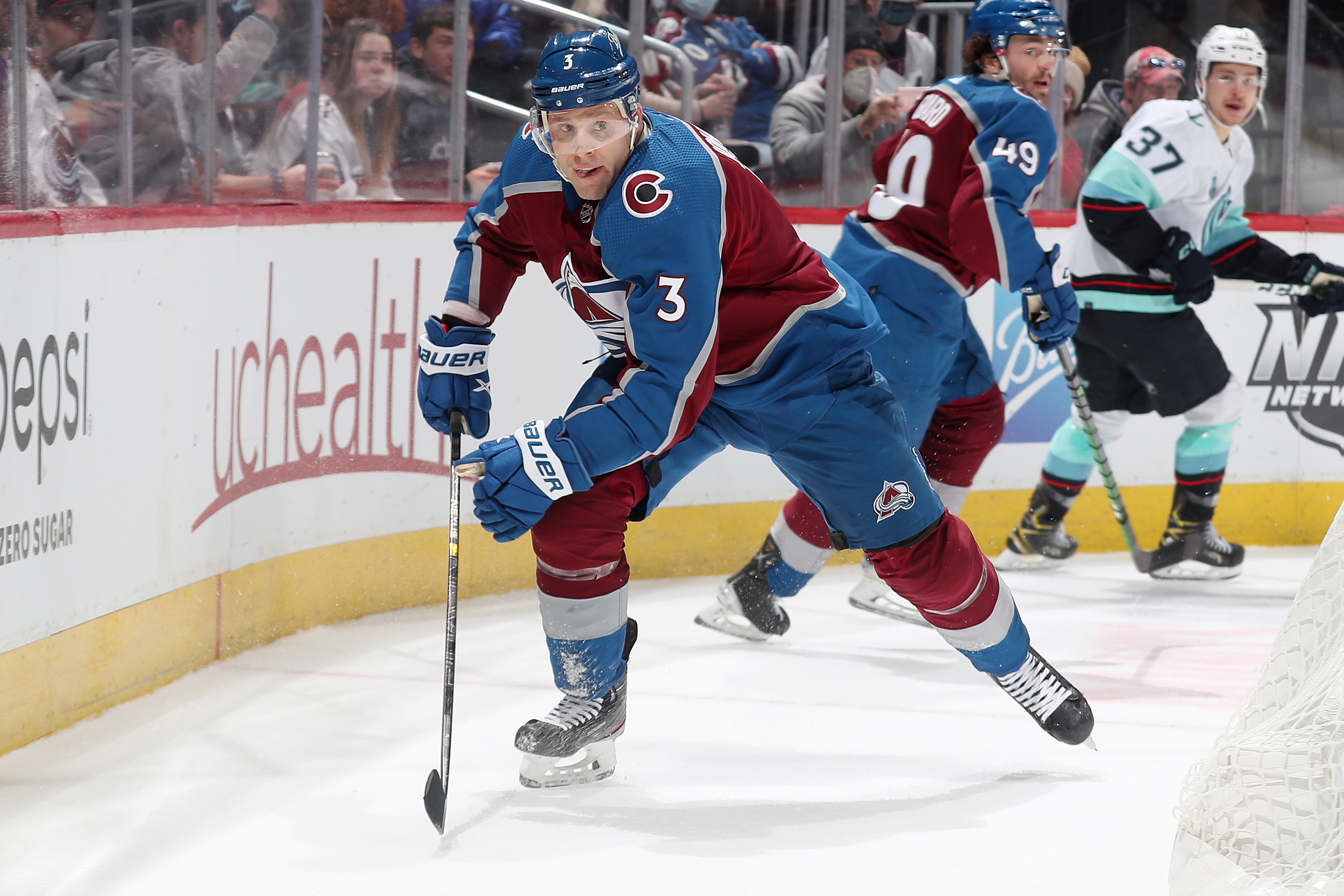
26. Colorado Avalanche Home (2017-Present)
Michael Martin/NHLI via Getty Images
RELATED: Nathan MacKinnon's Girlfriend Steers Clear of the Spotlight
These are the best current sweaters in the NHL — by a mile. Colorado's jerseys have mostly been around the same since they moved to the Rocky Mountains in 1995. Still, they finally did away with that blue side piping in 2017. The jerseys are so much better for it.
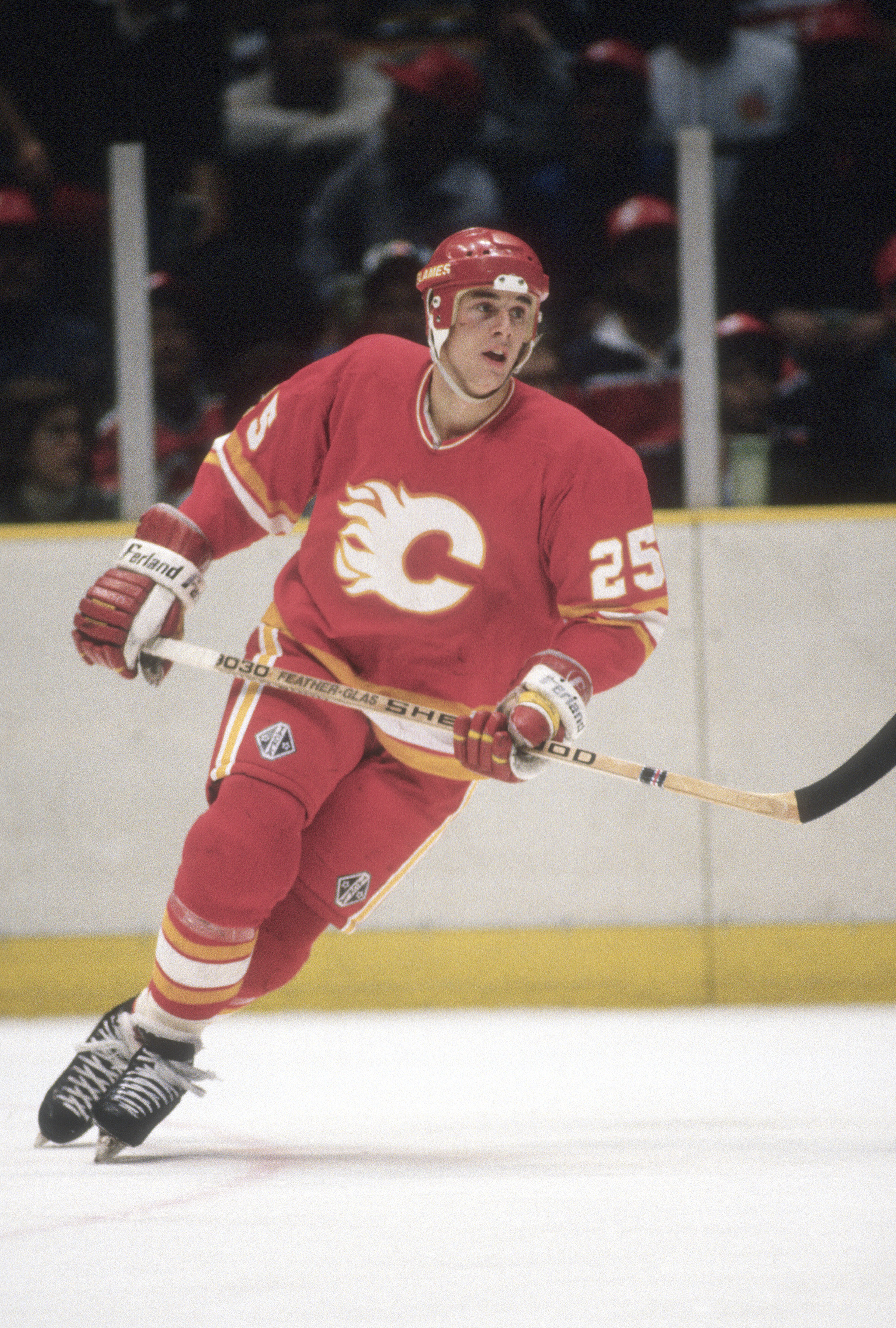
25. Calgary Flames Primary (1980-1994)
Focus on Sport/Getty Images
I'm not sure what Calgary thought when the Flames tried to transition from their original red-and-whites to a red-and-black fusion jersey in the mid-'90s. Still, whatever it was, it didn't work. Thankfully, the team finally figured this out, doing away with the black-and-reds altogether last season.
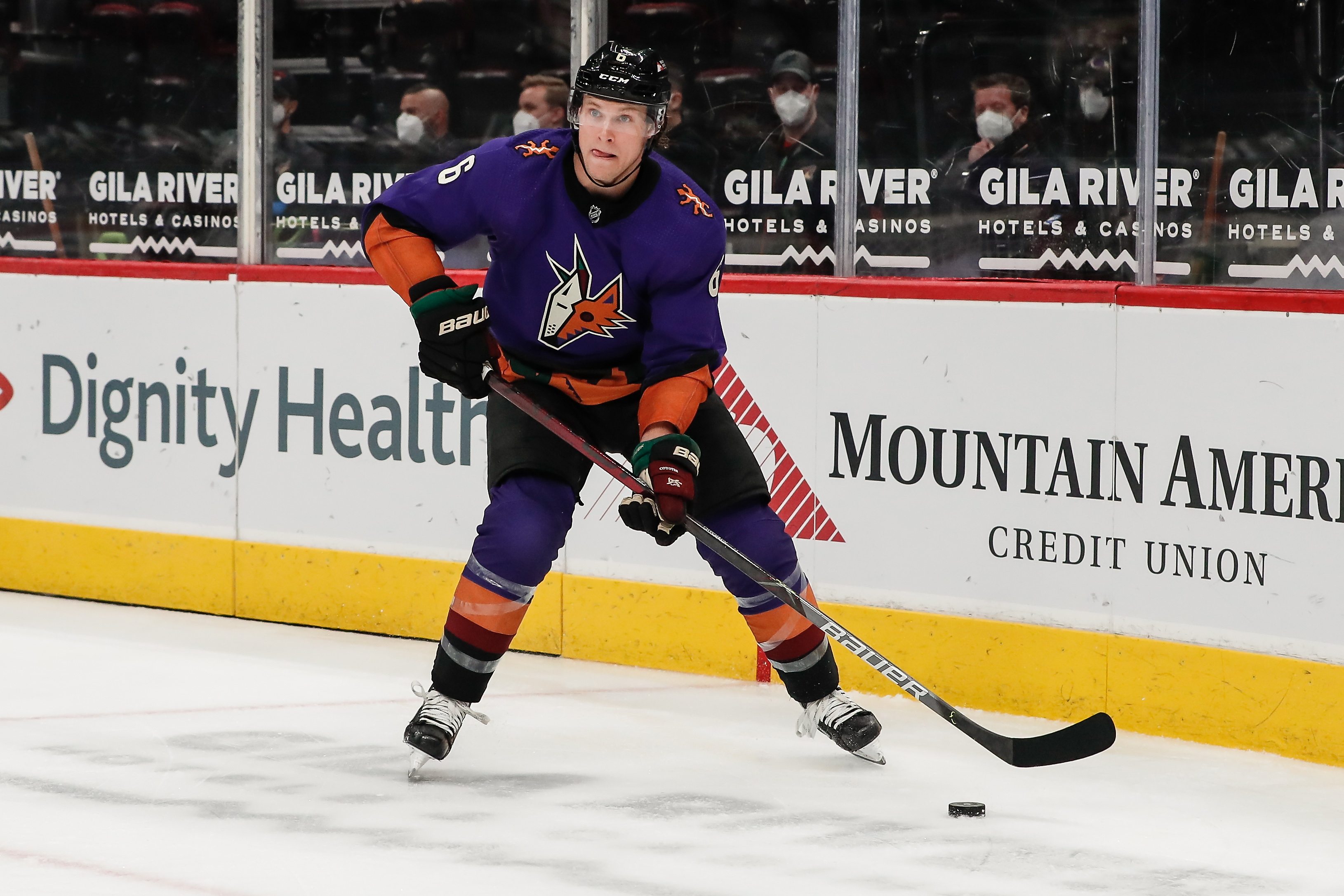
24. Arizona Coyotes Reverse Retro (2021)
Kevin Abele/Icon Sportswire via Getty Images
RELATED: The 16 Best Hockey Nicknames in NHL History, Ranked
The Coyotes have been the most hapless franchise in the league since they moved to the desert in 1996, and their unis have been mainly crap ever since. But there's one notable exception, and it's a big one: their 2021 Reverse Retro jersey might be the best in league history. Inspired by the team's 1998-2003 alternate jersey and their old kachina logo, but with a much better color scheme, this might be the most successful of a VERY successful uniform campaign.
23. Montreal Canadiens Primary (1917-Present)
Minas Panagiotakis/Getty Images
Technically, the Habs jerseys have changed since 1917. But the changes are so minor that they're more or less the same as they've been for over a century. There's something to be said for the classics of NHL history, and it doesn't get any more classic than these. You don't need a throwback if you never throw away from it.
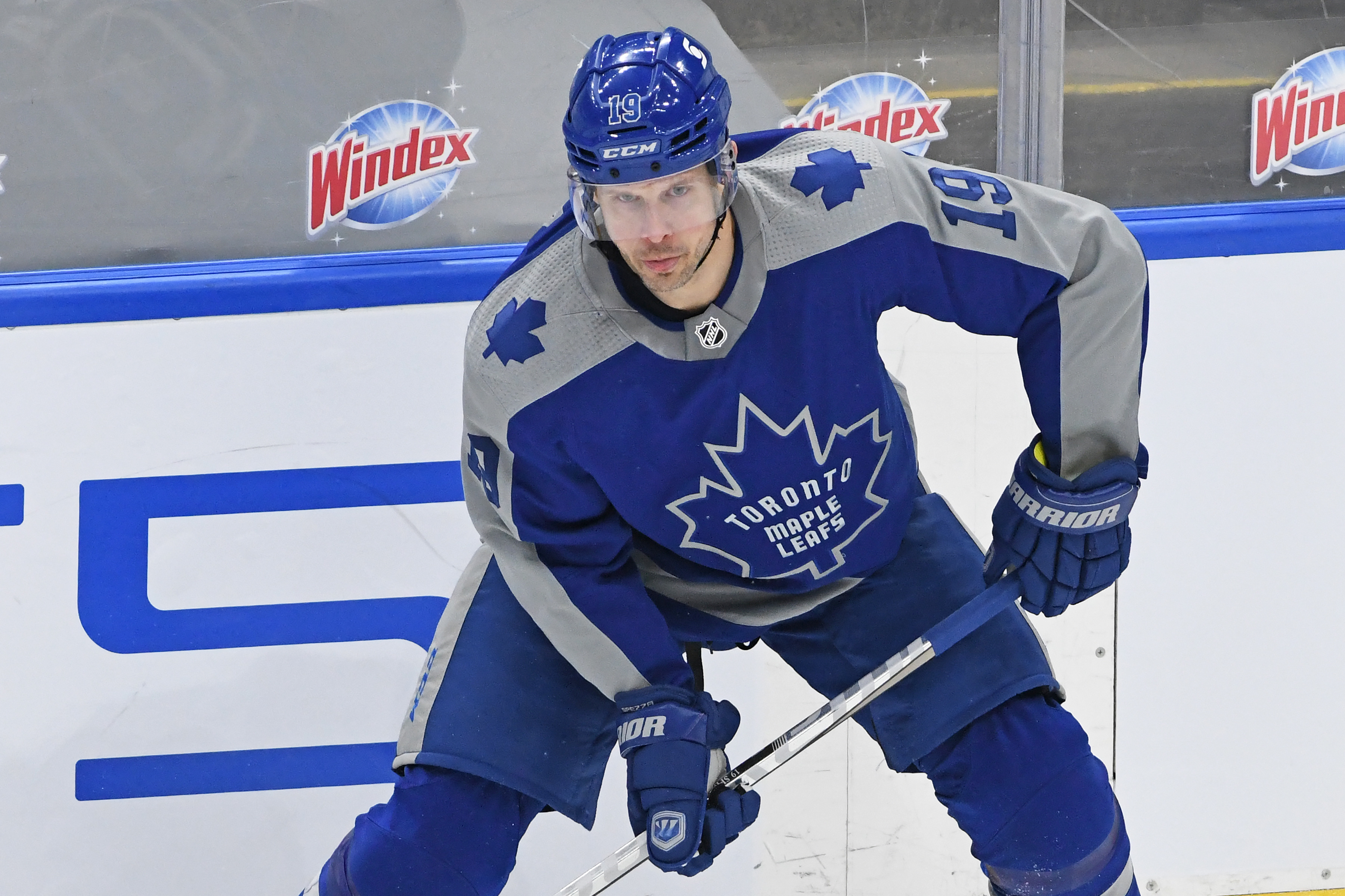
22. Toronto Maple Leafs Reverse Retro (2021)
Gerry Angus/Icon Sportswire via Getty Images
The Original Six teams have largely had pretty dull uniforms. For most of their history, the Maple Leafs were no different. But their 1970-1992 jerseys were an exception because that white shoulder stripe works — even if their introduction did coincide with the team's still-running lack of success in the playoffs. Their 2021 Reverse Retros, meanwhile, took that design and improved upon it, replacing the white with gray for the team's best-ever look. Yet, their playoff struggles still continue. Poor Leafs fans.
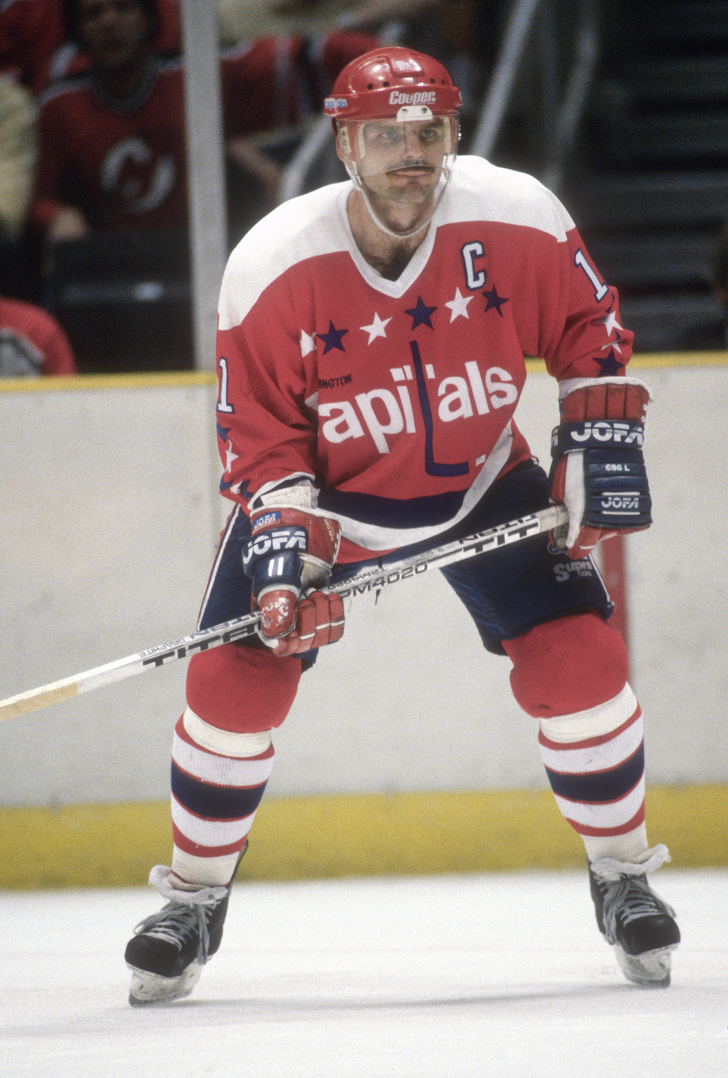
21. Washington Capitals Primary (1974-1995)
Focus on Sport/Getty Images
I'm alone among Caps fans because I love the original color scheme and hate their weird teal eagle design from 1995-2007. The team ultimately seems to agree: they finally brought back these jerseys as alternates in 2015, and they've been popping up ever since.
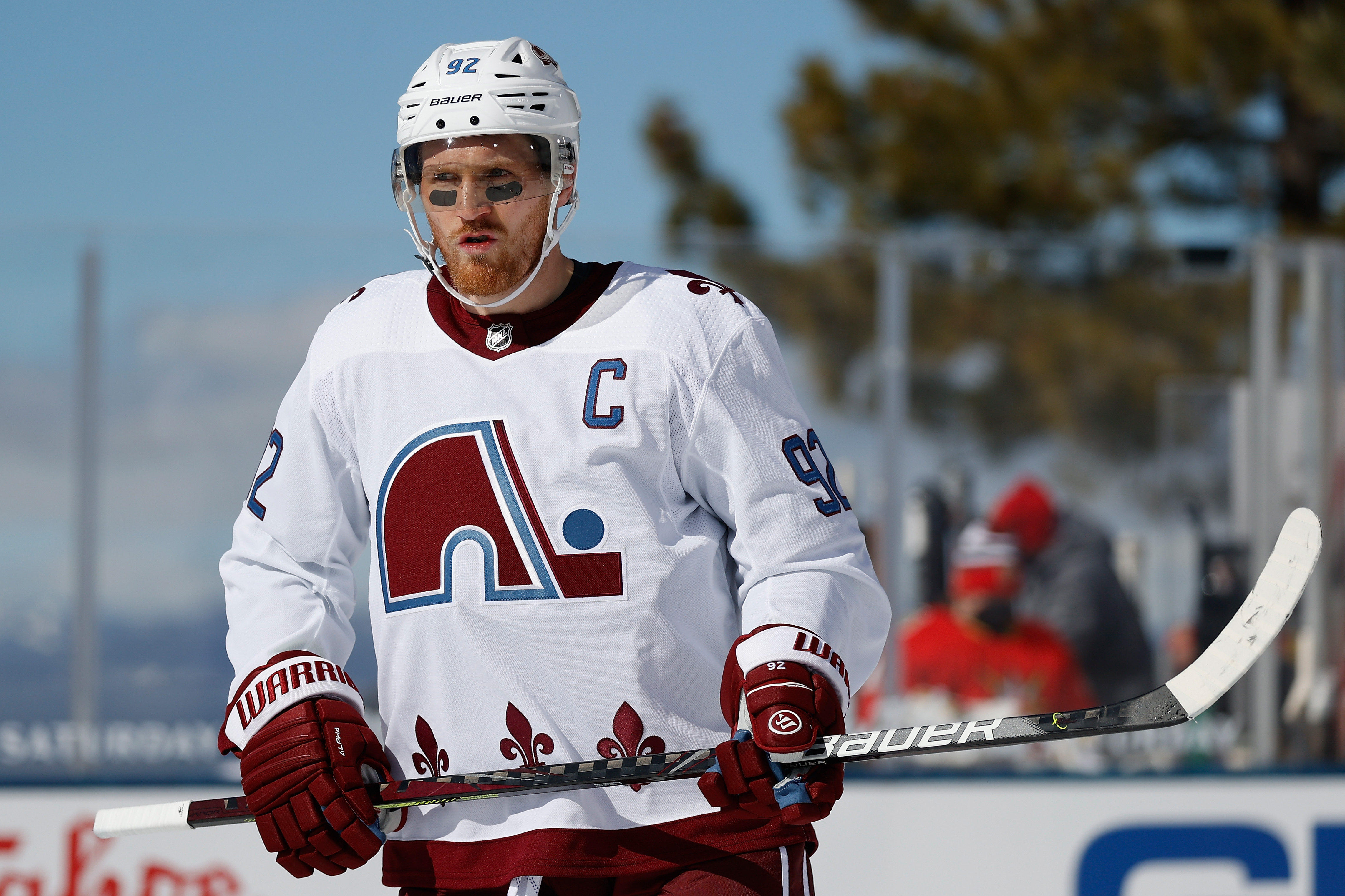
20. Colorado Avalanche Reverse Retro (2021)
Christian Petersen/Getty Images
Take that brilliant Avs color scheme and combine it with the classic Quebec Nordiques look, and what do you get? Maybe the best of any Reverse Retro jerseys, and It looked especially great against the landscape of Lake Tahoe. Just a win all around.
19. Buffalo Sabres Primary (1970-1996, 2021-Present)
Ben Green/NHLI via Getty Images
Of all the teams that made an ill-advised jersey change in the mid-'90s, Buffalo's has to be considered the most ill-advised. The team's 10-year black-and-red sojourn didn't work. Then they compounded the problem by almost going back to their original unis — but not quite. They went with a dull shade of navy instead of royal blue. They finally figured out the solution in 2021, though, so even though the Sabres are terrible, at least their uniforms aren't.
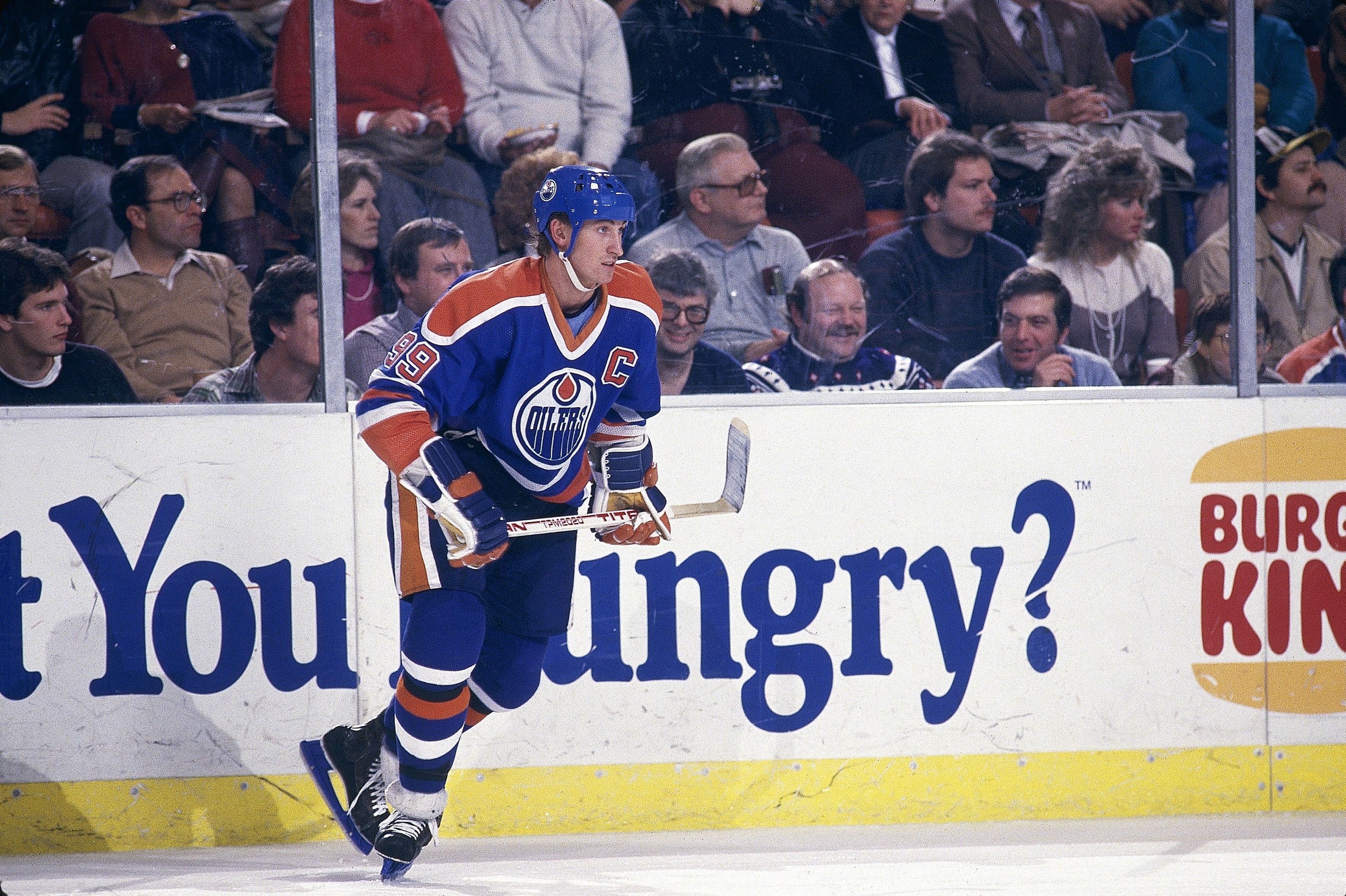
18. Edmonton Oilers Primary (1981-1994)
Tony Tomsic/Sports Illustrated via Getty Images
Blue-and-orange is an absolute winner of a combo, and whoever decided to move the Oilers away from the color scheme of their Wayne Gretzky glory days belongs in prison. The only question here was which Oilers choice is better: their 1980s Stanley Cup jerseys or their 2015-Present orange-on-blue? If Connor McDavid can bring another cup back to Edmonton, the latter could instantly become a classic.
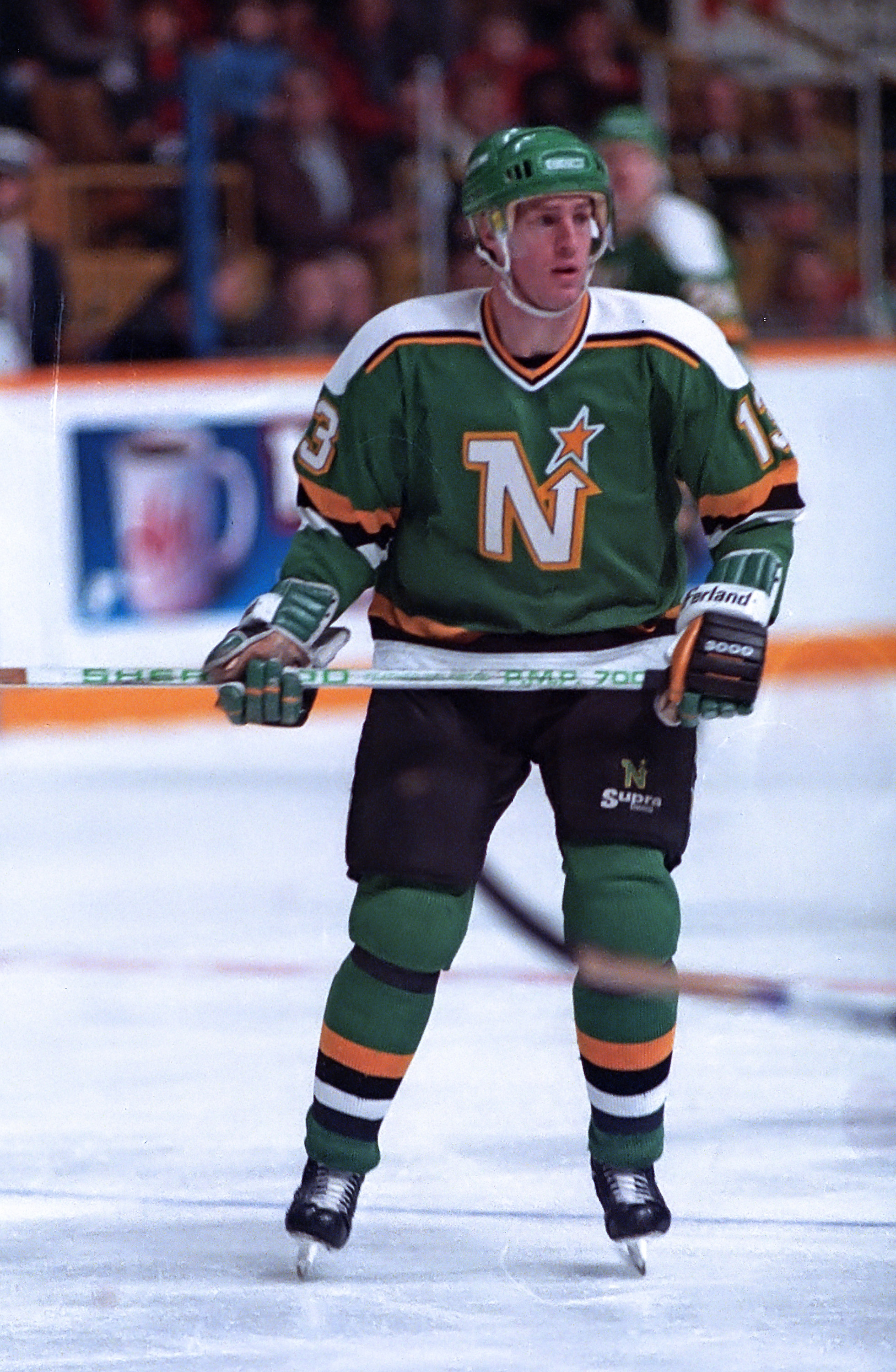
17. Minnesota North Stars Primary (1981-1991)
Graig Abel/Getty Images
The Minnesota Wild have the best logo in all professional sports. Still, honestly, their jerseys have been pretty crap since they came into the league. But their predecessor was much better: the North Stars had some pretty cool fits. The best were these from the 1980s when the team added a black stripe to their existing uniforms.
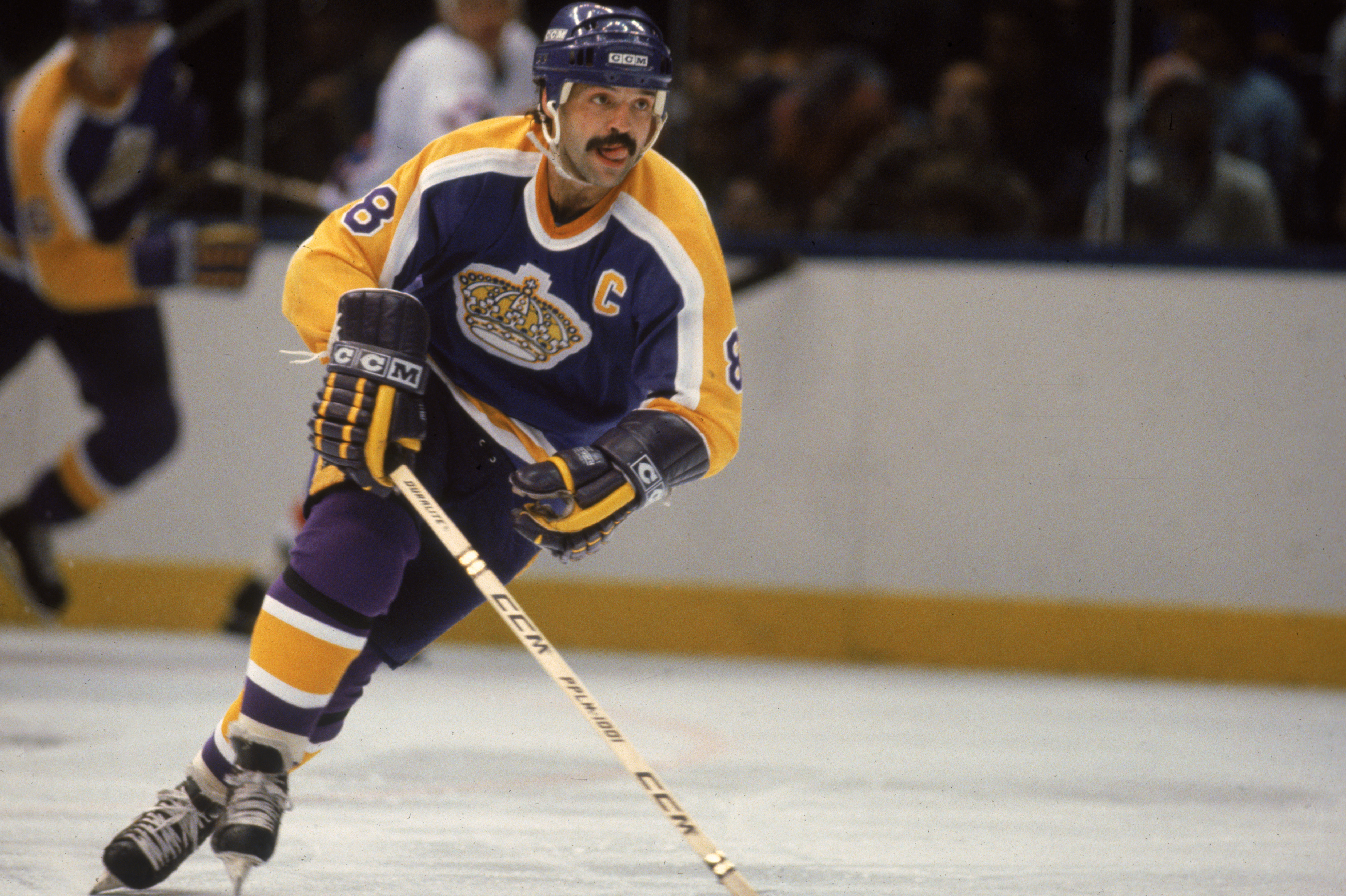
16. Los Angeles Kings Primary (1980-1988)
Bruce Bennett Studios via Getty Images Studios/Getty Images
Why did the Kings ever gravitate to black and white as a color combo? They'd had some variant of the color combo since 1967, but this iteration from the '80s rocks. Yet, in 1988, they decided to change to a black-and-white snoozefest for some reason. Their' 1998-2013 black-and-purple was a little better, but they used such a lifeless shade of purple that it didn't work. There's a reason their 2021 Reverse Retro went back to the classics.
15. Detroit Red Wings Winter Classic (2014)
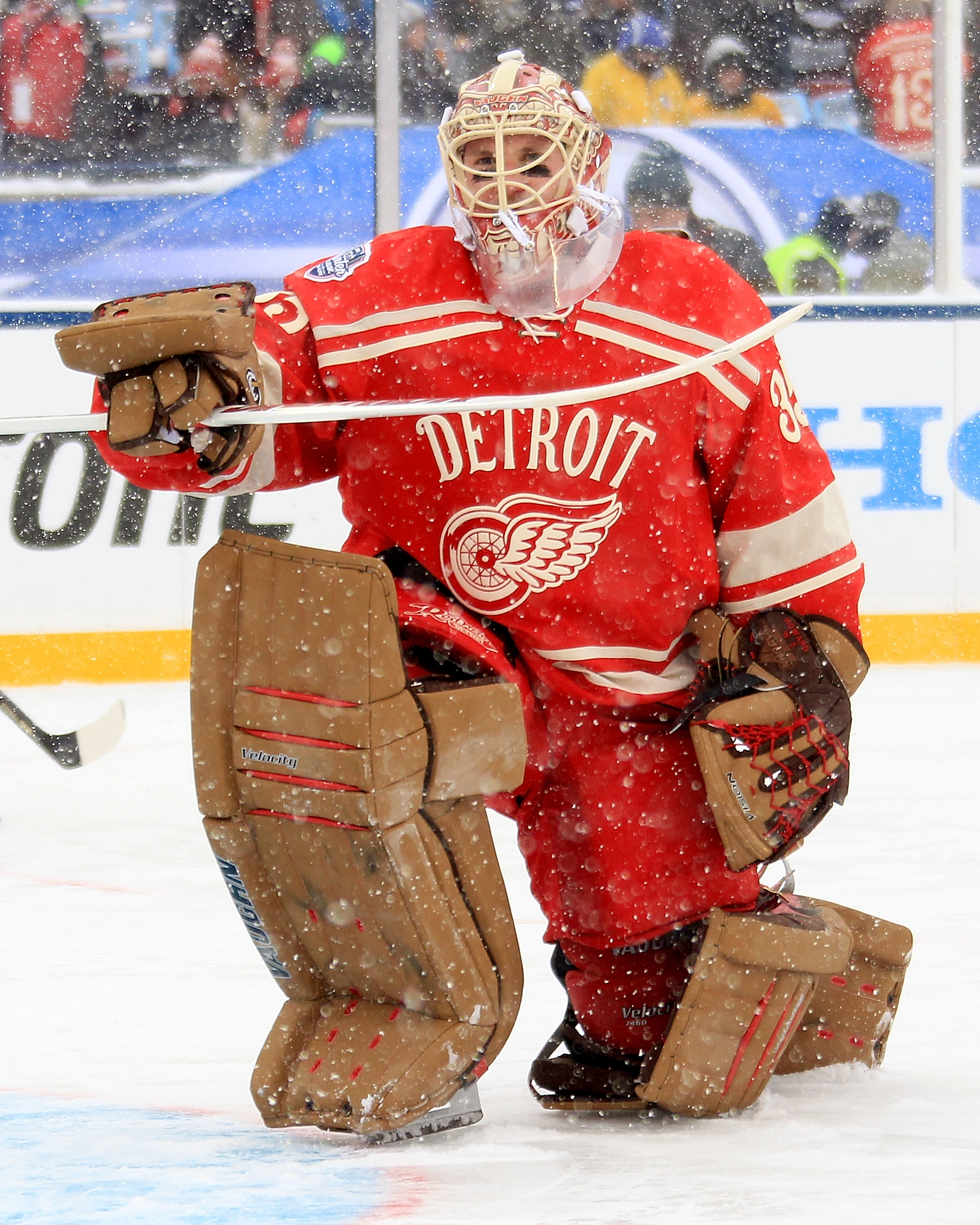
Dave Reginek/NHLI via Getty Images
I think the Red Wings jerseys are pretty dull, but one exception made it work: their 2014 Winter Classic fits. The font change, the horizontal lines and the use of beige rather than white make the whole thing work. It looks slick against all red.
14. Boston Bruins Reverse Retro (2021)
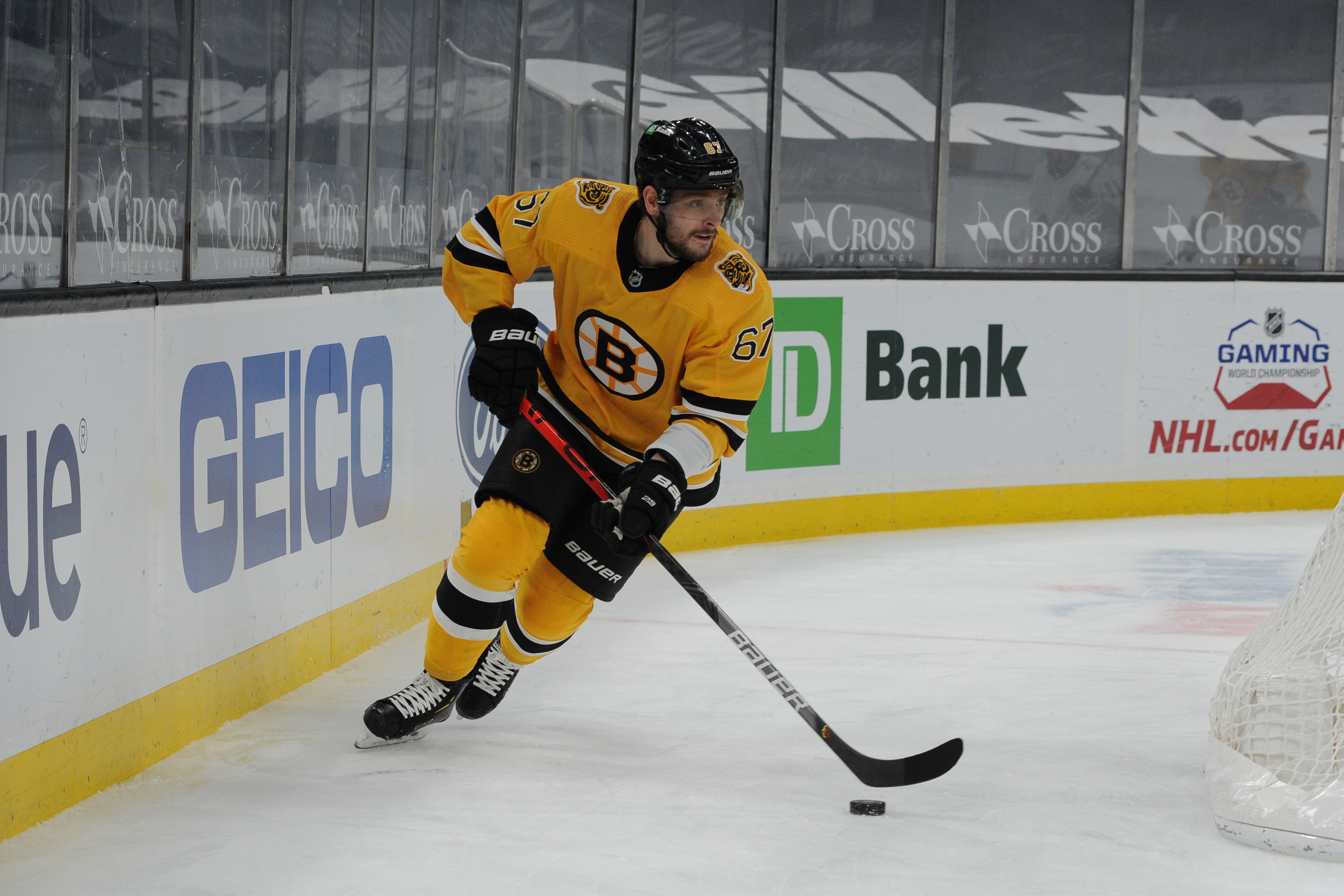
Steve Babineau/NHLI via Getty Images
The Bruins wore yellow away uniforms for a good portion of the mid-20th century, and it's a shame they ever got away from them. Their Reverse Retros were inspired by this concept and probably improved upon it. Why don't more teams use a color aside from white as an away fit?
13. Anaheim Ducks Primary (1993-2006)
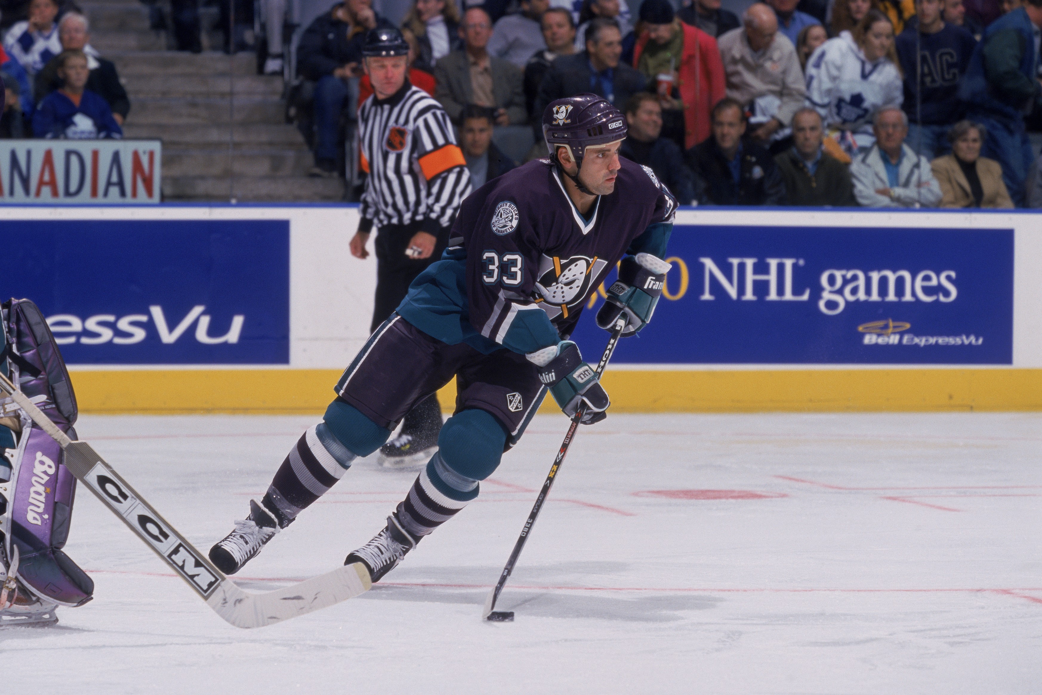
Dave Sandford /Allsport
At first, everyone made fun of the Mighty Ducks of Anaheim as they were a literal Mickey Mouse team. But in retrospect, the joke is on us. Meanwhile, since they renamed themselves "the Ducks," their black unis have been hot garbage. However, their recent attempts at orange alternates are somewhat of an improvement. They're still not touching these green-and-purples, though — one of the few examples of mid-90s jerseys that worked.
12. Nashville Predators Primary (2017-Present)
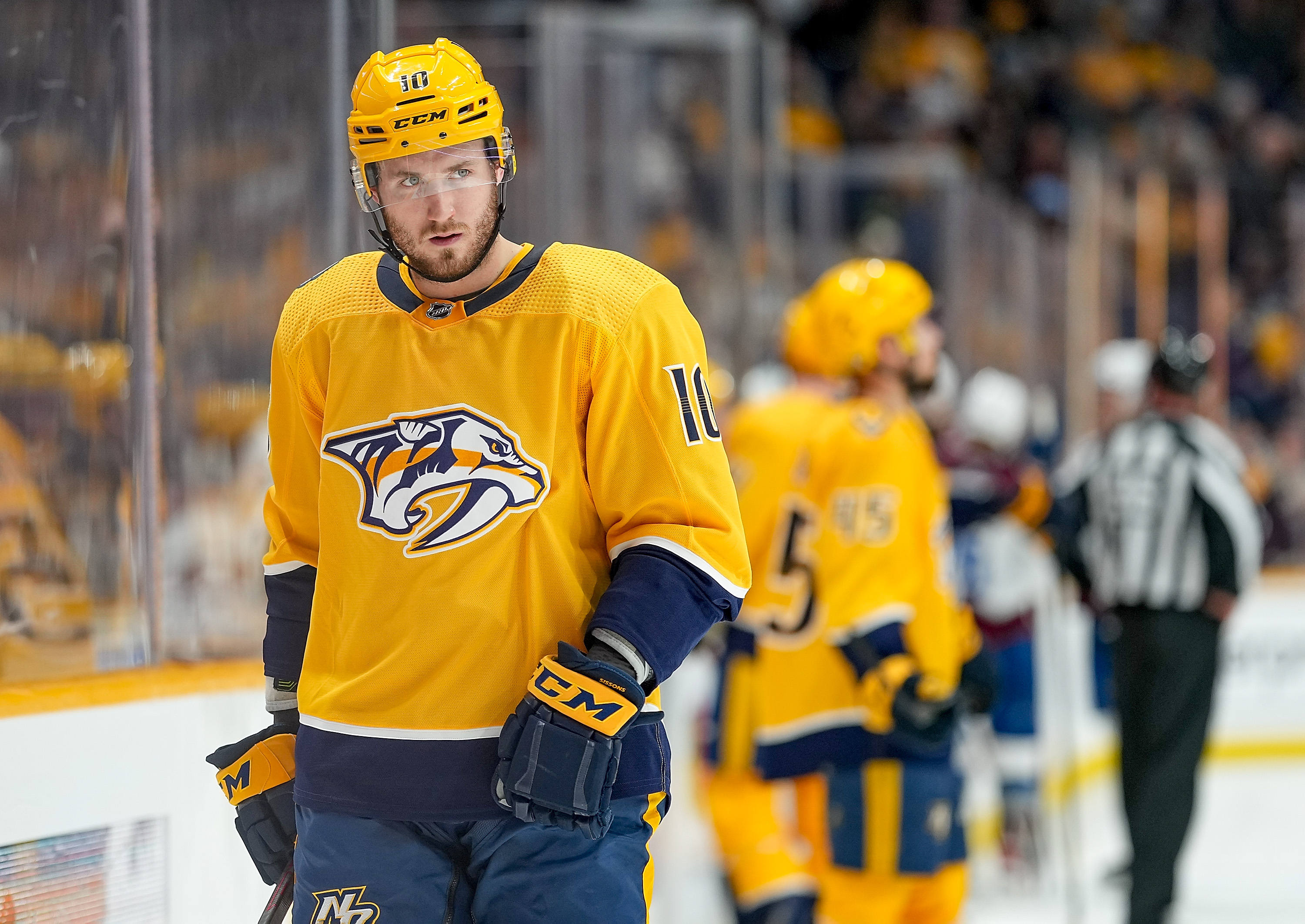
John Russell/NHLI via Getty Images
It took Nashville a while to get its act together. From 1998-to 2011, their sweaters were some of the worst in the league. Then they transitioned to a primarily yellow look, and they had one of the best jerseys in the NHL overnight. They finally got to their best form in 2017 when they simplified their unis even further, eliminating some noisy, pointless lines and finding some team success as well.
11. Winnipeg Jets Alternate (2019, 2021-Present)
Jeff Vinnick/NHLI via Getty Images
The Jets originally wore this sweater in the late '70s, but brought it back for the 2019 Tim Hortons NHL Heritage Classic. They then made it their third jersey this past season. I like Winnipeg's primary uniforms, but the Canadian Air Force insignia throws it off. Reverting back to the classic look, plus the horizontal stripes, make the jerseys pop.
10. Dallas Stars Reverse Retro (2021)
Glenn James/NHLI via Getty Images
I'm not too fond of white uniforms, mainly white NHL uniforms. Typically I wouldn't say I like busy lines. But sometimes, even a stopped clock is correct, and these Stars Reverse Retros are great. The clean star lines work uniquely.
9. San Jose Sharks Primary (2007-2013)
Don Smith/Getty Images
San Jose is the only franchise in the league that has never had a single bad uniform. Every single teal-and-black combo the team has trotted out has worked. If I have to pick one, I'm going with this look, which combined a black shoulder stripe with its splendid colors and cool logo.
8. St. Louis Blues Primary (1998-Present)
Scott Rovak/NHLI via Getty Images
The Blues had a great classic uniform with their rad blue note logo. It changed some from 1967 to 1994, but mostly everything worked. Then from 1995 to 1998, the team went insane and created possibly the worst sweaters ever worn by a hockey team (professional or otherwise), a red-and-blue eyesore best left forgotten. But then a funny thing happened: they not only figured it out but made the jerseys better than ever thanks to the addition of black highlights that made the whole thing sing. They haven't looked back since.
7. Carolina Hurricanes Reverse Retro (2021)

Gregg Forwerck/NHLI via Getty Images
RELATED: NHL Referees Have a Demanding Job, But the Paycheck is Worth It
The Hartford Whalers, despite their great logo, had horrible jerseys for their entire run in the league. I'm not going to say that's why they were so bad, but it certainly didn't help. The Hurricanes, meanwhile, have had boring uniforms since they moved to Raleigh. So how did someone come up with a Reverse Retro that worked for both teams? Part of it is the choice of grey, an underrated uniform color that looks dynamite with the green pants. These are just cool as heck.
6. Philadelphia Flyers Primary (2008-Present)
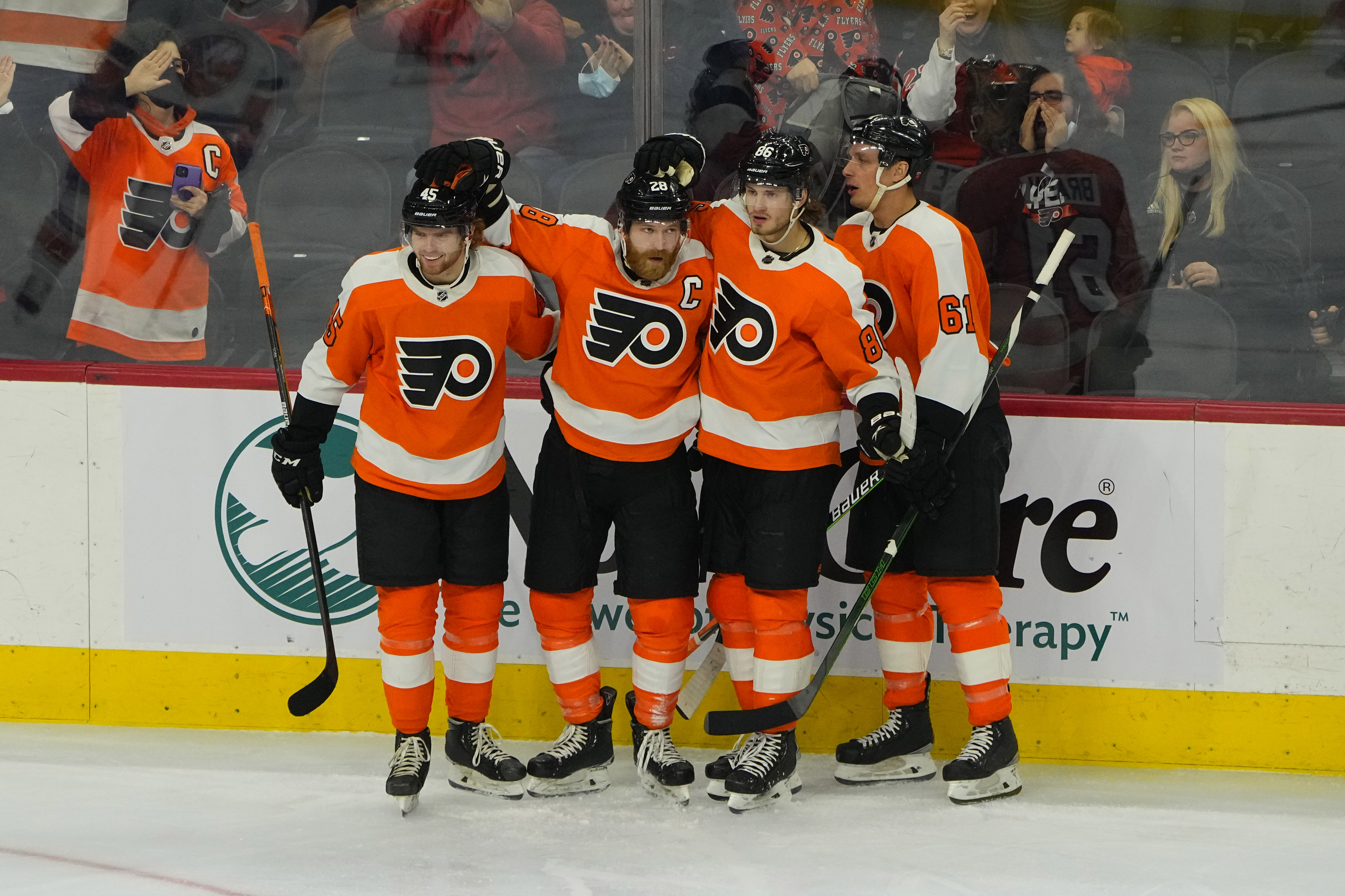
Gregory Fisher/Icon Sportswire via Getty Images
No franchise does orange like the Flyers. No franchise does unmitigated low-blow violence like the Flyers. Look, man, I'll compliment the team's jerseys and their mascot (#Gritty4Lyfe), but you can't expect me to like them.
5. Pittsburgh Penguins Primary (1980-1992, 2014-Present)
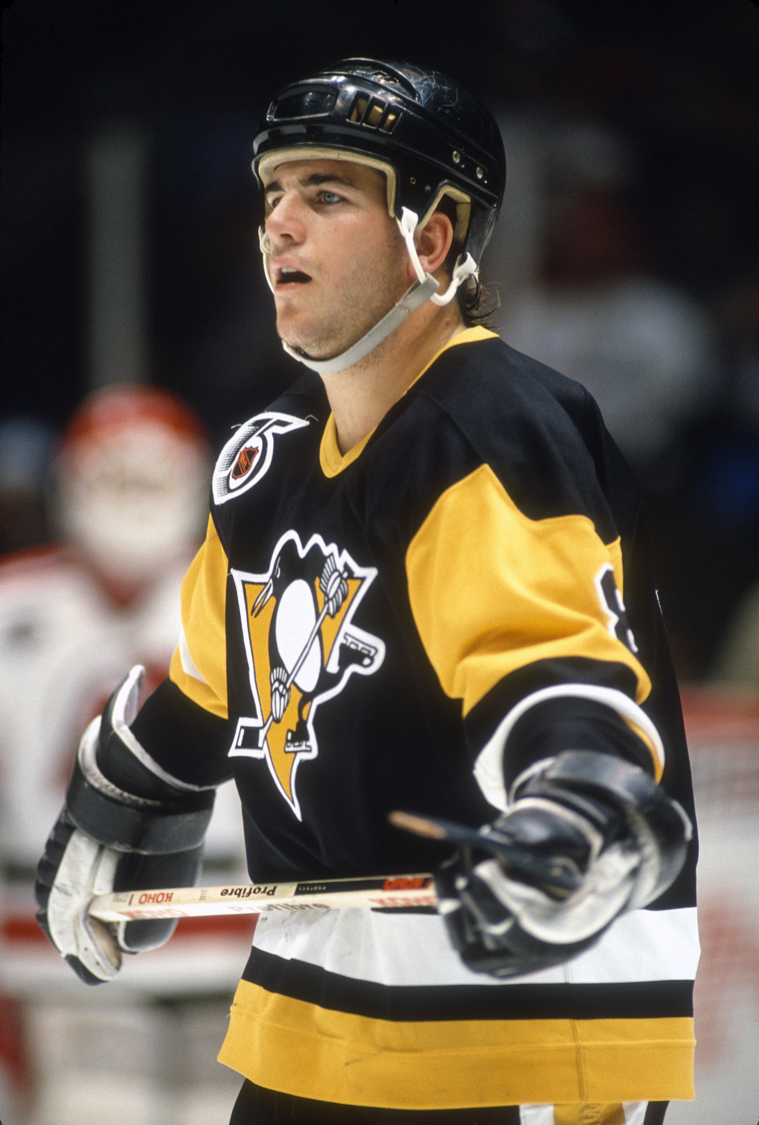
Focus on Sport/Getty Images
I hate the Penguins more than any other team in professional sports, so please understand how this hurts me.
For most of their history, they've had the yellow-and-black home jerseys (they went away in '92 but brought them back over two decades later). They are some of the most excellent NHL jerseys ever. I feel dirty now.
4. New Jersey Devils Primary (1992-2017)
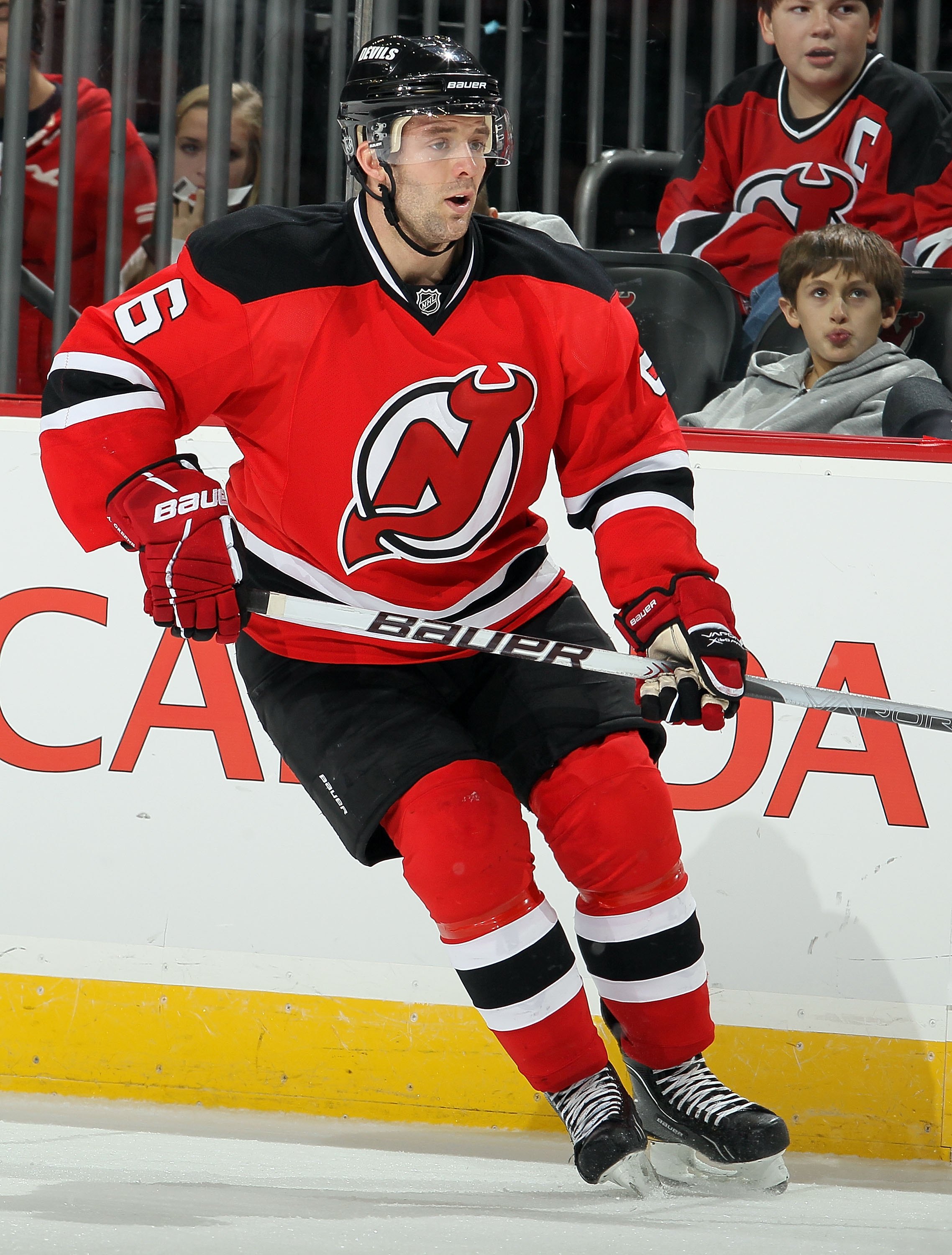
Jim McIsaac/Getty Images
Many NHL teams have tried red-and-black uniforms, and as much as I hate admitting it, only one has ever really gotten them right. The Devils may have singlehandedly attempted to destroy hockey as a sport by creating the Dead Puck Era, but at least they looked good doing it, I guess.
3. Vancouver Canucks Primary (1992-1997)
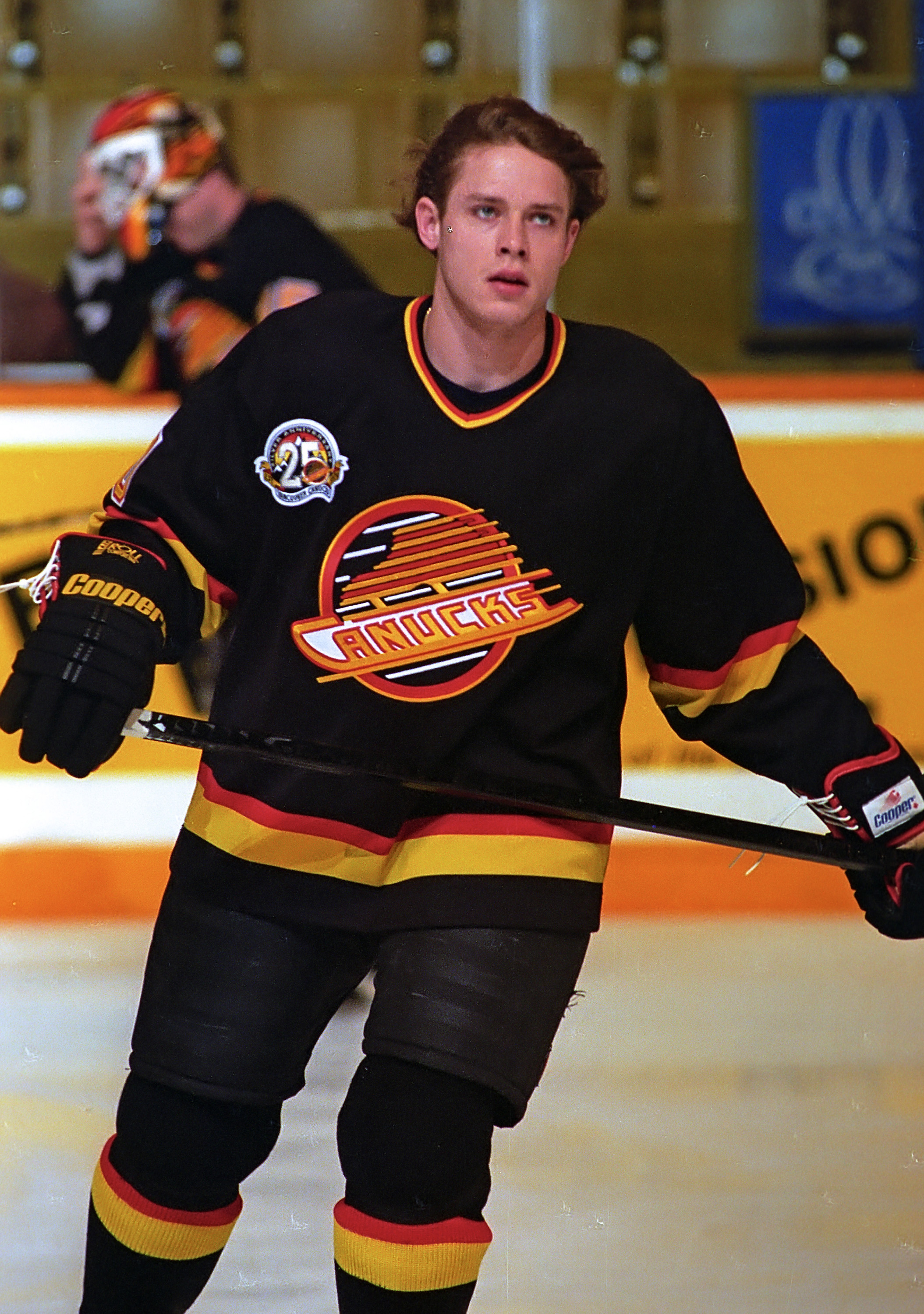
Graig Abel/Getty Images
The Canucks might be the only team who wore their best uniforms in the mid-'90s. Maybe the team didn't win any Stanley Cups, but with Pavel Bure putting up 60 goals a year and looking slick, the Canucks were fun to watch. I do have to say, their current blue and green uniforms are nice, too, and give a real Pacific Northwest feel. But, these are head and shoulders above.
2. California Golden Seals Primary (1960-1976)
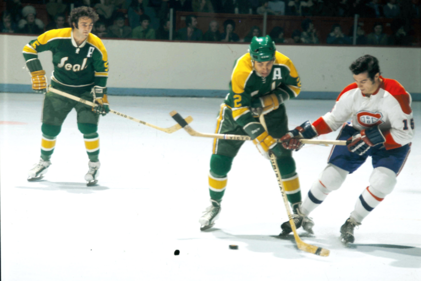
Denis Brodeur/NHLI via Getty Images
Before the Sharks, the California Golden Seals were the Bay Area's hockey team. They didn't have much success on the ice, but they looked good nonetheless. Kelly green and yellow is always a good combo, which is why the Oakland A's alternate jerseys are some of the best in MLB.
1. Tampa Bay Lightning Primary (2001-2007)
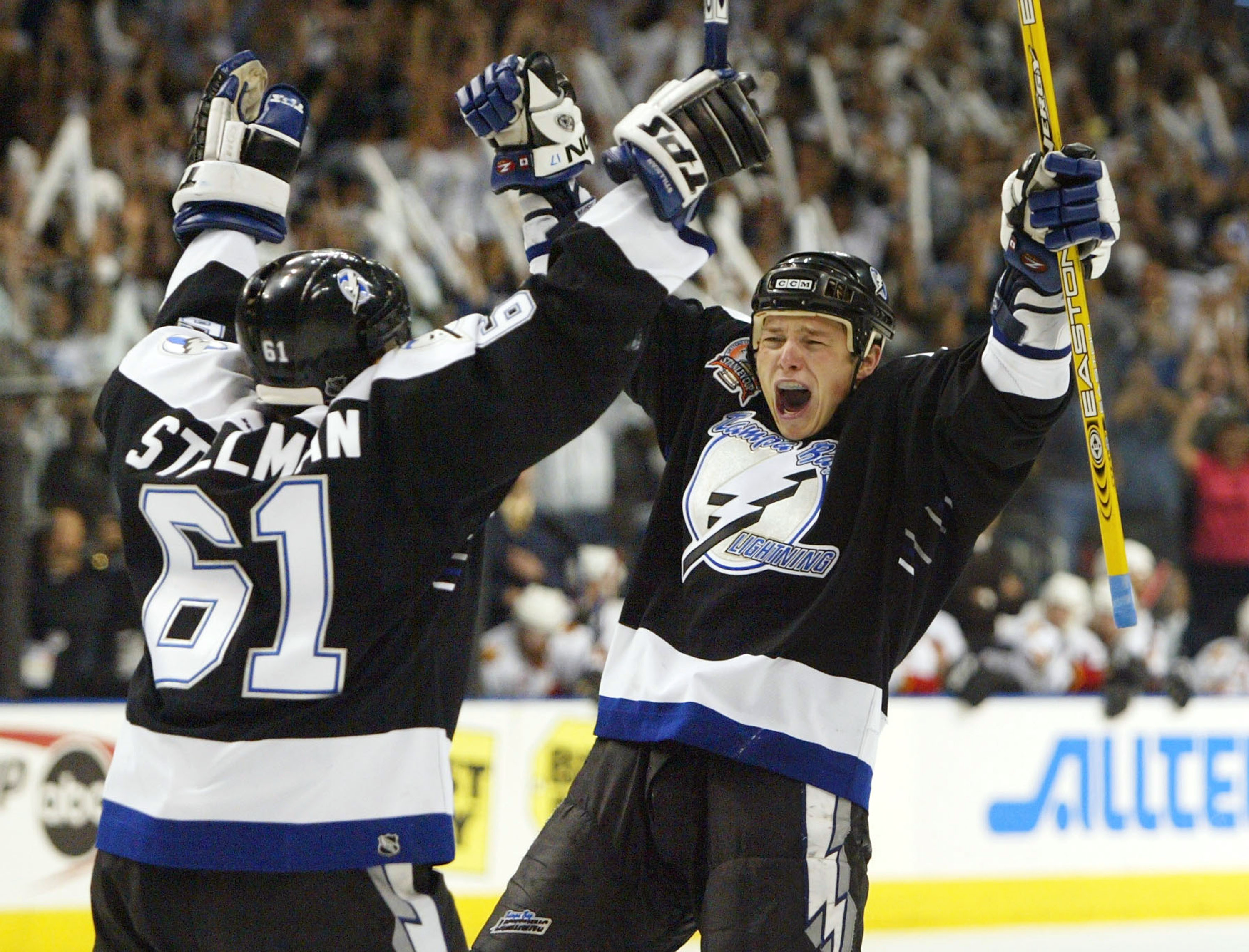
Dave Sandford/Getty Images
I'm in the minority in really hating the Lightning's transition to blue as a primary color. This is weird for me because I'm not usually a fan of black uniforms, but the Lightning's original look ruled. Tampa had some variation of these sweaters from 1992 to the present. Still, they kept changing the fonts until 2001, when they finally got it right. These were the uniforms for their first Stanley Cup win in 2004, and they should go back to them.
This article was originally published on January 21, 2022.