A lot of people would say the NBA has gotten weird with jerseys lately. Of course, there's always going to be throwbacks (which are more than welcome), but even I have to admit their attempts to break new jersey ground are...often troubling.
Videos by FanBuzz
Their recent forays into "The City" fits have been largely less than stellar, teams like the Cavaliers still won't give up that stupid burgundy and rose gold look they have going, and everyone still loves black for some reason. Also, you can't get me to say the current Brooklyn Nets jerseys are good no matter how much propaganda claims otherwise. They're boring and bad and should be consigned to the same trash bin as Kyrie Irving's homemade flat earth pamphlets.
But the NBA, more than any other sport, has a long and proud history of cool, unique and colorful jerseys. Not everything is going to be a winner, and sometimes the efforts to break new ground have fallen flat, but when they've worked, they've really, really worked.
MLB, the NFL and even the NHL sometimes try to branch out into new territory, but they never seem to achieve it quite as well as the NBA does on the regular. Even when they fail, they fail memorably; with a few exceptions like the Bucks and Raptors home jerseys, even the worst NBA uniforms aren't boring. So what are some of the coolest jerseys in NBA history? Let's find out.
The 25 Best Jerseys in NBA History, Ranked
25. Buffalo Braves 1973 Road
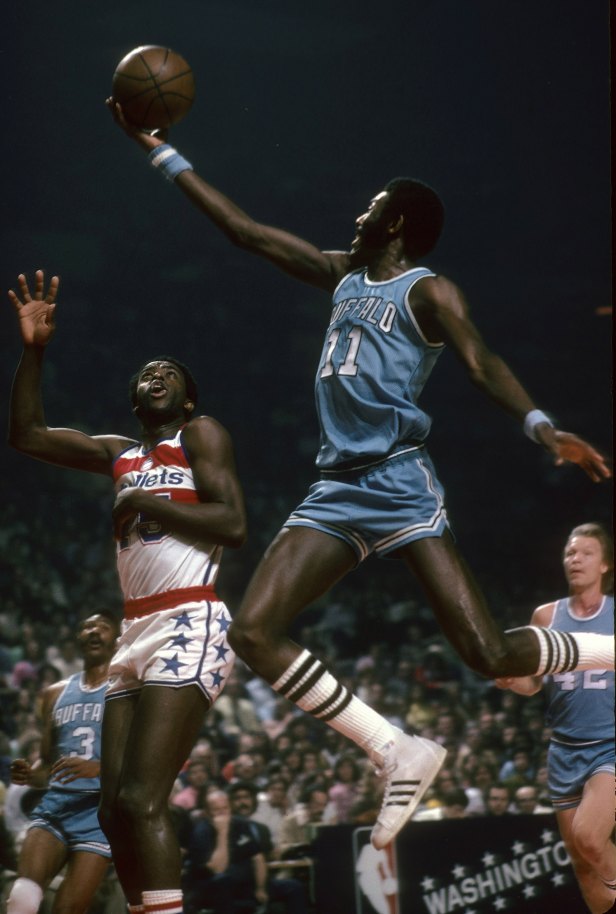
We're starting with a curveball on a franchise most people don't remember existed. Long before they were the Los Angeles Clippers, the Buffalo Braves were the team of Bob McAdoo in these baby blue road uniforms. No fancy tricks here, but these jerseys didn't need them: just a gorgeous color and an iconic font and they were good to go. The Braves may have had as long a history of failure as the Clippers did after them, but you can't go wrong with baby blue.
24. Toronto Raptors 1995 Road
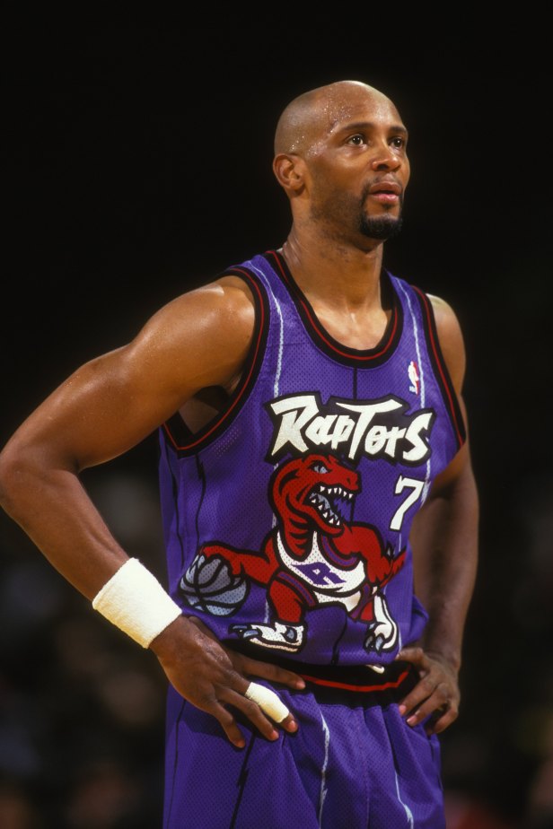
To say that early-to-mid-1990s NBA jerseys were noisy would be like describing Antarctica as "a bit nippy." Usually, it created some of the ugliest fits in NBA history (the Cleveland Cavaliers did something this same year that should've resulted in someone facing charges in The Hague), but in this case, it created something so hideous that it looped back around and became beautiful. I think if you removed any single element of these jerseys (the absurd font, the silly-if-deeply-cool logo, the weird vertical barbed wire almost-pinstripes), it wouldn't work, but somehow they all come together into a harmonious whole. Heck of a lot better than the boring fuchsia with basic lettering the team is trotting out now.
23. Washington Bullets 1974 Home
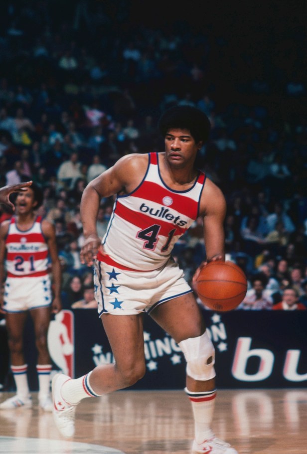
This is one of the few examples in NBA history where the home jersey is actually better than the road one (which adds a lower-half blue that just detracts from the general effect). What really sets these jerseys apart (aside from being, y'know, from my team) is the horizontal stripes combined with the stars on the lower half. Why the team ever moved away from the Washington Bullets and towards the *gag* Washington Wizards is far beyond me (yes, I know why, it had to do with gang violence, it's just a dumb reason).
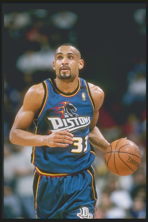
22. Detroit Pistons 1997 Road
Alright, Detroit, you got me. I've never liked the Pistons (the Bad Boys era was particularly insufferable), and I had an irrational hatred for Grant Hill that probably stemmed from the Duke thing...but these jerseys were as cool as everyone says they were. The rider-on-a-teal-horse look was another '90s look that got real weird and shouldn't have worked, but did. I know the classic Detroit colors are blue and red (gag), but at the very least, bring the trim design back from these bad boys even if you want to bring the color scheme in line.
21. Miami Heat 2020 The City
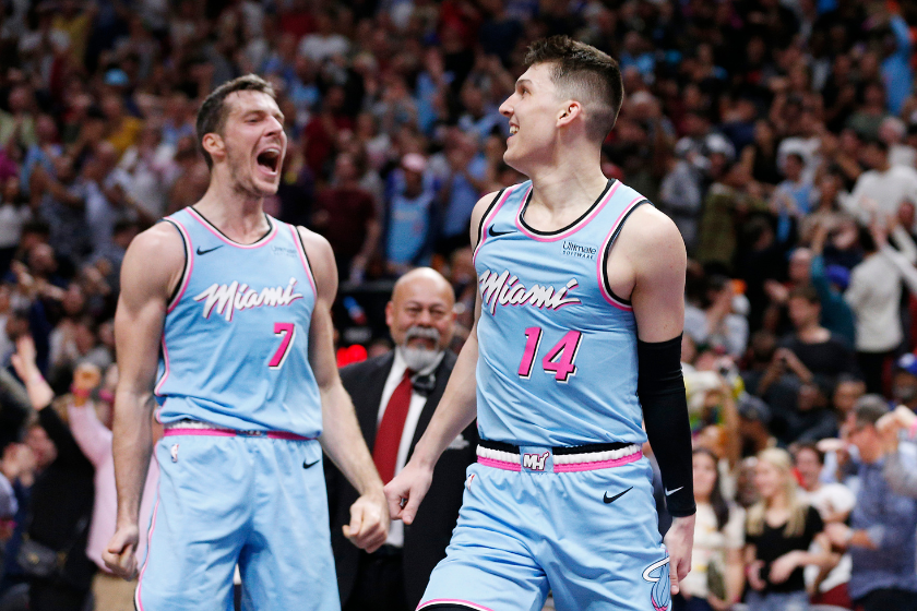
Michael Reaves via Getty Images
The Miami Heat's "Vice City" jerseys are iconic, but the powder blue version was by far the best. Powder blue is always a solid base color, but add the pink, white and a touch of black? We're back hanging with Don Johnson and Philip Michael in the 80s, baby. Note to jersey designers: powder blue and pink are an underrated combination.
20. Los Angeles Lakers 2019 Road
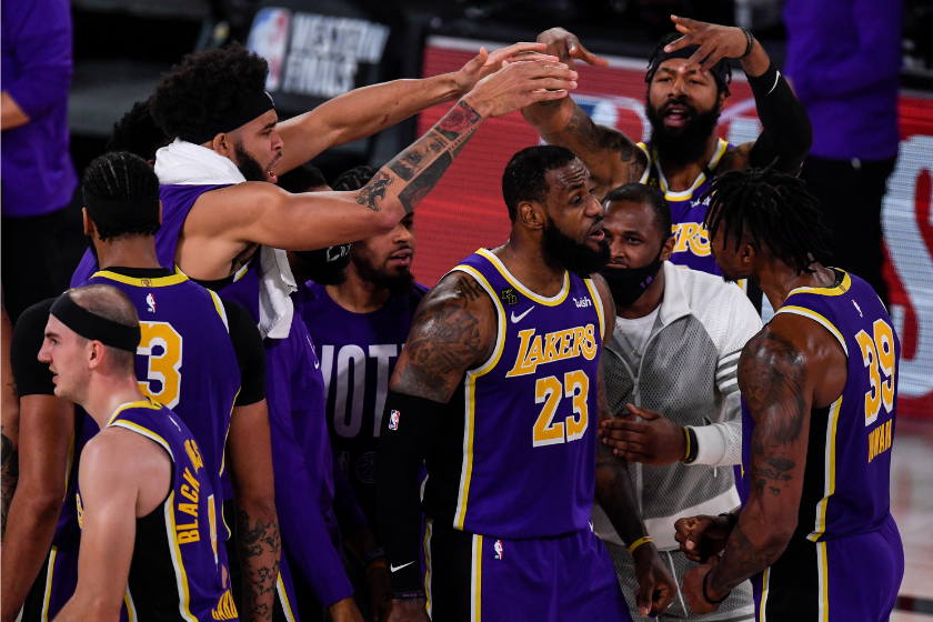
AAron Ontiveroz/MediaNews Group/The Denver Post via Getty Images
The Lakers have arguably the greatest color combination in sports, so why would they mess with relatively perfect jerseys. Well, when LeBron James made the move to Southern California in 2018, the franchise replaced the yellow side piping with black on their classic purple jersey that took it to another level. They also added a white outline that makes the design particularly sing. I'm a sucker for purple and black, and adding it to the iconic purple and gold was a bold move. Yet, it works spectacularly.
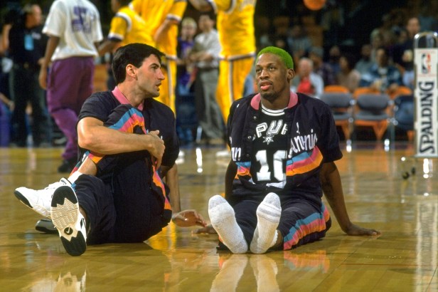
19. San Antonio Spurs 1995 Road
OK, this one is definitely cheating, but I don't care. This is the only jersey to earn a place here based purely on the warmups rather than the jerseys themselves, but that teal-pink-orange splash logo added a pop of color to what are otherwise some pretty boring uniforms from a franchise with a long history of them. I can still remember the ESPN highlights of David Robinson getting absolutely obliterated by Hakeem Olajuwon after whipping off these warmups.
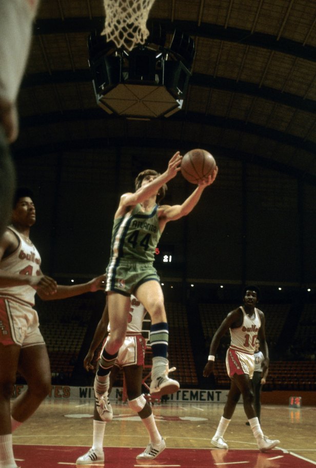
18. Atlanta Hawks 1971 Road
Why on Earth did the Hawks ever transition away from these neon green-and-blue retro jerseys towards the red-and-white color scheme half the teams in the league have or had at one point? They have the worst current jerseys in the NBA, even worse than the Rockets and the Nets (and that's a high bar), and I would argue it's a direct result of moving away from these. Maybe the Pete Maravich-Lou Hudson-Walt Bellamy teams never won anything of significance, but there's no denying they looked cool.
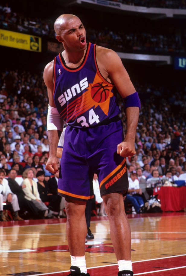
17. Phoenix Suns 1993 Road
I know these are going to be divisive, and I know I'm biased (the '93 playoffs were pretty formative for me), but as good as the Suns' uniforms have typically been over the years (have they ever had bad ones?), I don't think they've ever been better than the classic streaking basketball. Purple and orange always works as a color scheme, and while a lot of the unusual splash images jerseys employed during the early '90s didn't quite work (the Hawks and Cavs had particularly absurd ones), this one absolutely did. Few NBA MVPs have ever looked as iconic as Charles Barkley did during the 1993 season, even if the NBA Finals were a letdown for Suns fans hungry for that first title.
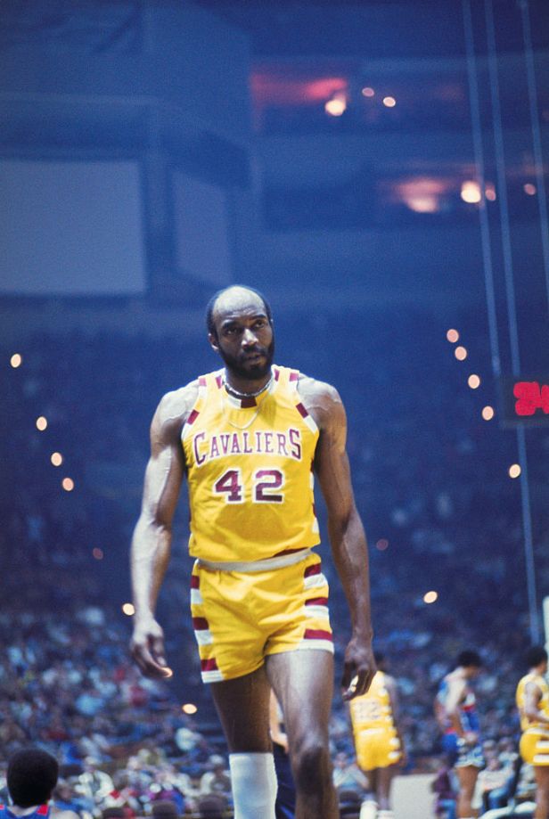
16. Cleveland Cavaliers 1977 Home
Everyone say it with me: yellow is a better home color than white. It just is! White is boring, while these jerseys were just worlds of fun. The coolest flourish here is the color segments on the trim. The University of Maryland did that at one point, but I can't think of another NBA team that ever tried it. Every time LeBron James wore these in a throwback it was the coolest he ever looked in a Cavs uniform.
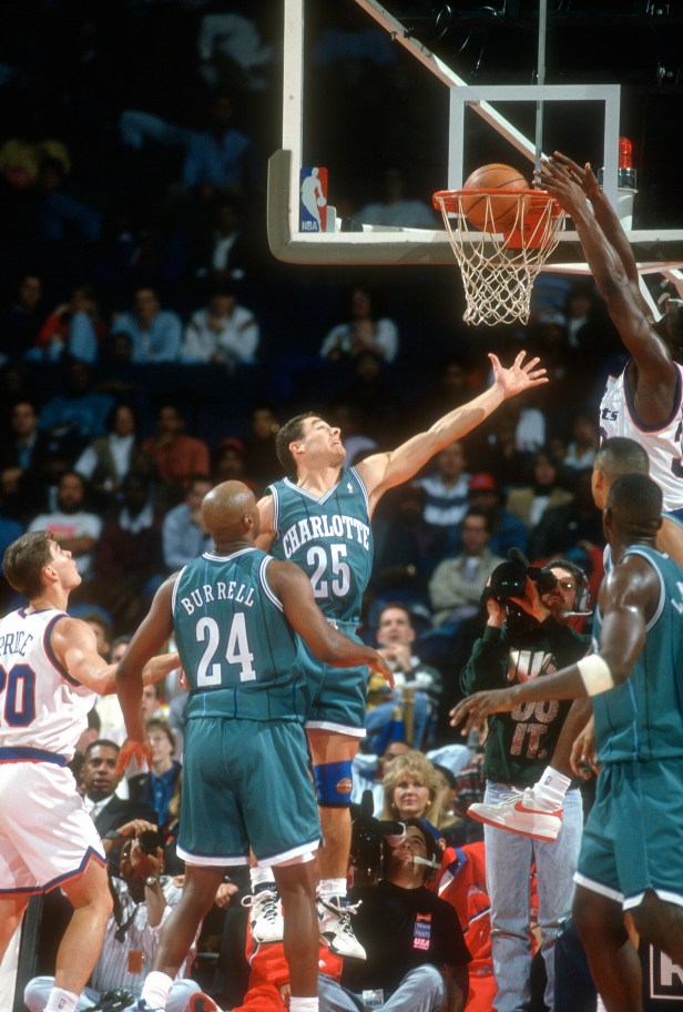
15. Charlotte Hornets 1992 Road
Many teams have attempted teal as a primary color, and virtually none have ever succeeded at it — except the 1990s Charlotte Hornets. There's a reason everyone hated the Bobcats name and wanted them to bring back the hornets as fast as humanly possible. I'm not sure why the team didn't fully bring back these throwback pinstripe unis. Watching Alonzo Mourning, Larry Johnson and Muggsy Bogues in these (not to mention Dell Curry, aka Steph's dad!) was formative for a lot of NBA fans.
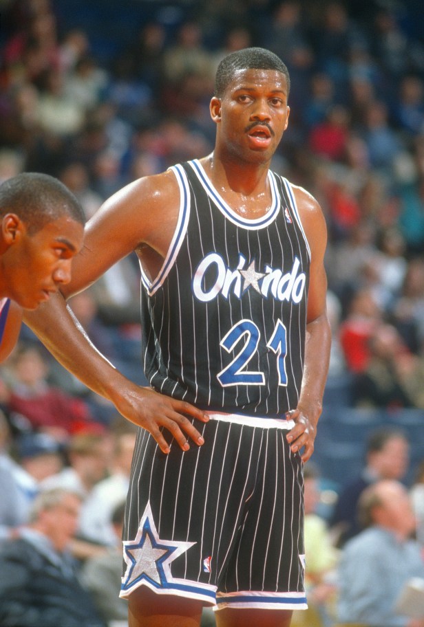
14. Orlando Magic 1990 Road
These road black jerseys prove that no team has ever done pinstripes better than Orlando. Sure, the franchise may have been mired in a deep hole for the past decade or so and they've squandered a few of the best big men in NBA history, but...hey, at least they looked good while doing it.
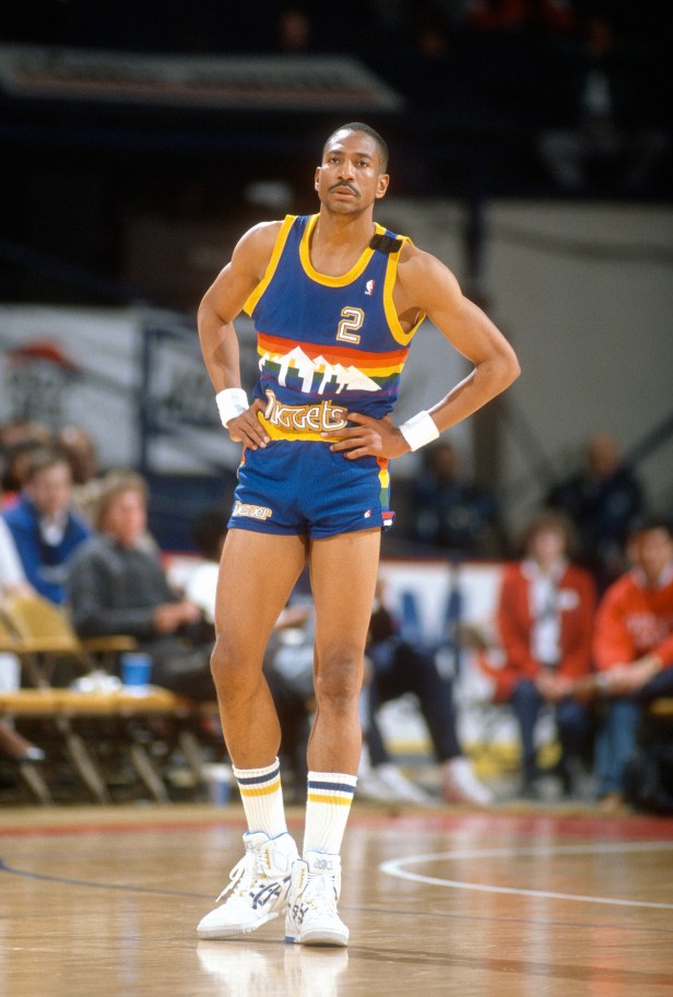
13. Denver Nuggets 1987 Road
These have a strong, strong case as the best jerseys in NBA history. A beautiful color scheme combining royal blue with bright yellow trim, the Denver skyline and Rocky Mountains set against a rainbow backdrop...just perfection. No notes. These are my personal favorite NBA jerseys ever.
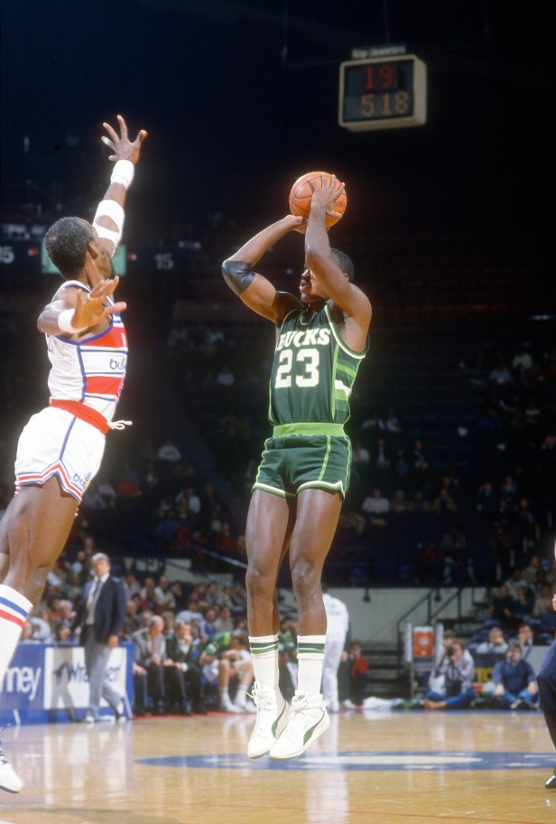
12. Milwaukee Bucks 1986 Road
When a team is given "green, just green" to work with, it's gonna be an uphill climb...but somehow this particular iteration of the Bucks jerseys summited that mountain. Also known as the "Irish Rainbow," these green-on-green jerseys work in part because of the cool font, and in part because of the horizontal side-stripe piping, but more than anything it's because the lime and hunter green offset each other so well.
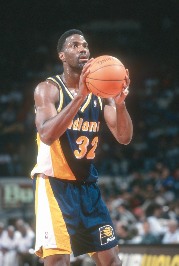
11. Indiana Pacers 1995 Road
The Pacers have always had sneaky-good jerseys, but I'm not sure they've ever been better than this slick triangle-design fit. It takes a lot for me to like a navy-colored jersey, but...these have done it for me, and not just because it was extremely, extremely funny to watch Reggie Miller rip the hearts out of New York Knicks fans while wearing these in the '95 playoffs.
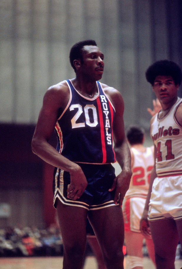
10. Cincinnati Royals 1970 Road
It might seem weird to include a jersey that debuted before the era of color photography, but if there's one design trick NBA teams appear to be waking up to a bit more now, it's that vertical lettering is very, very cool. It's also hard to find much fault with the jersey made famous by the Big O himself, Oscar Robertson. Sometimes, you just gotta go old-school.
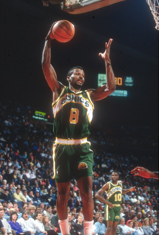
9. Seattle Supersonics 1990 Road
Green and gold is a hard combo to make work, but the Sonics managed it with these uniforms, which is part of why they lasted so long: an almost unheard-of 17 years from 1978-1995. The downswooping nameplate across the front is really what makes this look, because the league has never seen anything quite like it. Not having a Sonics team in Seattle is a crime against league history, and that should change this year, last year and every year.
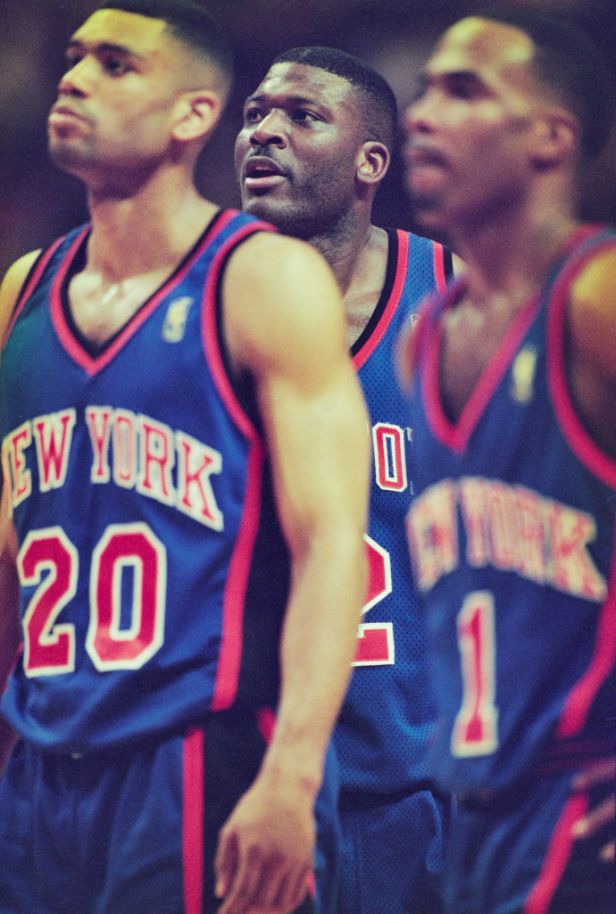
8. New York Knicks 1997 Road
The Knicks have always had good jerseys — blue and orange is a winning color combination no matter which team employs it — and they've been smart enough to rarely chang their look very much. But in the late 1990s, they did make one significant change, adding black side piping. The team has never looked better; something about the black off-set the other colors and made the team look way more menacing...which, considering the way the Knicks played in the 1990s, tracks pretty well, honestly.
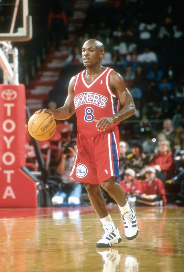
7. Philadelphia 76ers 1996 Road
The worst thing about the late '90s NBA trend towards darker colors was how every team with a fun uniform — Cleveland, Atlanta, and yes, Philadelphia — went away from it in favor of some smudgy black road thing. But this jersey, worn by a rookie Allen Iverson, was probably the best of the classic Sixers uniforms, combining the old-school bright red with some unique side flourishes to make a true classic.
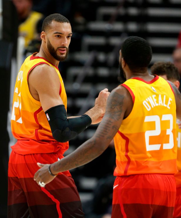
6. Utah Jazz 2017 The City
Fine, crap, there's two good city edition jerseys. For the most part, the city uniforms seem designed to just give Nike something to do, but these...these are indisputably rad. Color gradients are always going to look cool on NBA uniforms, and I really don't think any team has ever done it better. I hate admitting it because it's Utah, for god's sake, but the Jazz have had some really good uniforms throughout their history.
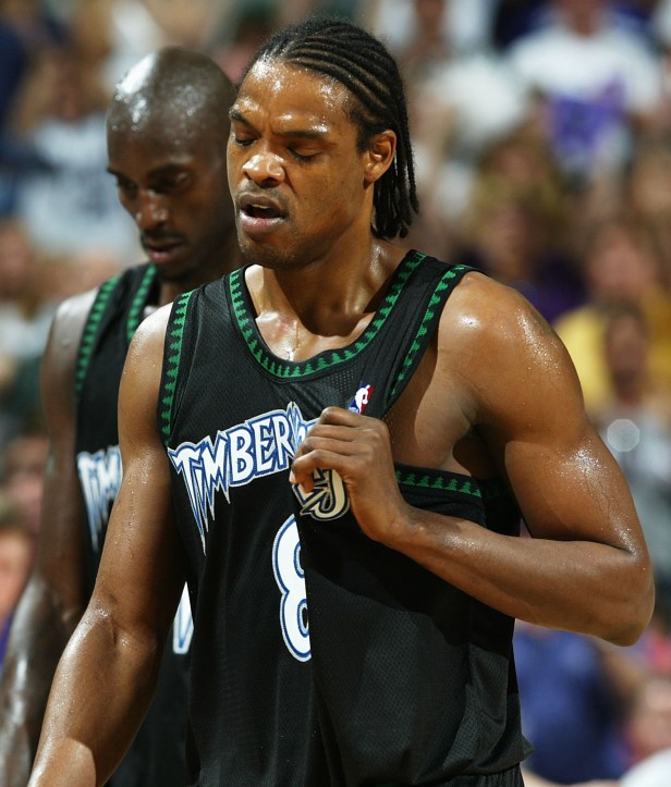
5. Minnesota Timberwolves 2004 Alternate
For a while there, the NBA became obsessed with black (or near enough to make no difference) jerseys, and most of the time it didn't work. They just looked smudged or boring, kind of like '90s and 2000s versions of the terrible Brooklyn Nets unis now (no, I will not let this go). But once in a while, a team managed to make black work — and probably no team made it work more than these alternates in the heyday of Kevin Garnett. 2004 was the year he won his MVP, and he never looked better that season than he did when wearing these.
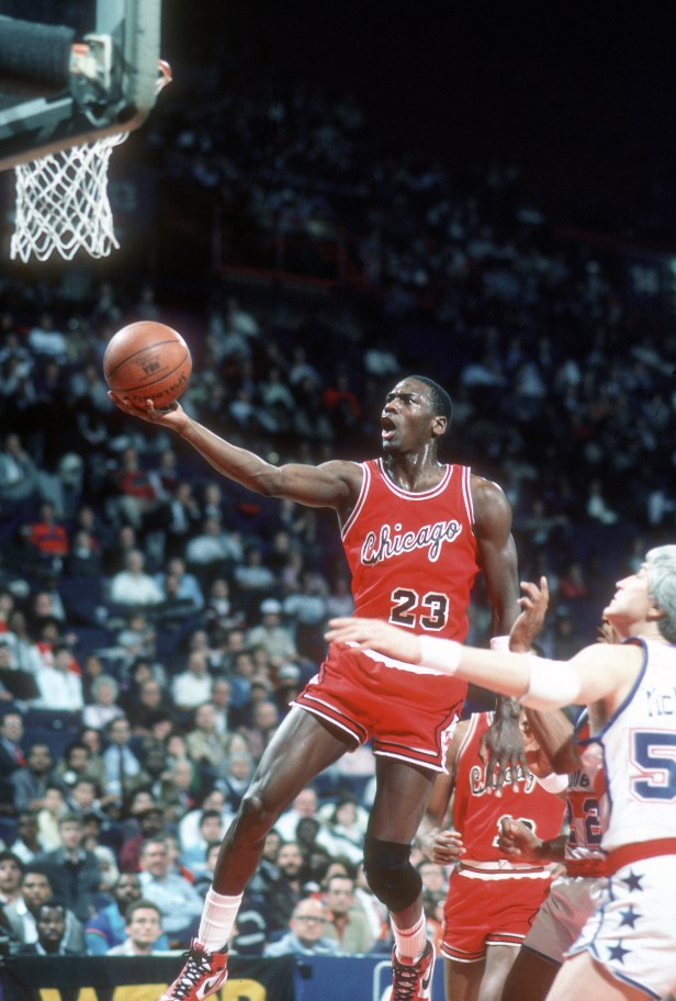
4. Chicago Bulls 1985 Road
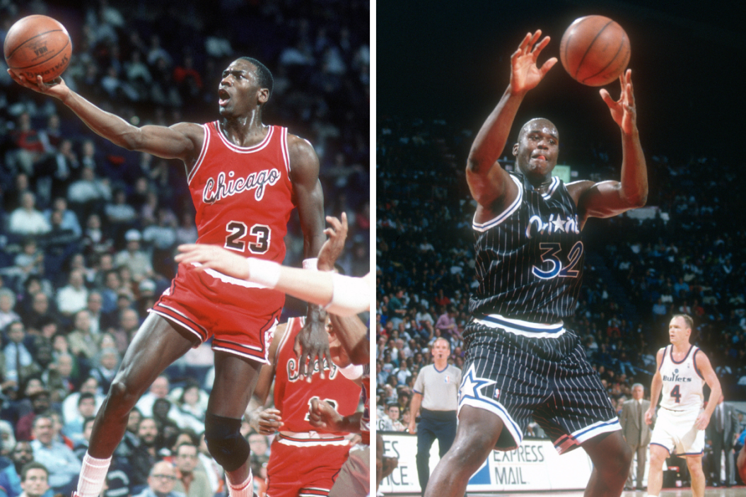
As someone who hated the Bulls as a kid, this pains me to admit, but these were some great jerseys. This was the fit Michael Jordan wore when he won the '85 dunk contest, and the team has never looked better. The bright red color is iconic enough that it's never going anywhere (hopefully), but it's really the slanted cursive that makes this look; there's nothing like it in the modern NBA.
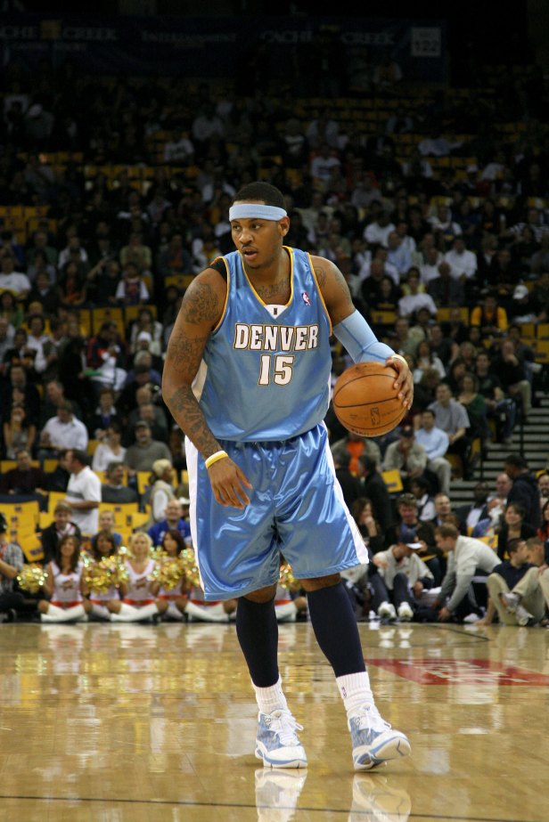
3. Denver Nuggets 2008 Road
RELATED: The 14 Most Overrated NBA Players of All Time Relied on Reputation
Denver is the only team that appears here twice, but even I have to admit the franchise's history is littered with great uniforms. Powder blue is the single best uniform color — it's almost impossible to have a bad uni based in powder blue — but it's the side of the jerseys here that really make them: that piping shouldn't quite work, yet it somehow does. This is also the quintessential Carmelo Anthony jersey, and you have to respect it for that.
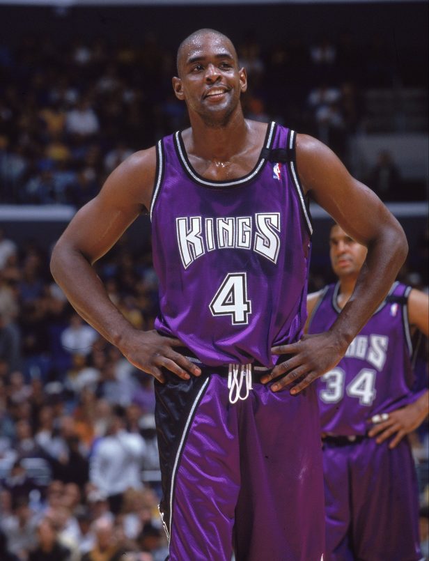
2. Sacramento Kings 2000 Alternate
I don't think there's a better color scheme than purple and black — every fit with that combo looks incredible. It has arguably never looked better than this alternate jersey from the Kings' greatest period of success: the late '90s/early 2000s when Chris Webber manned the post. The only question here: why on Earth wasn't this the Kings primary road uni rather than that far inferior black?!
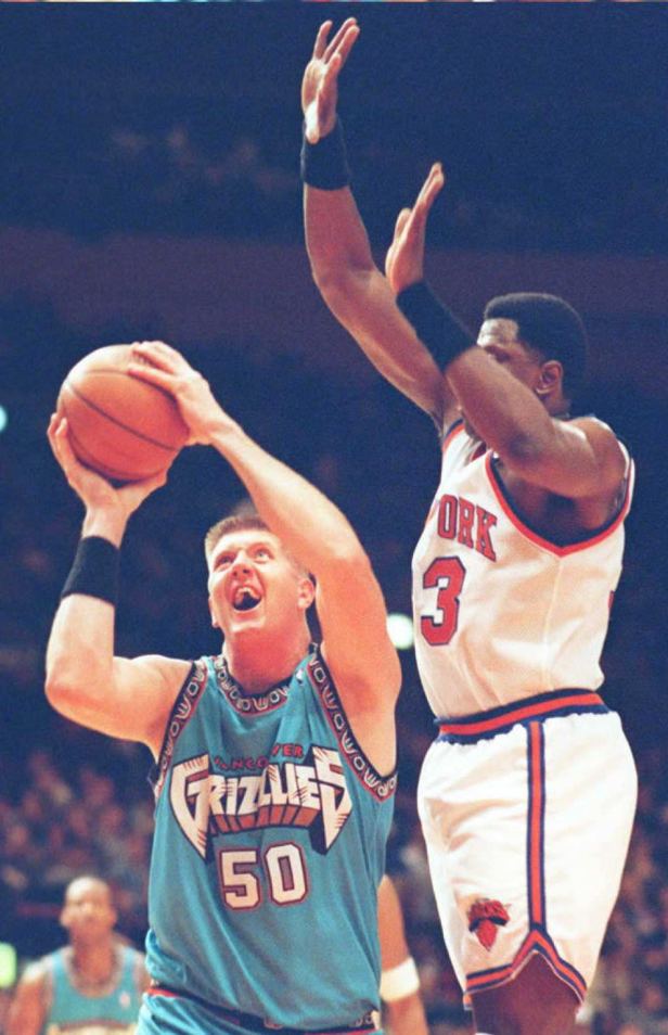
1. Vancouver Grizzlies 1995 Road
Before there were the Memphis Grizzlies and their atrocious navy uniforms, there was a little disaster of a basketball team north of the border called the Vancouver Grizzlies. Everything about them was a failure. They were a nightmare on the court, nobody showed up to the games and oh yeah, their jersey choices were...a lot. But sometimes, much like their counterparts during the same year in Toronto, something can become so ugly that it winds up looking surprisingly cool. Of particular note here is whatever is happening on the trim. I don't understand it, but I know I like it!
